CP

Dark & White Color Palette — Midnight & Chalk

A high-contrast four-color scheme pairing near-black darks with crisp white and two soft greys between — every color matched to real paint you can buy.

By Emily Roberts · DIY Editor & First-Timer's Guide

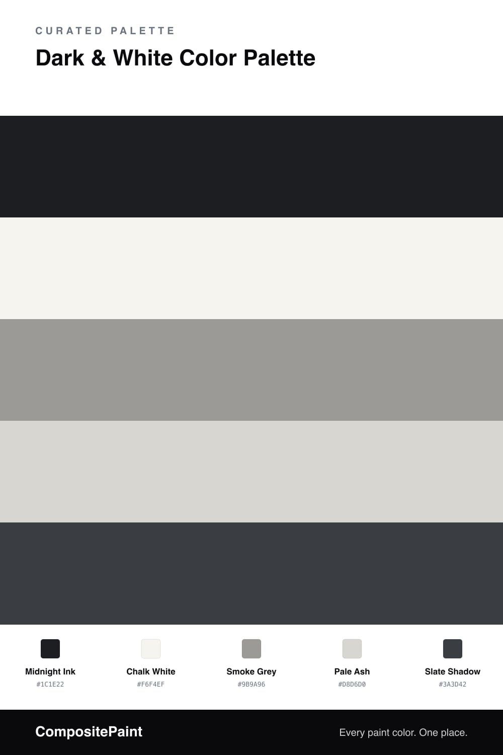
High contrast is having a real moment in 2026, and this is the cleanest way to do it. Chalk White carries the whole scheme with a soft, warm-leaning brightness, while Midnight Ink drops in as a near-black anchor that feels deep without going flat or pure black.

The trick to making it look intentional rather than harsh is the middle. Smoke Grey and Pale Ash are the quiet step between your darkest and lightest tones, easing the eye across the jump so nothing feels jarring.

A touch of Slate Shadow rounds things out with a cooler, bluish dark you can use for the small stuff. Keep white doing most of the work, let the dark be your accent, and the greys hold it all together.

View palette in
Midnight Ink
Dominant
Backdrop Hocus Pocus · BD-HP
#1F2025
LRV 3
Chalk White
Base
Dunn-Edwards Droplets · DEW381
#F6F4EF
LRV 83
Smoke Grey
Secondary
C2 Paint Tin Man · C2-970
#9B9995
LRV 32
Pale Ash
Support
Farrow & Ball Ammonite · No. 274
#D8D6CF
LRV 67
Slate Shadow
Accent
Benjamin Moore Soot · 2129-20
#373C41
LRV 6

Buy These Colors

Each color matched to the closest real paint in every brand, by ΔE2000. Tap a swatch for its full guide or + to save it — take any SKU to the store, they mix on demand.

Midnight Ink
#1C1E22 · LRV 1 · Dominant
Sherwin-Williams · SW 2936 · ΔE 10.65
Behr · 770F-7 · ΔE 7.26
Benjamin Moore · PM-9 · ΔE 4.89
Valspar · 8006-8G · ΔE 2.67
PPG / Glidden · PPG0995-7 · ΔE 10.24
Glidden · 00NN 05/000 · ΔE 9.69
Dutch Boy · 438-7DB · ΔE 5.87
HGTV Home by Sherwin-Williams · HGSW 1441 · ΔE 5.87
Dunn-Edwards · DEA002 · ΔE 9.51
Magnolia Home · JG-05 · ΔE 7.02
Farrow & Ball · NO. 256 · ΔE 9.53
Diamond Vogel · H101 · ΔE 9.15
Hirshfield's · 0515 · ΔE 4.61
Rodda · CA210 · ΔE 10.15
C2 Paint · BD49 · ΔE 10.65
Clare · PNT100-DP-54 · ΔE 13.88
Portola Paints · FACTORY BLACK · ΔE 4.38
Annie Sloan · OXFORD NAVY · ΔE 10.64
Backdrop · BD-HP · ΔE 1.32
Rust-Oleum · 285144 · ΔE 9.27
Kompozit · 0515 · ΔE 4.61
Chalk White
#F6F4EF · LRV 91 · Base
Sherwin-Williams · SW 9541 · ΔE 0.79
Behr · DC-001 · ΔE 0.8
Benjamin Moore · 2121-70 · ΔE 1.98
Valspar · 8007-6F · ΔE 1.22
PPG / Glidden · PPG1001-1 · ΔE 1.62
Glidden · PPG1001-1 · ΔE 1.54
Dutch Boy · 002W · ΔE 1.22
HGTV Home by Sherwin-Williams · HGSW 4001 · ΔE 1.32
Dunn-Edwards · DEW381 · ΔE 0
Magnolia Home · JG-21 · ΔE 1.51
Farrow & Ball · NO. 2005 · ΔE 1.05
Diamond Vogel · 0355 · ΔE 1.45
Hirshfield's · 0011 · ΔE 1.91
Rodda · R007 · ΔE 0.99
C2 Paint · C2-612 · ΔE 1.23
Clare · PNT100-LT-04 · ΔE 1.64
Portola Paints · ORIGAMI · ΔE 1.31
Annie Sloan · OLD OCHRE · ΔE 14.45
Backdrop · BD-TR · ΔE 2.82
Rust-Oleum · 285140 · ΔE 3.64
Kompozit · 0011 · ΔE 1.91
Smoke Grey
#9B9A96 · LRV 32 · Secondary
Sherwin-Williams · SW 7673 · ΔE 1.2
Behr · HDC-NT-10A · ΔE 1.65
Benjamin Moore · 1559 · ΔE 4.08
Valspar · V120-2 · ΔE 1.09
PPG / Glidden · PPG0997-5 · ΔE 2.03
Glidden · 30YY 31/024 · ΔE 1.46
Dutch Boy · 438-4DB · ΔE 1.2
HGTV Home by Sherwin-Williams · HGSW 1473 · ΔE 2.63
Dunn-Edwards · DEGR58 · ΔE 1.65
Magnolia Home · JG-135 · ΔE 2.27
Farrow & Ball · NO. 284 · ΔE 1.76
Diamond Vogel · 0554 · ΔE 3.58
Hirshfield's · 0548 · ΔE 2.83
Rodda · R094 · ΔE 5.23
C2 Paint · C2-970 · ΔE 0.61
Clare · PNT100-LT-32 · ΔE 8.15
Portola Paints · TWIN PEAKS · ΔE 7.41
Annie Sloan · FRENCH LINEN · ΔE 8.95
Backdrop · BD-AN · ΔE 8.17
Rust-Oleum · 285141 · ΔE 5.68
Kompozit · 0548 · ΔE 2.83
Pale Ash
#D8D6D0 · LRV 67 · Support
Sherwin-Williams · SW 9628 · ΔE 1.4
Behr · HDC-MD-21 · ΔE 1.46
Benjamin Moore · CSP-500 · ΔE 1.06
Valspar · 7004-18 · ΔE 1.03
Fog
PPG / Glidden · PPG1010-2 · ΔE 2
Fog
Glidden · PPG1010-2 · ΔE 1.48
Dutch Boy · 446-1DB · ΔE 3.82
HGTV Home by Sherwin-Williams · HGSW 2457 · ΔE 1.28
Dunn-Edwards · DEC791 · ΔE 1.02
Magnolia Home · JG-132 · ΔE 0.66
Farrow & Ball · NO. 274 · ΔE 0.49
Diamond Vogel · 0530 · ΔE 1.23
Hirshfield's · 0030 · ΔE 1.94
Rodda · CA030 · ΔE 1
C2 Paint · C2-979 · ΔE 2.49
Clare · PNT100-LT-07 · ΔE 1.48
Portola Paints · SAN FERNANDO · ΔE 1.95
Annie Sloan · OLD OCHRE · ΔE 11.24
Backdrop · BD-RR · ΔE 5.02
Rust-Oleum · 285142 · ΔE 9.66
Kompozit · 0030 · ΔE 1.94
Slate Shadow
#3A3D42 · LRV 5 · Accent
Sherwin-Williams · SW 9690 · ΔE 4.48
Behr · BLACK · ΔE 2.69
Benjamin Moore · 2129-20 · ΔE 1.24
Valspar · V120-3 · ΔE 2.53
PPG / Glidden · PPG0995-7 · ΔE 3.15
Glidden · PPG0995-7 · ΔE 3.15
Dutch Boy · 438-6DB · ΔE 6.12
HGTV Home by Sherwin-Williams · HGSW 3381 · ΔE 5.4
Dunn-Edwards · DESS50 · ΔE 3.26
Magnolia Home · JG-150 · ΔE 8.21
Farrow & Ball · NO. 256 · ΔE 4.42
Diamond Vogel · 0515 · ΔE 2.69
Hirshfield's · 0529 · ΔE 3.21
Rodda · CA210 · ΔE 3.02
C2 Paint · C2-757 · ΔE 2.78
Clare · PNT100-DP-54 · ΔE 5.75
Portola Paints · NOMAD · ΔE 6.17
Annie Sloan · AUBUSSON BLUE · ΔE 8.52
Backdrop · BD-AH · ΔE 6.43
Rust-Oleum · 285144 · ΔE 2.19
Kompozit · 0529 · ΔE 3.21

Questions

Will a near-black and white scheme feel too stark?

It only feels stark when you skip the middle tones. The two greys here, Smoke Grey and Pale Ash, soften the jump between Midnight Ink and Chalk White, so the contrast reads crisp and modern instead of cold.

How much of the dark color should I actually use?

Let white lead. Keep Chalk White on the big surfaces, use Midnight Ink on roughly one-fifth of the space as your anchor, and sprinkle Slate Shadow into smaller details so the dark never takes over.

KEEP EXPLORING

Similar Palettes

Closest schemes by color — not by label.