Plum Color Palette — Plum Harbor
A plum-led five-color scheme pairing deep harbor plum with soft mauve and warm neutrals, lifted by a single gold accent — every color matched to real paint you can buy.
By Jessica Williams · Color Stylist & Interior Editor
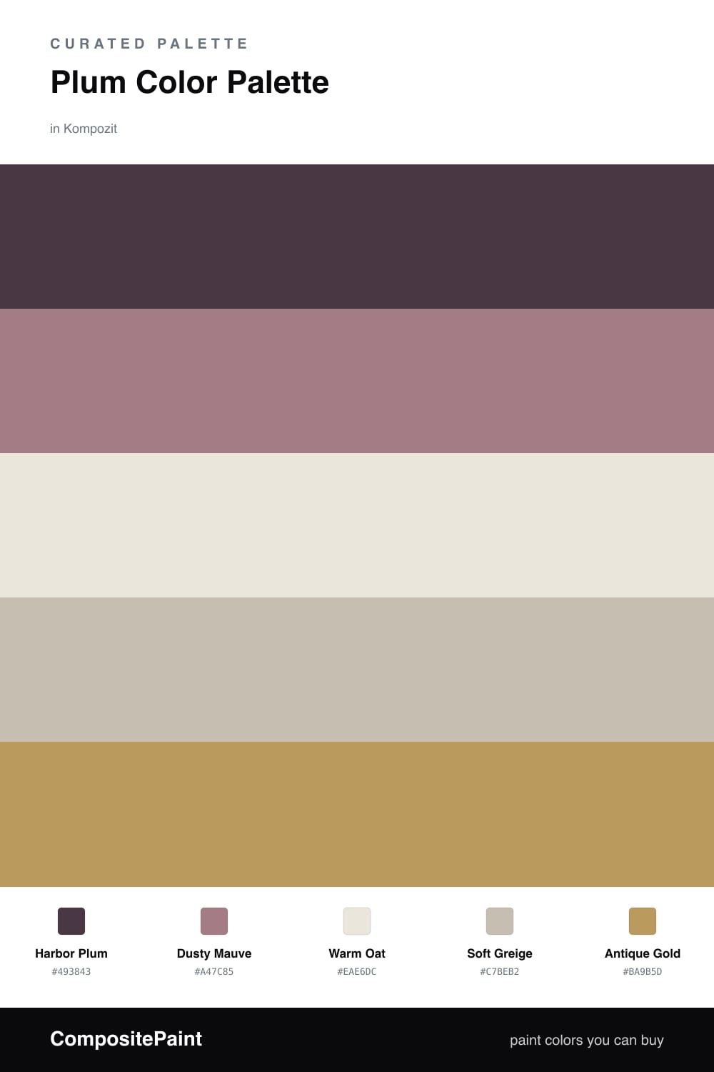
There is something quietly grown-up about plum right now. Harbor Plum has the moody pull of a dark blue but a warmer heart, so it wraps a room instead of chilling it. I love it on a feature wall where late light can deepen it into something almost wine-colored by evening.
Around it, Dusty Mauve softens the edges and keeps the plum from reading too formal, while Warm Oat and Soft Greige do the calm, steady work that lets your eye rest. These neutrals lean warm on purpose — they keep the whole scheme feeling lived-in rather than staged.
Then comes the spark. Antique Gold is the one note that makes this palette feel current for 2026, a low, brushed glow rather than anything shiny. Keep it small — a mirror frame, a reading lamp, a slim cabinet pull — and the plum will look even richer for it.
Buy These Colors
Each color matched to the closest real paint in every brand, by ΔE2000. Kompozit first; take any SKU to the store — these mix on demand.
Questions
Plum carries the depth of a navy but with a softer, warmer undertone, so it grounds a room without feeling cold. Surrounding it with mauve and warm neutrals lets the plum stay rich while the space still breathes.
Let it lead but not swallow the room — think one deep plum wall or a big upholstered piece, then carry the mauve and warm neutrals across the rest. The gold belongs in small doses, a frame or a lamp, never a whole surface.
Similar Palettes
Closest schemes by color — not by label.