CP

Plum Color Palette — Velvet Hour

A moody plum-led scheme softened by warm greige and stone, with a brushed-gold accent — every color matched to real paint you can buy.

By Jessica Williams · Color Stylist & Interior Editor

Velvet Plum
Dominant
Kompozit Purple Shadow · 1215
#493843
LRV 5
Dusty Mauve
Secondary
Kompozit Berry Bright · 1213
#A08497
LRV 26
Warm Greige
Base
Kompozit Power Lunch · 0572
#D4D1C7
LRV 64
Soft Stone
Support
Kompozit Marshy Habitat · 0204
#B8AEA2
LRV 43
Brushed Gold
Accent
Kompozit Gold Finch · 0871
#BA9B5D
LRV 35
View palette in

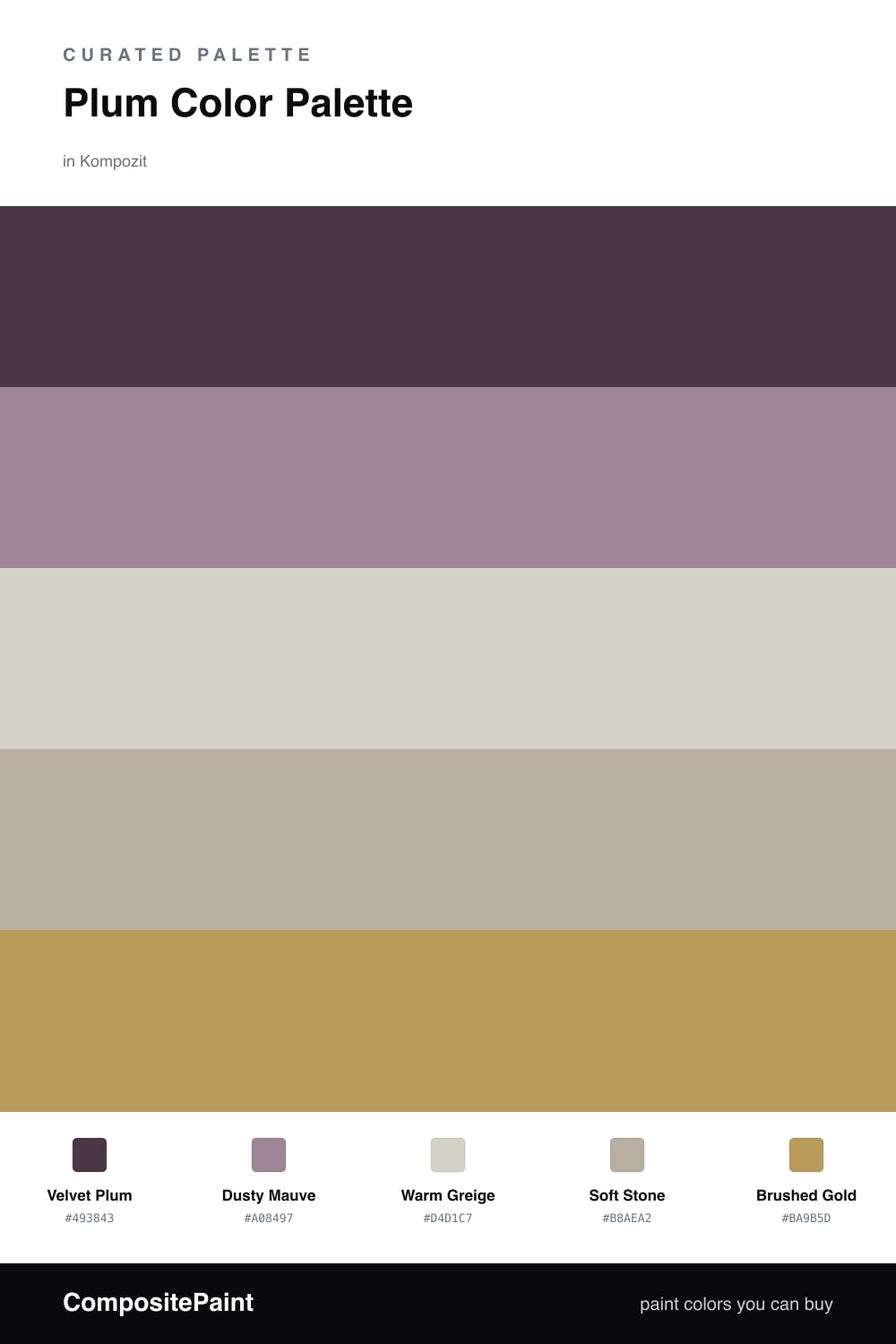
There is something quietly luxurious about plum in 2026. Velvet Plum leads this scheme as a deep, soft-cool anchor — the kind of shade that feels like dusk settling in. It reads moody on a feature wall but stays warm enough to live with every day.

Dusty Mauve carries the plum into a gentler register, so the color story flows instead of jumping. Around them, Warm Greige and Soft Stone do the calm, grounding work, keeping the whole palette easy on the eye and never too dark.

Then comes Brushed Gold, used sparingly — a lamp base, a frame, a pull. It catches the light against all that plum and gives the scheme its glow. Keep it to small doses and the room feels collected rather than gilded.

Buy These Colors

Each color matched to the closest real paint in every brand, by ΔE2000. Kompozit first; take any SKU to the store — these mix on demand.

Velvet Plum
#4A3349 · LRV 4 · Dominant
Kompozit Purple Shadow · 1215 ΔE 5.14
Backdrop Last Call · BD-LC ΔE 12.75
Behr Deep Aubergine · 100F-7 ΔE 3.76
Benjamin Moore Exotic Purple · 2071-10 ΔE 3.2
Clare Blackish · PNT100-DP-54 ΔE 17.09
Dunn-Edwards Preserve · DEA193 ΔE 4.1
Farrow & Ball Pelt · No. 254 ΔE 6.68
Magnolia Home Plum Suede · JG-102 ΔE 5.2
PPG / Glidden Napoleon · 1013-7 ΔE 13.14
Sherwin-Williams Concord Grape · SW 6559 ΔE 5.56
Valspar Virtuoso · M215 ΔE 4.1
Dusty Mauve
#9C7E91 · LRV 24 · Secondary
Kompozit Berry Bright · 1213 ΔE 2.05
Backdrop Polly Wants · BD-PW ΔE 23.09
Behr Muse · 700B-4 ΔE 2.4
Benjamin Moore Wild Orchid · 2072-40 ΔE 3.79
Clare Dirty Chai · PNT100-DP-52 ΔE 18.22
Dunn-Edwards Plumville · DE6012 ΔE 6
Farrow & Ball Brassica · No. 271 ΔE 7.23
Magnolia Home Pashmina Plum · JG-100 ΔE 9.27
PPG / Glidden Mauve Madness · 1049-5 ΔE 6.9
Sherwin-Williams Ruby Violet · SW 9076 ΔE 2.26
Valspar Pink Plumeria · P002 ΔE 3.88
Warm Greige
#D8CFC4 · LRV 63 · Base
Kompozit Power Lunch · 0572 ΔE 2.92
Backdrop Real Real · BD-RR ΔE 3.17
Behr Mineral · UL170-15 ΔE 0.94
Benjamin Moore Sea Froth · 2107-60 ΔE 1.46
Clare Flatiron · PNT100-LT-17 ΔE 0.97
Dunn-Edwards Fine Grain · DE6213 ΔE 1.38
Farrow & Ball Shaded White · No. 201 ΔE 3.2
Magnolia Home Stoneware Pieces · JG-55 ΔE 4.71
PPG / Glidden River Rock · 18-02 ΔE 1.67
Sherwin-Williams Modern Gray · SW 7632 ΔE 0.57
Valspar Rabbit's Foot · 8004-9B ΔE 1.94
Soft Stone
#B6ABA0 · LRV 42 · Support
Kompozit Marshy Habitat · 0204 ΔE 1.13
Backdrop Nuevo · BD-NU ΔE 7.8
Behr Perfect Taupe · PPU18-13 ΔE 1.02
Benjamin Moore Evening Gown · CSP-375 ΔE 0.75
Clare Money Moves · PNT100-MD-48 ΔE 9.6
Dunn-Edwards Crushed Stone · DE6067 ΔE 3.28
Farrow & Ball Hardwick White · No. 5 ΔE 3.8
Magnolia Home Drawing Room · JG-157 ΔE 3.29
PPG / Glidden Shadow Taupe · 14-01 ΔE 0.63
Sherwin-Williams Perfect Greige · SW 6073 ΔE 0.53
Valspar Ivory Brown · 6006-1C ΔE 2.93
Brushed Gold
#C2954E · LRV 34 · Accent
Kompozit Gold Finch · 0871 ΔE 4.26
Backdrop Anita · BD-AN ΔE 14.32
Behr Donegal Tweed · 310F-5 ΔE 2.87
Benjamin Moore French Horn · 195 ΔE 1.14
Clare Good as Gold · PNT100-DP-59 ΔE 4.52
Dunn-Edwards Maple Syrup · DE5362 ΔE 1.72
Farrow & Ball India Yellow · No. 66 ΔE 2.75
Magnolia Home Vintage Crown · JG-152 ΔE 8.56
PPG / Glidden Amaretto Sours · 1106-6 ΔE 1.62
Sherwin-Williams Different Gold · SW 6396 ΔE 1.44
Valspar Creole Mustard · V092-4 ΔE 2.21

Questions

Why does plum work so well with these neutrals?

Plum is a deep, slightly cool color, so the warm greige and stone keep it from feeling heavy. The neutrals read soft and grounded, which lets the plum stay rich without taking over the whole room.

How much plum should I actually use?

Let plum lead but not flood — think roughly two-thirds plum and mauve, one-third neutrals, with the gold used in small touches like hardware or a frame. That balance keeps it cozy instead of dark.

Similar Palettes

Closest schemes by color — not by label.