CP

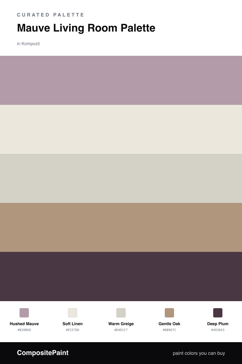
Mauve Living Room Palette — Hushed Mauve & Soft Linen

A calm five-color living room scheme led by a dusty mauve, balanced with soft linen, warm white, gentle oak, and a deep plum accent — every color matched to real paint you can buy.

By Jessica Williams · Color Stylist & Interior Editor

Hushed Mauve
Walls
Kompozit Play Time · 1220
#B39BA9
LRV 36
Soft Linen
Trim & Ceiling
Kompozit Umber Style · 0208
#ECE7DD
LRV 80
Warm Greige
Cabinets or Vanity
Kompozit Power Lunch · 0572
#D4D1C7
LRV 64
Gentle Oak
Wood & Floors
Kompozit Country Dweller · 0176
#B0967C
LRV 32
Deep Plum
Accent
Kompozit Purple Shadow · 1215
#493843
LRV 5
View palette in

Mauve is having a quiet moment, and a living room is the perfect place to use it. Hushed Mauve on the walls gives you that dusty, grown-up softness that shifts through the day, cool and gray in morning light, warm and almost rosy under evening lamps. It is the kind of color you settle into.

To keep it feeling fresh rather than fussy, I lean on calm supporting tones. Soft Linen on the trim and ceiling lifts the room and keeps it airy, while Warm Greige on built-ins or a media cabinet bridges the mauve and the wood. Gentle Oak for floors and furniture adds the natural warmth that stops mauve from drifting too cool.

Then comes the part that makes it feel current. A touch of Deep Plum in a throw pillow, an armchair, or a single painted alcove gives the scheme depth and a little drama. Keep the mauve as your main story and let the plum show up in small, deliberate doses, and the whole room reads soft, modern, and easy to live in.

Buy These Colors

Each color matched to the closest real paint in every brand, by ΔE2000. Kompozit first; take any SKU to the store — these mix on demand.

Hushed Mauve
#B39CA6 · LRV 36 · Walls
Kompozit Play Time · 1220 ΔE 1.64
Backdrop Nuevo · BD-NU ΔE 18.17
Behr Quiet Refuge · 710B-4 ΔE 1.54
Benjamin Moore Inspired · AF-595 ΔE 3.39
Clare Cosmic Vibes · PNT100-LT-32 ΔE 9.63
Dunn-Edwards Playful Plum · DE6018 ΔE 3.29
Farrow & Ball Manor House Gray · No. 265 ΔE 14.14
Magnolia Home Vintage Collection · JG-99 ΔE 8.9
PPG / Glidden Ashberry · 1179-5 ΔE 3.55
Sherwin-Williams Orchid · SW 71 ΔE 4.45
Valspar Bedroom Plum · 1004-8A ΔE 2.08
Soft Linen
#EDE6DC · LRV 80 · Trim & Ceiling
Kompozit Umber Style · 0208 ΔE 1
Backdrop Jane · BD-JA ΔE 2.8
Behr Exclusive Ivory · HDC-MD-11 ΔE 0.53
Benjamin Moore Dove Wing · 960 ΔE 2.2
Clare On Point · PNT100-LT-11 ΔE 2.03
Dunn-Edwards French White · DEW311 ΔE 1.41
Farrow & Ball Pavilion Blue · No. 252 ΔE 4.58
Magnolia Home Antique Rose · JG-23 ΔE 1.63
PPG / Glidden Pearls And Lace · 1074-1 ΔE 0.53
Sherwin-Williams Futon · SW 7101 ΔE 0.46
Valspar Cozy White · 3008-10C ΔE 0.92
Warm Greige
#D9CFC2 · LRV 63 · Cabinets or Vanity
Kompozit Power Lunch · 0572 ΔE 3.31
Backdrop Real Real · BD-RR ΔE 2.7
Behr Aged Beige · PPU7-09 ΔE 1.25
Benjamin Moore Cedar Key · 982 ΔE 1.23
Clare Flatiron · PNT100-LT-17 ΔE 1.29
Dunn-Edwards Fine Grain · DE6213 ΔE 0.8
Farrow & Ball Shaded White · No. 201 ΔE 2.73
Magnolia Home Stoneware Pieces · JG-55 ΔE 4.91
PPG / Glidden Cool Concrete · 1023-2 ΔE 1.19
Sherwin-Williams Modern Gray · SW 7632 ΔE 1.09
Valspar Gentle Shadows · 8005-5A ΔE 0.82
Gentle Oak
#B49574 · LRV 32 · Wood & Floors
Kompozit Country Dweller · 0176 ΔE 2.42
Backdrop Anita · BD-AN ΔE 6.4
Behr Burnt Almond · 280F-4 ΔE 2.31
Benjamin Moore Morrel · AF-125 ΔE 1.17
Clare Good as Gold · PNT100-DP-59 ΔE 6.56
Dunn-Edwards Colorado Trail · DE6117 ΔE 1.62
Farrow & Ball Dead Salmon · No. 28 ΔE 6.5
Magnolia Home Antiquing · JG-128 ΔE 9.56
PPG / Glidden Coffee Kiss · 1084-5 ΔE 1.05
Sherwin-Williams Soft Fawn · SW 9097 ΔE 0.87
Valspar Doe Eyes · 3002-9C ΔE 1.02
Deep Plum
#4A3340 · LRV 4 · Accent
Kompozit Purple Shadow · 1215 ΔE 2.8
Backdrop After Hours · BD-AH ΔE 19.94
Behr Wild Raisin · S-G-700 ΔE 1.21
Benjamin Moore Dark Purple · 2073-10 ΔE 1.1
Clare Blackish · PNT100-DP-54 ΔE 14.98
Dunn-Edwards Preserve · DEA193 ΔE 5.4
Farrow & Ball Pitch Black · No. 256 ΔE 13.05
Magnolia Home Plum Suede · JG-102 ΔE 4.04
PPG / Glidden Black Magic · 1001-7 ΔE 13.22
Sherwin-Williams Merlot · SW 2704 ΔE 3.66
Valspar Virtuoso · M215 ΔE 4.03

Questions

Why does mauve work so well in a living room?

Mauve is a soft mix of dusty rose and gray, so it feels warm without going pink. That quiet middle tone reads as restful in a room where you sit and unwind, and it flatters skin and lamplight in the evening.

How do I keep mauve from feeling too sweet?

Ground it. Pair the mauve walls with a warm white on the trim, lean on natural oak for floors and furniture, then add small doses of deep plum in pillows or a chair so the scheme feels grown up rather than girlish.

Similar Palettes

Closest schemes by color — not by label.