CP

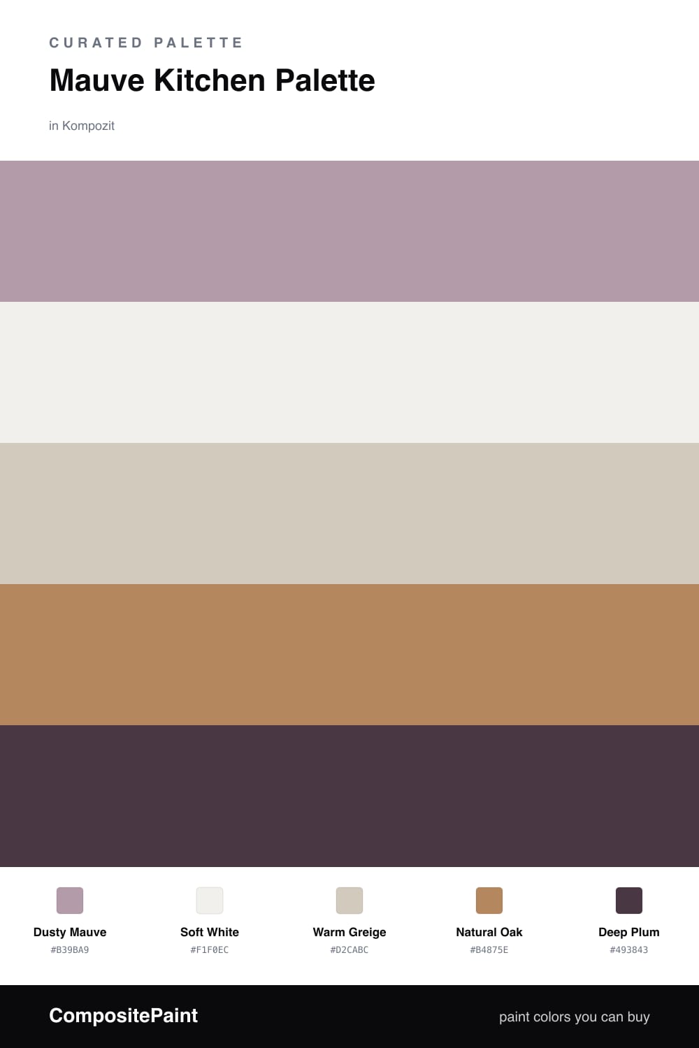
Mauve Kitchen Palette — Dusty Mauve & Warm Greige

A soft five-color kitchen scheme led by dusty mauve walls, balanced with warm greige, a clean white, oak tones, and a deep plum accent — every color matched to real paint you can buy.

By Jessica Williams · Color Stylist & Interior Editor

Dusty Mauve
Walls
Kompozit Play Time · 1220
#B39BA9
LRV 36
Soft White
Trim & Ceiling
Kompozit White Shoulders · 1265
#F1F0EC
LRV 87
Warm Greige
Cabinets
Kompozit Desert Mirage · 0231
#D2CABC
LRV 60
Natural Oak
Wood & Floors
Kompozit Safari Sun · 0248
#B4875E
LRV 28
Deep Plum
Accent
Kompozit Purple Shadow · 1215
#493843
LRV 5
View palette in

Mauve is having a quiet moment in kitchens, and it is easy to see why. Dusty Mauve on the walls feels soft and a little vintage, but it still reads modern when you keep everything around it warm and earthy.

I paired it with Warm Greige cabinets so the color has somewhere to settle, and a clean Soft White on the trim and ceiling to keep the whole room feeling fresh. Natural Oak floors and open shelving warm the mauve up and stop it from drifting too pink.

The one deeper note is Deep Plum, used in small doses on a pantry door, a island base, or hardware. It gives the scheme a little weight and makes the mauve feel intentional rather than pastel. Let the mauve and greige lead, and bring the plum in just enough to ground the room.

Buy These Colors

Each color matched to the closest real paint in every brand, by ΔE2000. Kompozit first; take any SKU to the store — these mix on demand.

Dusty Mauve
#B49BA3 · LRV 36 · Walls
Kompozit Play Time · 1220 ΔE 2.44
Backdrop Nuevo · BD-NU ΔE 18.26
Behr Quiet Refuge · 710B-4 ΔE 1.98
Benjamin Moore Inspired · AF-595 ΔE 4.3
Clare Cosmic Vibes · PNT100-LT-32 ΔE 10.29
Dunn-Edwards Playful Plum · DE6018 ΔE 2.61
Farrow & Ball Dead Salmon · No. 28 ΔE 11.73
Magnolia Home Watering Can · JG-135 ΔE 12.17
PPG / Glidden Tawny Mushroom · 1054-5 ΔE 4.53
Sherwin-Williams Orchid · SW 71 ΔE 3.43
Valspar Bedroom Plum · 1004-8A ΔE 1.63
Soft White
#F3EFE9 · LRV 87 · Trim & Ceiling
Kompozit White Shoulders · 1265 ΔE 1.54
Backdrop Tabula Rasa · BD-TR ΔE 2.82
Behr Falling Snow · PPU18-07 ΔE 2.19
Benjamin Moore Alabaster · 876 ΔE 0.81
Clare Wing It · PNT100-LT-24 ΔE 1.87
Dunn-Edwards Light Beige · DE6211 ΔE 0.94
Farrow & Ball Pointing · No. 2003 ΔE 3.45
Magnolia Home Silos White · JG-107 ΔE 1.25
PPG / Glidden Snowy Mount · 1049-1 ΔE 1.46
Sherwin-Williams Arcade White · SW 7100 ΔE 0.6
Valspar Du Jour · 7002-6 ΔE 1.01
Warm Greige
#D4C8BB · LRV 59 · Cabinets
Kompozit Desert Mirage · 0231 ΔE 2.23
Backdrop Real Real · BD-RR ΔE 3.82
Behr Sandstone Cliff · 750C-3 ΔE 2.39
Benjamin Moore Mocha Cream · 995 ΔE 0.9
Clare Flatiron · PNT100-LT-17 ΔE 1.51
Dunn-Edwards Desert Rock · DE6066 ΔE 2.84
Farrow & Ball Cornforth White · No. 228 ΔE 3.02
Magnolia Home Southern Grown · JG-104 ΔE 2.39
PPG / Glidden Moth Gray · 1024-4 ΔE 2.49
Sherwin-Williams Touch of Sand · SW 9085 ΔE 0.96
Valspar Villa Grey · 6005-1B ΔE 2.97
Natural Oak
#B08A5E · LRV 28 · Wood & Floors
Kompozit Safari Sun · 0248 ΔE 2.74
Backdrop Anita · BD-AN ΔE 10.11
Behr Almond Roca · S260-5 ΔE 1.27
Benjamin Moore Bryan Ochre · CW-390 ΔE 1.27
Clare Good as Gold · PNT100-DP-59 ΔE 7.09
Dunn-Edwards Dark Sepia · DE6138 ΔE 1.71
Farrow & Ball Mouse's Back · No. 40 ΔE 9.39
Magnolia Home Vintage Crown · JG-152 ΔE 2.08
PPG / Glidden Caramel Kiss · 1083-6 ΔE 0.88
Sherwin-Williams Peristyle Brass · SW 43 ΔE 3.87
Valspar Char Latte · M128 ΔE 2.23
Deep Plum
#4A3742 · LRV 5 · Accent
Kompozit Purple Shadow · 1215 ΔE 0.86
Backdrop After Hours · BD-AH ΔE 17.9
Behr Mahogany Spice · BNC-31 ΔE 1.35
Benjamin Moore Dark Purple · 2073-10 ΔE 1.3
Clare Blackish · PNT100-DP-54 ΔE 13.08
Dunn-Edwards Preserve · DEA193 ΔE 4.75
Farrow & Ball Paean Black · No. 294 ΔE 6.77
Magnolia Home Plum Suede · JG-102 ΔE 2.4
PPG / Glidden Napoleon · 1013-7 ΔE 10.34
Sherwin-Williams Blackberry · SW 7577 ΔE 3.92
Valspar Virtuoso · M215 ΔE 3.17

Questions

Does mauve work in a kitchen?

Yes, and it is one of the warmest ways to bring color into a kitchen without going bold. Mauve reads soft and grown-up, so it stays calm next to wood and stone all day long.

How do I keep mauve from looking too pink?

Lean on the greige and oak to ground it, and add the deep plum in small touches like a pantry door or open shelving. Those warm, earthy tones pull the mauve toward dusty rather than sweet.

Similar Palettes

Closest schemes by color — not by label.