CP

Rose Living Room Palette — Dawn Rose & Warm Greige

A soft five-color living room scheme led by dawn rose walls, balanced with greige, a crisp trim white, warm oak, and a deep plum accent — every color matched to real paint you can buy.

By Maya Patel · Reviews Editor & Product Tester

Dawn Rose
Walls
Kompozit Sauterne · 0126
#D7BBB3
LRV 53
Warm Greige
Cabinets or Vanity
Kompozit Awakening · 0560
#D5CBBE
LRV 61
Soft Chalk White
Trim & Ceiling
Kompozit Bunny Cake · 0012
#F5EFE2
LRV 87
Honey Oak
Wood & Floors
Kompozit Spiced Rum · 0240
#AD8B6A
LRV 28
Deep Plum
Accent
Kompozit Purple Shadow · 1215
#493843
LRV 5
View palette in

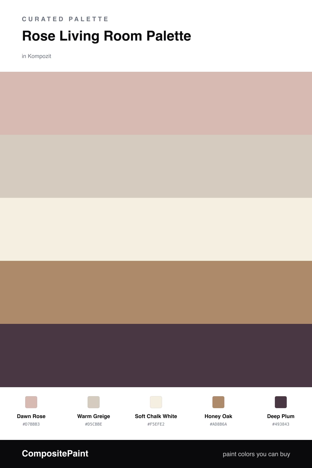
Rose is having a real moment in 2026, and the trick is to treat it like a neutral instead of a statement. This scheme puts a soft Dawn Rose on the walls — dusty, a little gray, the kind of shade that shifts with the light through the day.

Around it, Warm Greige does the quiet work on built-ins or a media cabinet, while Soft Chalk White keeps the trim and ceiling fresh without going stark. The Honey Oak floor tone is what makes the rose feel intentional, grounding all that softness with something natural and warm.

The winner here is restraint. Use Deep Plum in small doses — a velvet chair, a throw, a single accent wall — and let it add the depth the rose needs. Roughly a 70/20/10 split between rose, neutrals, and plum keeps the whole room balanced and very current.

Buy These Colors

Each color matched to the closest real paint in every brand, by ΔE2000. Kompozit first; take any SKU to the store — these mix on demand.

Dawn Rose
#D9B8B0 · LRV 52 · Walls
Kompozit Sauterne · 0126 ΔE 1.75
Backdrop Boy Meets Girl · BD-BG ΔE 3.22
Behr Sedona Pink · S190-3 ΔE 1.36
Benjamin Moore Desert Rose · 2094-50 ΔE 1.86
Clare Meet Cute · PNT100-LT-60 ΔE 4.39
Dunn-Edwards Pencil Eraser · DE6024 ΔE 5.42
Farrow & Ball Elephant's Breath · No. 229 ΔE 8.81
Magnolia Home Cinnamon Sugar · JG-133 ΔE 8.84
PPG / Glidden Rose Hip · 1055-3 ΔE 2.37
Sherwin-Williams Rose Colored · SW 6303 ΔE 3.68
Valspar Soft Pink · 1008-8B ΔE 2.83
Warm Greige
#D6CDBF · LRV 62 · Cabinets or Vanity
Kompozit Awakening · 0560 ΔE 0.9
Backdrop Real Real · BD-RR ΔE 1.92
Behr Aged Beige · PPU7-09 ΔE 0.66
Benjamin Moore Cedar Key · 982 ΔE 0.49
Clare Flatiron · PNT100-LT-17 ΔE 1.44
Dunn-Edwards Porous Stone · DE6220 ΔE 1.72
Farrow & Ball Cromarty · No. 285 ΔE 4.02
Magnolia Home Stoneware Pieces · JG-55 ΔE 4.37
PPG / Glidden In The Buff · 1019-2 ΔE 1.64
Sherwin-Williams Modern Gray · SW 7632 ΔE 1.28
Valspar Secluded Beach · V146-1 ΔE 2.42
Soft Chalk White
#F3EEE6 · LRV 86 · Trim & Ceiling
Kompozit Bunny Cake · 0012 ΔE 2.15
Backdrop Jane · BD-JA ΔE 2.02
Behr Flurries · HDC-WR14-1 ΔE 0.82
Benjamin Moore Alabaster · 876 ΔE 0.97
Clare Wing It · PNT100-LT-24 ΔE 1.8
Dunn-Edwards Light Beige · DE6211 ΔE 0.85
Farrow & Ball Pointing · No. 2003 ΔE 2.61
Magnolia Home Silos White · JG-107 ΔE 1.43
PPG / Glidden Cow's Milk · 1053-1 ΔE 0.56
Sherwin-Williams Arcade White · SW 7100 ΔE 0.48
Valspar Wooly Lamb · V156 ΔE 0.48
Honey Oak
#B08D63 · LRV 29 · Wood & Floors
Kompozit Spiced Rum · 0240 ΔE 2.8
Backdrop Anita · BD-AN ΔE 9.09
Behr Almond Roca · S260-5 ΔE 1.81
Benjamin Moore Bryan Ochre · CW-390 ΔE 2.12
Clare Good as Gold · PNT100-DP-59 ΔE 6.42
Dunn-Edwards Maple View · DE6152 ΔE 2.07
Farrow & Ball Mouse's Back · No. 40 ΔE 8.74
Magnolia Home Vintage Crown · JG-152 ΔE 2.24
PPG / Glidden Caramel Kiss · 1083-6 ΔE 1.39
Sherwin-Williams Baguette · SW 6123 ΔE 1.28
Valspar Caramel Gold · 3006-7B ΔE 1.17
Deep Plum
#4A2E3A · LRV 4 · Accent
Kompozit Purple Shadow · 1215 ΔE 4.96
Backdrop After Hours · BD-AH ΔE 21.53
Behr Chicory Root · BXC-21 ΔE 1.82
Benjamin Moore Caponata · AF-650 ΔE 5.6
Clare Blackish · PNT100-DP-54 ΔE 16.48
Dunn-Edwards Black · DEA187 ΔE 14.39
Farrow & Ball Pitch Black · No. 256 ΔE 14.29
Magnolia Home Moments · JG-150 ΔE 12.36
PPG / Glidden Black Magic · 1001-7 ΔE 14.71
Sherwin-Williams Merlot · SW 2704 ΔE 2.34
Valspar Virtuoso · M215 ΔE 6.26

Questions

Why does rose work for a whole living room?

A muted, dusty rose reads more like a warm neutral than a bright pink, so it stays calm on big wall stretches. Pairing it with greige and a clean white keeps the room feeling grown-up rather than sweet.

How do I keep the rose from feeling too pink?

Lean on the warm wood tones and the deep plum accent. A little brown and a little depth in the room pull the rose toward earthy and away from candy.

Similar Palettes

Closest schemes by color — not by label.