CP

Rose Dining Room Palette — Dusty Rose & Warm Greige

A soft five-color dining room scheme led by dusty rose, balanced with warm greige, a clean trim white, oak wood tones, and a deep plum accent — every color matched to real paint you can buy.

By Maya Patel · Reviews Editor & Product Tester

Dusty Rose
Walls
Kompozit Ruby Eye · 0071
#D0A2A0
LRV 42
Warm Greige
Cabinets or Vanity
Kompozit Pebblebrook · 0224
#D8D0BC
LRV 63
Soft Chalk White
Trim & Ceiling
Kompozit White Shoulders · 1265
#F1F0EC
LRV 87
Honey Oak
Wood & Floors
Kompozit Safari Sun · 0248
#B4875E
LRV 28
Deep Plum
Accent
Kompozit Purple Shadow · 1215
#493843
LRV 5
View palette in

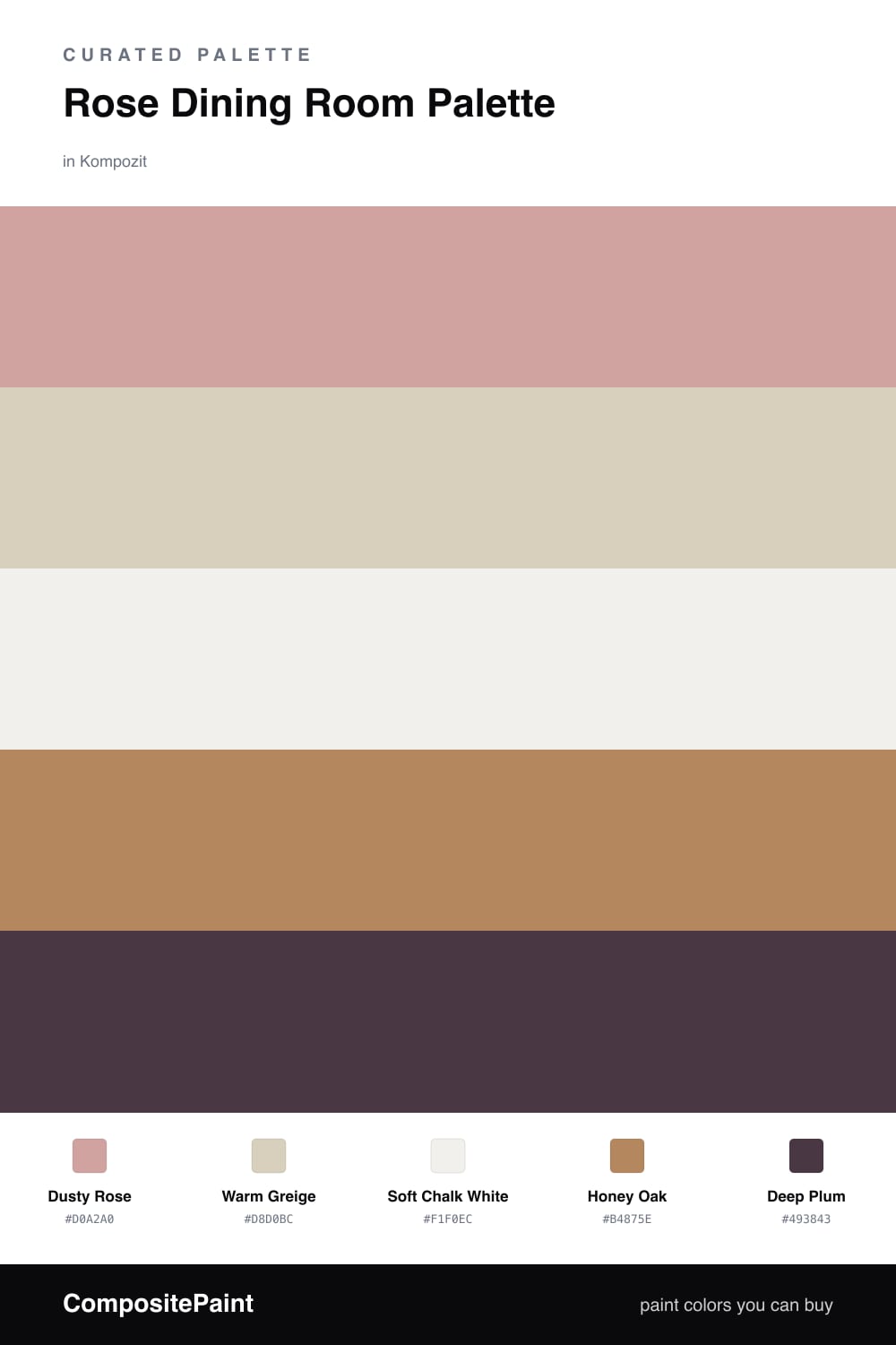
Rose is having a real moment in dining rooms right now, and for good reason. Dusty Rose on the walls gives you that soft, blushing glow that makes everyone at the table look their best, especially once the lights come down for dinner. It is the lead here, and it should cover the most surface.

To keep it from tipping sweet, I lean on Warm Greige for built-ins or a sideboard and a clean Soft Chalk White on the trim and ceiling so the rose has room to breathe. Honey Oak floors or a wood table add that natural warmth that ties the whole scheme together and stops it from feeling flat.

The move that makes this palette feel current is the Deep Plum accent. Use it sparingly — dining chairs, a single feature wall, or heavy drapery — and it turns a pretty room into a confident one. That is the trade-off worth making here: a touch of depth buys you a rose room that feels modern instead of precious.

Buy These Colors

Each color matched to the closest real paint in every brand, by ΔE2000. Kompozit first; take any SKU to the store — these mix on demand.

Dusty Rose
#D2A8A0 · LRV 44 · Walls
Kompozit Ruby Eye · 0071 ΔE 3.17
Backdrop Rosita · BD-RO ΔE 2.07
Behr Pink Ginger · PPU2-08 ΔE 2.38
Benjamin Moore Rose Bisque · 2102-50 ΔE 3.33
Clare Subrosa · PNT100-MD-76 ΔE 3.05
Dunn-Edwards Teatime Mauve · DEC700 ΔE 3.48
Farrow & Ball Cinder Rose · No. 246 ΔE 4.71
Magnolia Home Rosy Pink · JG-154 ΔE 6.47
PPG / Glidden Velveteen Crush · 1060-4 ΔE 3.67
Sherwin-Williams Pinky Beige · SW 79 ΔE 6.57
Valspar Damask Dunes · 1006-10B ΔE 3.15
Warm Greige
#D8CFC1 · LRV 63 · Cabinets or Vanity
Kompozit Pebblebrook · 0224 ΔE 2.71
Backdrop Real Real · BD-RR ΔE 1.9
Behr Aged Beige · PPU7-09 ΔE 0.5
Benjamin Moore Cedar Key · 982 ΔE 0.51
Clare Flatiron · PNT100-LT-17 ΔE 1.64
Dunn-Edwards Fine Grain · DE6213 ΔE 0
Farrow & Ball Shaded White · No. 201 ΔE 1.97
Magnolia Home Stoneware Pieces · JG-55 ΔE 4.33
PPG / Glidden Cool Concrete · 1023-2 ΔE 0.49
Sherwin-Williams Grecian Ivory · SW 7541 ΔE 1.29
Valspar Gentle Shadows · 8005-5A ΔE 0.9
Soft Chalk White
#F4EFE8 · LRV 87 · Trim & Ceiling
Kompozit White Shoulders · 1265 ΔE 2.09
Backdrop Tabula Rasa · BD-TR ΔE 2.74
Behr Nude W-f-210 · W-F-210 ΔE 2.35
Benjamin Moore Gardenia · AF-10 ΔE 1.01
Clare Wing It · PNT100-LT-24 ΔE 1.5
Dunn-Edwards Light Beige · DE6211 ΔE 0.5
Farrow & Ball Pointing · No. 2003 ΔE 3.05
Magnolia Home Silos White · JG-107 ΔE 1.51
PPG / Glidden Crumb Cookie · 18-01 ΔE 2.35
Sherwin-Williams Arcade White · SW 7100 ΔE 0.21
Valspar Crisp Cotton · 7007-4 ΔE 0.48
Honey Oak
#B08858 · LRV 28 · Wood & Floors
Kompozit Safari Sun · 0248 ΔE 3.02
Backdrop Anita · BD-AN ΔE 11.18
Behr Rice Curry · MQ4-9 ΔE 2.11
Benjamin Moore Bryan Ochre · CW-390 ΔE 0.71
Clare Good as Gold · PNT100-DP-59 ΔE 7.39
Dunn-Edwards Dark Sepia · DE6138 ΔE 2.41
Farrow & Ball Mouse's Back · No. 40 ΔE 10.23
Magnolia Home Vintage Crown · JG-152 ΔE 2.62
PPG / Glidden Allegro · 1090-6 ΔE 0.52
Sherwin-Williams Chamois · SW 6131 ΔE 1.52
Valspar Corner Café · 3003-7C ΔE 2.85
Deep Plum
#4A2F3A · LRV 4 · Accent
Kompozit Purple Shadow · 1215 ΔE 4.56
Backdrop After Hours · BD-AH ΔE 20.97
Behr Embarcadero · 140F-7 ΔE 1.12
Benjamin Moore Dark Purple · 2073-10 ΔE 2.5
Clare Blackish · PNT100-DP-54 ΔE 15.96
Dunn-Edwards Black · DEA187 ΔE 13.92
Farrow & Ball Pitch Black · No. 256 ΔE 13.81
Magnolia Home Moments · JG-150 ΔE 11.83
PPG / Glidden Black Magic · 1001-7 ΔE 14.22
Sherwin-Williams Merlot · SW 2704 ΔE 2.17
Valspar Virtuoso · M215 ΔE 6.06

Questions

Why does rose work so well in a dining room?

Rose reads warm and flattering under both daylight and candlelight, so skin tones and food both look better at the table. It is soft enough to feel calm but has enough color to feel intentional, which is exactly what you want in a room built for gathering.

How do I keep a rose dining room from feeling too sweet?

Ground it. Pull in the deep plum on a single wall, the chairs, or the drapery, and let honey oak floors or a wood table do the heavy lifting. The greige and chalk white keep everything quiet so the rose stays grown-up rather than girlish.

Similar Palettes

Closest schemes by color — not by label.