CP

Greige Color Palette — Quartz Calm

A soft five-color greige scheme led by warm gray-beige and layered with creamy off-white, pale stone, and a quiet inky accent — every color matched to real paint you can buy.

By Jessica Williams · Color Stylist & Interior Editor

Quartz Greige
Dominant
Kompozit Hearthstone · 0567
#C7BEB2
LRV 52
Mushroom Taupe
Secondary
Kompozit Sedge · 0226
#B1A591
LRV 38
Linen White
Base
Kompozit Hint of Vanilla · 0001
#EEE8DC
LRV 81
Pale Stone
Support
Kompozit Mossy Shade · 0195
#DBD2C7
LRV 65
Ink Slate
Accent
Kompozit Black Licorice · 0529
#3A3B3B
LRV 4
View palette in

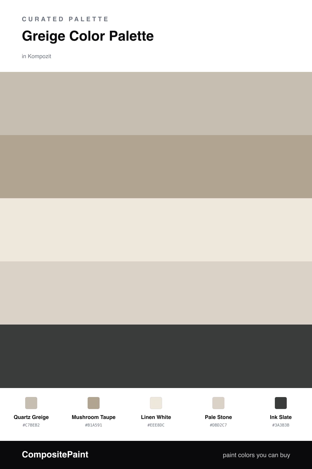
Greige is the neutral that refuses to commit, and that is exactly why designers keep reaching for it. This scheme is built around Quartz Greige, a warm gray-beige that shifts gently through the day, never cold and never overly tan. It is the kind of color you stop noticing in the best way, because it simply lets the room breathe.

Around it, Mushroom Taupe adds a half-step of depth, while Linen White and Pale Stone keep things soft and airy. These three do the quiet work, so the space feels layered rather than washed out. Think of them as the calm middle of the palette, the part you live in every day.

Then there is Ink Slate, a near-black with a cool edge that gives the whole scheme a contemporary spine. Use it sparingly — a door, a frame, a single piece of furniture — and let the greige lead. That contrast is what makes this palette feel current for 2026 rather than just safe.

Buy These Colors

Each color matched to the closest real paint in every brand, by ΔE2000. Kompozit first; take any SKU to the store — these mix on demand.

Quartz Greige
#C9C0B2 · LRV 53 · Dominant
Kompozit Hearthstone · 0567 ΔE 1.03
Backdrop Boy Meets Girl · BD-BG ΔE 12.13
Behr Washed Khaki · UL170-8 ΔE 1.31
Benjamin Moore Ashen Tan · 996 ΔE 1.01
Clare Motor City · PNT100-LT-09 ΔE 6.45
Dunn-Edwards Birchwood · DEC752 ΔE 2.37
Farrow & Ball Elephant's Breath · No. 229 ΔE 2.51
Magnolia Home Anatolian · JG-127 ΔE 3.2
PPG / Glidden Ashen · 1023-3 ΔE 0.83
Sherwin-Williams Skyline Steel · SW 1015 ΔE 1.11
Valspar Feathers of a Dove · M111 ΔE 2.07
Mushroom Taupe
#B0A492 · LRV 38 · Secondary
Kompozit Sedge · 0226 ΔE 0.88
Backdrop Carry the Two · BD-CT ΔE 2.53
Behr Garden Wall · 730D-4 ΔE 1.2
Benjamin Moore Rocky Beach · CSP-190 ΔE 0.88
Clare Mellow Mood · PNT100-DP-78 ΔE 13.27
Dunn-Edwards Hickory · DEC759 ΔE 4
Farrow & Ball Light Gray · No. 17 ΔE 1.13
Magnolia Home Quaint Cottage · JG-114 ΔE 3.05
PPG / Glidden Aldabra · 14-28 ΔE 3.13
Sherwin-Williams Ethereal Mood · SW 7639 ΔE 1.43
Valspar Ashen Gray · 6004-1C ΔE 2.55
Linen White
#EFE9DD · LRV 82 · Base
Kompozit Hint of Vanilla · 0001 ΔE 0.22
Backdrop Jane · BD-JA ΔE 2.03
Behr Ivory Palace · PPU10-14 ΔE 0.5
Benjamin Moore Stoneware · CSP-245 ΔE 1.52
Clare Like Buttah · PNT100-LT-62 ΔE 2.82
Dunn-Edwards Abstract White · DE6232 ΔE 1
Farrow & Ball James White · No. 2010 ΔE 2.57
Magnolia Home Antique Rose · JG-23 ΔE 0.5
PPG / Glidden Cream Puff · 1078-1 ΔE 0.77
Sherwin-Williams Downy · SW 7002 ΔE 0.8
Valspar Shell White · 7007-12 ΔE 0.54
Pale Stone
#D8D2C6 · LRV 65 · Support
Kompozit Mossy Shade · 0195 ΔE 1.74
Backdrop Real Real · BD-RR ΔE 2.16
Behr Mineral · UL170-15 ΔE 1.26
Benjamin Moore Alaskan Skies · 972 ΔE 1.31
Clare Beigeing · PNT100-LT-18 ΔE 2.74
Dunn-Edwards Muslin · DE6227 ΔE 1.11
Farrow & Ball Shaded White · No. 201 ΔE 2.01
Magnolia Home Stoneware Pieces · JG-55 ΔE 3.05
PPG / Glidden Gray Beige · 14-30 ΔE 1.74
Sherwin-Williams Natural Tan · SW 7567 ΔE 1.93
Valspar Warm Putty · 6006-1A ΔE 0.94
Ink Slate
#3A3A3C · LRV 4 · Accent
Kompozit Black Licorice · 0529 ΔE 1.69
Backdrop After Hours · BD-AH ΔE 5.86
Behr Limousine Leather · MQ5-5 ΔE 0.93
Benjamin Moore Wire Frame Glasses · 2132-20 ΔE 1.28
Clare Blackish · PNT100-DP-54 ΔE 5.02
Dunn-Edwards Black · DEA187 ΔE 1.35
Farrow & Ball Pitch Black · No. 256 ΔE 2.14
Magnolia Home Moments · JG-150 ΔE 5.93
PPG / Glidden Black Magic · 1001-7 ΔE 2.41
Sherwin-Williams Greenblack · SW 6994 ΔE 2.63
Valspar Black Heron · V120-3 ΔE 1.69

Questions

What makes a color greige instead of plain gray or beige?

Greige sits right between the two — it has the soft warmth of beige but the cool steadiness of gray, so it reads calm in cool light and cozy in warm light. That balance is why it works in almost any room.

How do I keep a greige room from feeling flat?

Layer your neutrals at slightly different depths and add one dark accent for contrast. Here the inky slate does that quiet heavy lifting while the creamy base keeps everything light.

Similar Palettes

Closest schemes by color — not by label.