CP

Sage Color Palette — Sage Cove

A calm five-color scheme led by soft sage and grounded with warm neutrals and a deep ink accent, every color matched to real paint you can buy.

By David Chen · Formulation Lead & Resident Chemist

Cove Sage
Dominant
Kompozit Hidden Glade · 0744
#98AD8E
LRV 39
Misty Sage
Secondary
Kompozit Favored One · 0455
#BFCABD
LRV 57
Warm Linen
Base
Kompozit Onion Skin · 0418
#EBE8DC
LRV 81
Soft Greige
Support
Kompozit Silky Green · 0358
#C7C0A9
LRV 53
Deep Ink
Accent
Kompozit Silent Sea · 0515
#2A2B2C
LRV 2
View palette in

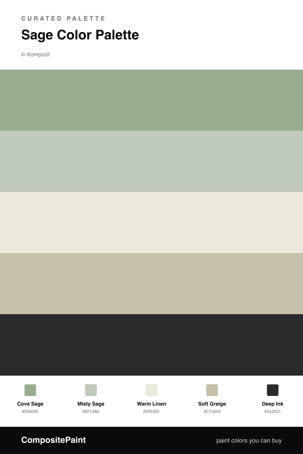
Think of sage as a green that has been softened with a little gray, the way morning fog mutes a hillside. That is what makes Cove Sage so easy to live with as the lead color. It carries the whole room without ever shouting.

To keep it from feeling one-note, I layer a lighter Misty Sage beside it and let Warm Linen open up the lighter end. The Soft Greige is the quiet connector, a neutral with just enough warmth to bridge the greens and the linen so nothing feels cold.

The spark is Deep Ink, a near-black with a green undertone. Use it sparingly in trim, a door, or one grounded piece of furniture. In 2026 palettes this kind of restrained, nature-led calm is exactly where things are heading, soft but never sleepy.

Buy These Colors

Each color matched to the closest real paint in every brand, by ΔE2000. Kompozit first; take any SKU to the store — these mix on demand.

Cove Sage
#9AA88E · LRV 37 · Dominant
Kompozit Hidden Glade · 0744 ΔE 2.87
Backdrop Le Freak · BD-LF ΔE 3.36
Behr Pesto Green · PPU11-05 ΔE 1.39
Benjamin Moore Greenwich Village · 445 ΔE 1.83
Clare OMGreen · PNT100-MD-58 ΔE 4.37
Dunn-Edwards Meadowood · DEC777 ΔE 4.3
Farrow & Ball Breakfast Room Green · No. 81 ΔE 1.75
Magnolia Home Clean Slate · JG-75 ΔE 6.27
PPG / Glidden Edamame · 1030-4 ΔE 2.84
Sherwin-Williams Coastal Plain · SW 6192 ΔE 4
Valspar Phoenix Tears · 8003-35D ΔE 5.64
Misty Sage
#C4CBB8 · LRV 58 · Secondary
Kompozit Favored One · 0455 ΔE 2.74
Backdrop Real Real · BD-RR ΔE 6.88
Behr Tanglewood · N320-3 ΔE 1.22
Benjamin Moore Wind Chime · AF-465 ΔE 1.69
Clare Dirty Martini · PNT100-MD-47 ΔE 1.5
Dunn-Edwards Opaline · DEC783 ΔE 4.17
Farrow & Ball Teresa's Green · No. 236 ΔE 3.81
Magnolia Home Gatherings · JG-18 ΔE 5.24
PPG / Glidden Whispering Pine · 1125-3 ΔE 2.17
Sherwin-Williams Acanthus · SW 29 ΔE 3.53
Valspar Mint Frost · 6001-3B ΔE 3.6
Warm Linen
#EDE7D9 · LRV 80 · Base
Kompozit Onion Skin · 0418 ΔE 1.46
Backdrop Don't Eat the Yellow Snow · BD-DS ΔE 3.69
Behr Exclusive Ivory · HDC-MD-11 ΔE 1.93
Benjamin Moore White Down · 970 ΔE 0.8
Clare Like Buttah · PNT100-LT-62 ΔE 2.37
Dunn-Edwards Ball of String · DE6190 ΔE 0.96
Farrow & Ball James White · No. 2010 ΔE 1.81
Magnolia Home Antique Rose · JG-23 ΔE 0.49
PPG / Glidden Edelweiss · 14-23 ΔE 0.46
Sherwin-Williams Futon · SW 7101 ΔE 1.57
Valspar Dover White · 7007-1 ΔE 0.5
Soft Greige
#CABFAC · LRV 53 · Support
Kompozit Silky Green · 0358 ΔE 2.92
Backdrop Boy Meets Girl · BD-BG ΔE 12.51
Behr Bungalow Beige · HDC-AC-10 ΔE 0.99
Benjamin Moore Ashen Tan · 996 ΔE 1.72
Clare Greige · PNT100-LT-13 ΔE 6.16
Dunn-Edwards Birchwood · DEC752 ΔE 1.7
Farrow & Ball Drop Cloth · No. 283 ΔE 0.26
Magnolia Home Solid Wood · JG-109 ΔE 1.86
PPG / Glidden Hideaway · 14-26 ΔE 2.22
Sherwin-Williams Sandbar · SW 7547 ΔE 0.77
Valspar Snake Charmer · 8004-23B ΔE 2.02
Deep Ink
#2C322E · LRV 3 · Accent
Kompozit Silent Sea · 0515 ΔE 5.34
Backdrop After Hours · BD-AH ΔE 5.3
Behr Black Suede · S-H-790 ΔE 2.19
Benjamin Moore Black · 2132-10 ΔE 5.51
Clare Blackish · PNT100-DP-54 ΔE 8.78
Dunn-Edwards Black · DEA187 ΔE 6.45
Farrow & Ball Pitch Black · No. 256 ΔE 6.5
Magnolia Home Blackboard · JG-05 ΔE 7.46
PPG / Glidden Black Magic · 1001-7 ΔE 7.59
Sherwin-Williams Tricorn Black · SW 6258 ΔE 5.53
Valspar Tomcat · 8006-12G ΔE 4.99

Questions

Why does sage feel so calming in a room?

Sage is a muted green with a touch of gray, so it reads soft instead of bright. That low saturation is what your eye finds restful, and pairing it with warm neutrals keeps the whole space gentle.

How do I keep a sage scheme from looking flat?

Add contrast in small doses. Here the deep ink accent does the heavy lifting in trim or a single piece, while the linen base adds light, so the sage has room to breathe.

Similar Palettes

Closest schemes by color — not by label.