PROFESSIONAL-GRADE PAINT
ONE COAT COVERAGE
MADE FOR REAL RESULTS
CompositePaint

Warm Neutral Living Room Palette — Greige Walls & Soft Taupe

A cozy, grounded 4-color living room scheme built on warm greige, creamy trim, and a deep espresso anchor that feels relaxed and timeless. Every color matched to real paint you can buy.

By Jessica Williams · Color Stylist & Interior Editor

Soft Greige
Walls
Kompozit Moth Wing · 0183
#CCBCA9
LRV 52
Creamy Trim
Trim
Kompozit Queen Anne's Lace · 0558
#F0ECE2
LRV 84
Warm Taupe
Built-Ins
Kompozit Country Dweller · 0176
#B0967C
LRV 32
Espresso
Accent
Kompozit Black Licorice · 0529
#3A3B3B
LRV 4
View palette in

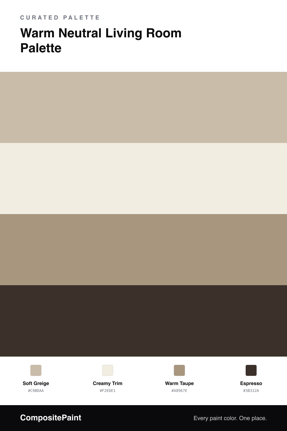
This palette wraps a living room in quiet, lived-in warmth. Start with the soft greige on your main walls. It has just enough brown in it to feel cozy in the evening but stays light enough to keep the room bright during the day. Bring the creamy trim onto baseboards, window casings, and crown molding so the edges of the room glow softly instead of going stark white. The warm taupe is your middle tone. Use it on built-in shelving, a console, or an accent wall to give the eye somewhere to rest between the pale walls and the deepest color. Finally, save the espresso for small touches. A fireplace surround, dark frames, or a single piece of furniture in this shade grounds everything and makes the lighter tones feel intentional. Together these four colors read as calm, warm, and easy to live with for years.

Buy These Colors

Each color matched to the closest real paint in every brand, by ΔE2000. Kompozit first; take any SKU to the store — these mix on demand.

Soft Greige
#C9BDAA · LRV 52 · Walls
Kompozit Moth Wing · 0183 ΔE 1.93
Backdrop Boy Meets Girl · BD-BG ΔE 12.08
Behr Creamy Mushroom · PPU5-13 ΔE 2.46
Benjamin Moore Brick House Tan · CW-145 ΔE 0.87
Clare Greige · PNT100-LT-13 ΔE 5.92
Dunn-Edwards Birchwood · DEC752 ΔE 1.28
Farrow & Ball Drop Cloth · No. 283 ΔE 0.54
Magnolia Home Solid Wood · JG-109 ΔE 1.67
PPG / Glidden Stonington · 15-25 ΔE 0.87
Sherwin-Williams Shiitake · SW 9173 ΔE 0.87
Valspar Hopsack · 3003-10B ΔE 3.2
Creamy Trim
#F2EDE1 · LRV 85 · Trim
Kompozit Queen Anne's Lace · 0558 ΔE 0.89
Backdrop Jane · BD-JA ΔE 1.48
Behr Almond Cream · W-B-710 ΔE 1.96
Benjamin Moore Arbor White · ES-01 ΔE 0.86
Clare Wing It · PNT100-LT-24 ΔE 3.31
Dunn-Edwards Bone China · DEW339 ΔE 1.2
Farrow & Ball White Tie · No. 2002 ΔE 2.86
Magnolia Home Silos White · JG-107 ΔE 2.33
PPG / Glidden Candlelit Beige · 1207-1 ΔE 0.75
Sherwin-Williams Westhighland White · SW 7566 ΔE 0.5
Valspar Cream Delight · 7002-14 ΔE 0.44
Warm Taupe
#A8967E · LRV 32 · Built-Ins
Kompozit Country Dweller · 0176 ΔE 3.32
Backdrop Anita · BD-AN ΔE 2.35
Behr Golden Olive · MQ2-24 ΔE 0.81
Benjamin Moore Beige Gray · ES-51 ΔE 1.97
Clare Extra Virgin · PNT100-MD-64 ΔE 12.75
Dunn-Edwards Wooden Peg · DE6215 ΔE 1.54
Farrow & Ball Charleston Gray · No. 243 ΔE 5.77
Magnolia Home Antiquing · JG-128 ΔE 4.75
PPG / Glidden Sauteed Mushroom · 1085-5 ΔE 2.51
Sherwin-Williams Colonial Revival Stone · SW 2827 ΔE 0.75
Valspar Wild Mushroom · 3007-9C ΔE 1.04
Espresso
#3B312A · LRV 3 · Accent
Kompozit Black Licorice · 0529 ΔE 7.62
Backdrop After Hours · BD-AH ΔE 10.41
Behr Bitter Chocolate · 790B-7 ΔE 3.78
Benjamin Moore Wenge · AF-180 ΔE 4.78
Clare Blackish · PNT100-DP-54 ΔE 8.75
Dunn-Edwards Black · DEA187 ΔE 6.59
Farrow & Ball Pitch Black · No. 256 ΔE 5.75
Magnolia Home Moments · JG-150 ΔE 2.43
PPG / Glidden Black Magic · 1001-7 ΔE 7.53
Sherwin-Williams Black Bean · SW 6006 ΔE 3.52
Valspar Fired Earth · 6011-1 ΔE 3.16

Questions

Will greige walls look too dark in a small living room?

No. Soft greige stays light and reflective, so it keeps a small room feeling open while adding more warmth and depth than a flat white. Pair it with the creamy trim to bounce light around.

Where should the espresso accent go?

Use the espresso on the smallest surfaces only, like a fireplace surround, a single shelf, or picture frames. A little of the darkest color anchors the room without making it feel heavy.

Similar Palettes

Closest schemes by color — not by label.