CP

Greige Powder Room Palette — Soft Greige & Espresso Walnut

A calm five-color powder room scheme led by soft greige, layered with a warm backdrop, crisp white trim, walnut wood, and a deep espresso accent — every color matched to real paint you can buy.

By Jessica Williams · Color Stylist & Interior Editor

Soft Greige
Walls
Kompozit Moth Wing · 0183
#CCBCA9
LRV 52
Linen Warm White
Trim & Ceiling
Kompozit Queen Anne's Lace · 0558
#F0ECE2
LRV 84
Mushroom Taupe
Cabinets or Vanity
Kompozit Village Crier · 0190
#AD9986
LRV 33
Walnut Brown
Wood & Floors
Kompozit Coffee Shop · 0151
#725042
LRV 10
Espresso Bronze
Accent
Kompozit Black Licorice · 0529
#3A3B3B
LRV 4
View palette in

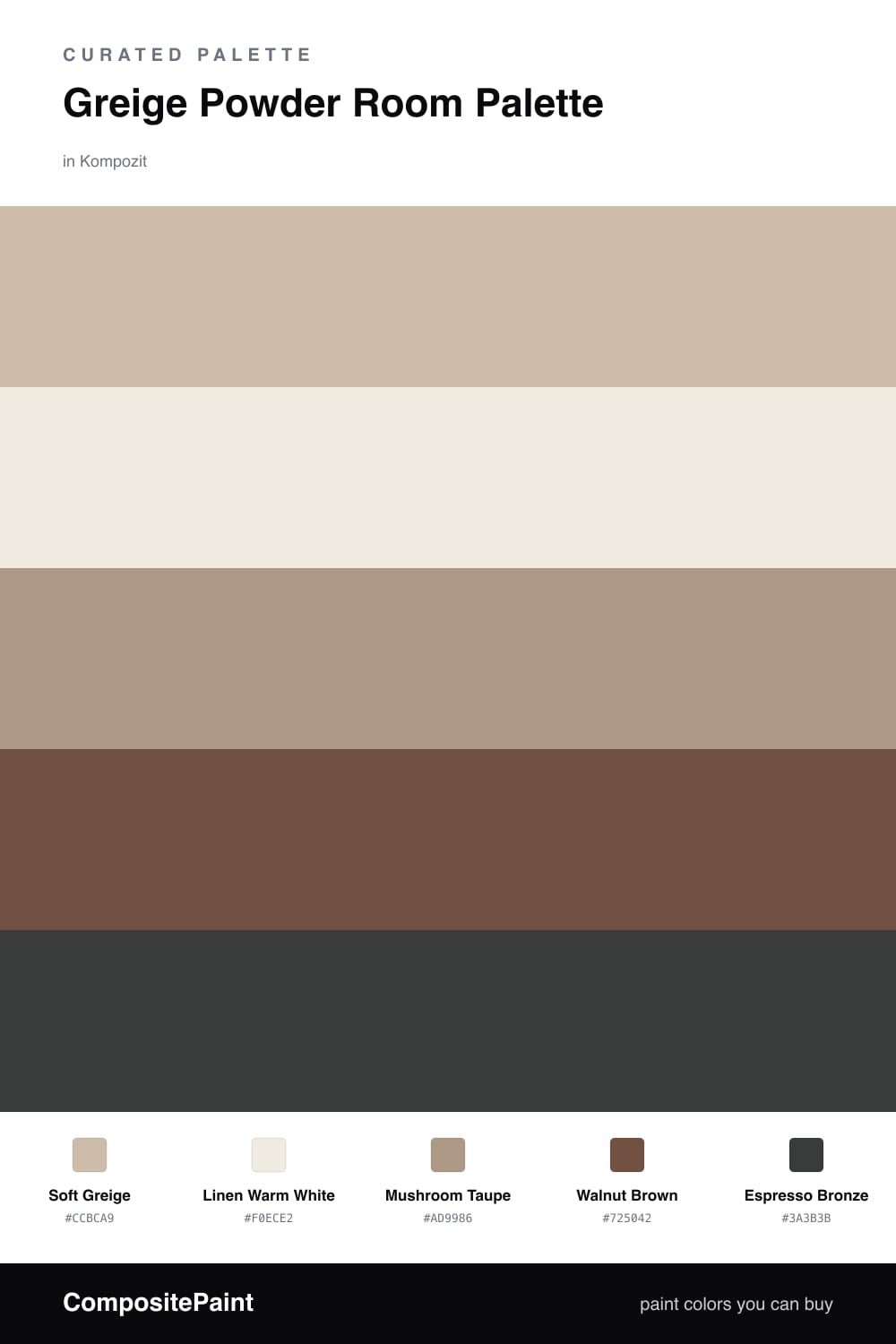
A powder room is small, so it can carry a little more warmth than you might risk in a big space. This scheme leans on a Soft Greige for the walls — that gray-meets-beige tone that feels current without trying too hard. It wraps the room like a cashmere throw and looks different all day as the light shifts.

Linen Warm White keeps the trim and ceiling fresh, while Mushroom Taupe on the vanity stays in the same family but a shade deeper, so the cabinet grounds the walls instead of competing with them. Together they read as one soft, considered envelope.

Then come the moments of depth. Walnut Brown on a wood floating shelf or floor brings real warmth underfoot, and Espresso Bronze is your accent — perfect for the faucet, the mirror frame, or a small painted detail. Use it sparingly and let the greige do the quiet, contemporary work.

Buy These Colors

Each color matched to the closest real paint in every brand, by ΔE2000. Kompozit first; take any SKU to the store — these mix on demand.

Soft Greige
#C9BDA9 · LRV 52 · Walls
Kompozit Moth Wing · 0183 ΔE 2.15
Backdrop Boy Meets Girl · BD-BG ΔE 12.37
Behr Bungalow Beige · HDC-AC-10 ΔE 0.97
Benjamin Moore Brick House Tan · CW-145 ΔE 0.49
Clare Greige · PNT100-LT-13 ΔE 6.32
Dunn-Edwards Birchwood · DEC752 ΔE 1.59
Farrow & Ball Drop Cloth · No. 283 ΔE 0.55
Magnolia Home Solid Wood · JG-109 ΔE 2
PPG / Glidden Stonington · 15-25 ΔE 1.27
Sherwin-Williams Shiitake · SW 9173 ΔE 1.27
Valspar Hopsack · 3003-10B ΔE 3.38
Linen Warm White
#F2EDE2 · LRV 85 · Trim & Ceiling
Kompozit Queen Anne's Lace · 0558 ΔE 0.6
Backdrop Jane · BD-JA ΔE 1.42
Behr Bleached Linen · PPU5-09 ΔE 1.58
Benjamin Moore Arbor White · ES-01 ΔE 1.3
Clare Wing It · PNT100-LT-24 ΔE 2.92
Dunn-Edwards Bone China · DEW339 ΔE 1.62
Farrow & Ball White Tie · No. 2002 ΔE 3.21
Magnolia Home Silos White · JG-107 ΔE 2.01
PPG / Glidden Accolade · 1208-1 ΔE 1.2
Sherwin-Williams Westhighland White · SW 7566 ΔE 0.21
Valspar Cream Delight · 7002-14 ΔE 0
Mushroom Taupe
#A89A86 · LRV 33 · Cabinets or Vanity
Kompozit Village Crier · 0190 ΔE 3.12
Backdrop Anita · BD-AN ΔE 1.65
Behr Chic Taupe · N230-4 ΔE 2.47
Benjamin Moore Downtown · CSP-165 ΔE 2.37
Clare Extra Virgin · PNT100-MD-64 ΔE 12.07
Dunn-Edwards Wooden Peg · DE6215 ΔE 0.81
Farrow & Ball Lichen · No. 19 ΔE 7.76
Magnolia Home Antiquing · JG-128 ΔE 2.87
PPG / Glidden Diversion · 1021-4 ΔE 1.6
Sherwin-Williams Threshold Taupe · SW 7501 ΔE 3.2
Valspar Land of Nod · T589 ΔE 1.55
Walnut Brown
#6B5440 · LRV 10 · Wood & Floors
Kompozit Coffee Shop · 0151 ΔE 6.21
Backdrop Buenos Aires · BD-BA ΔE 4.96
Behr Ancient Root · PPU4-20 ΔE 1.8
Benjamin Moore Brown Tar · 2110-20 ΔE 1.38
Clare Vintage · PNT100-DP-67 ΔE 13.61
Dunn-Edwards Wild Mustang · DEA161 ΔE 3.16
Farrow & Ball Salon Drab · No. 290 ΔE 6.71
Magnolia Home Mosswood · JG-168 ΔE 7.68
PPG / Glidden Chocolate Truffle · 15-13 ΔE 2.04
Sherwin-Williams Umber · SW 6146 ΔE 1.68
Valspar Chocolate Diamonds · V133-6 ΔE 2.04
Espresso Bronze
#3A322A · LRV 3 · Accent
Kompozit Black Licorice · 0529 ΔE 7
Backdrop After Hours · BD-AH ΔE 9.2
Behr Bitter Chocolate · 790B-7 ΔE 3.75
Benjamin Moore Onyx · 2133-10 ΔE 5.77
Clare Blackish · PNT100-DP-54 ΔE 8.2
Dunn-Edwards Black · DEA187 ΔE 6.18
Farrow & Ball Pitch Black · No. 256 ΔE 5.33
Magnolia Home Moments · JG-150 ΔE 3.13
PPG / Glidden Black Magic · 1001-7 ΔE 7.14
Sherwin-Williams Black Bean · SW 6006 ΔE 4.94
Valspar Fired Earth · 6011-1 ΔE 2.35

Questions

Why does greige work so well in a small powder room?

Greige reads as both warm and quiet, so it makes a tight space feel restful instead of boxed in. It also flatters skin in mirror light, which matters most in the one room everyone studies their reflection.

How do I keep the scheme from feeling flat?

Lean on contrast in the small details — warm walnut on the vanity and espresso bronze on the hardware and frames give the soft greige walls something deep to push against.

Similar Palettes

Closest schemes by color — not by label.