CP

Brown Living Room Palette — Toasted Walnut & Bronze Olive

A warm five-color living room scheme led by toasted walnut brown, balanced with a soft greige backdrop, crisp white trim, oak floors, and a deep bronze accent — every color matched to real paint you can buy.

By Maya Patel · Reviews Editor & Product Tester

Toasted Walnut
Walls
Kompozit Black Heath · 0235
#675A49
LRV 11
Soft Greige
Cabinets or Vanity
Kompozit Awakening · 0560
#D5CBBE
LRV 61
Gallery White
Trim & Ceiling
Kompozit Bunny Cake · 0012
#F5EFE2
LRV 87
Honey Oak
Wood & Floors
Kompozit Apple Crisp · 0247
#BB8E5E
LRV 31
Bronze Olive
Accent
Kompozit Film Noir · 0144
#473933
LRV 5
View palette in

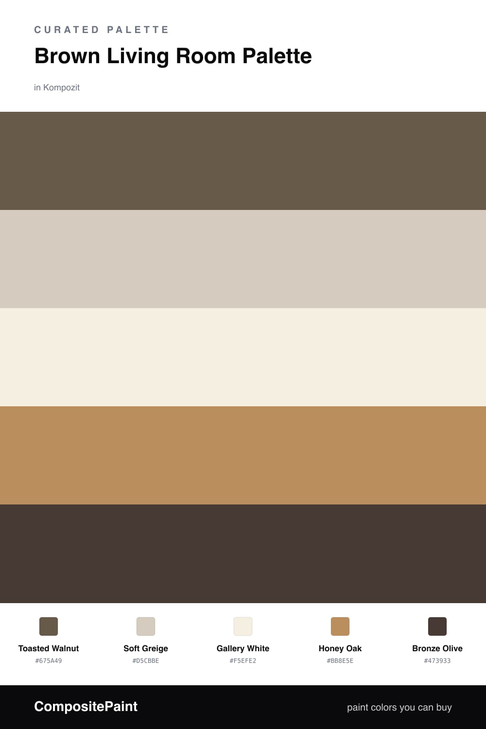
Brown is having a real moment in 2026, and the living room is where it earns its keep. This scheme leads with Toasted Walnut, a warm mid-brown that feels grounded without going cave-dark. It is the kind of brown that reads cozy in daylight and rich at night.

To keep it breathing, Soft Greige softens any built-ins or a feature wall, and Gallery White on the trim and ceiling gives your eye somewhere to rest. Honey Oak ties the floors and wood tones into the same warm family, so nothing fights.

The move that makes it modern is Bronze Olive, a deep earthy near-black used sparingly on an accent chair, a console, or open shelving. Keep the walnut as your dominant tone, let the neutrals do the quiet work, and save the bronze for the moments you want to land.

Buy These Colors

Each color matched to the closest real paint in every brand, by ΔE2000. Kompozit first; take any SKU to the store — these mix on demand.

Toasted Walnut
#6B5644 · LRV 10 · Walls
Kompozit Black Heath · 0235 ΔE 4.13
Backdrop Buenos Aires · BD-BA ΔE 5.02
Behr Cacao · UL160-22 ΔE 1.4
Benjamin Moore Brown Tar · 2110-20 ΔE 2.14
Clare Vintage · PNT100-DP-67 ΔE 13.61
Dunn-Edwards Wild Mustang · DEA161 ΔE 2.23
Farrow & Ball Salon Drab · No. 290 ΔE 5.73
Magnolia Home Mosswood · JG-168 ΔE 6.67
PPG / Glidden Chocolate Truffle · 15-13 ΔE 1.77
Sherwin-Williams Umber · SW 6146 ΔE 2.71
Valspar Sumatra Blend · 2008-9A ΔE 1.33
Soft Greige
#D7CDBE · LRV 62 · Cabinets or Vanity
Kompozit Awakening · 0560 ΔE 1
Backdrop Real Real · BD-RR ΔE 2
Behr Aged Beige · PPU7-09 ΔE 1
Benjamin Moore Cedar Key · 982 ΔE 0.53
Clare Flatiron · PNT100-LT-17 ΔE 1.74
Dunn-Edwards Porous Stone · DE6220 ΔE 2.01
Farrow & Ball Cromarty · No. 285 ΔE 4.4
Magnolia Home Stoneware Pieces · JG-55 ΔE 4.8
PPG / Glidden Crushed Silk · 1024-3 ΔE 1.21
Sherwin-Williams Grecian Ivory · SW 7541 ΔE 1.21
Valspar Gentle Shadows · 8005-5A ΔE 0.72
Gallery White
#F4EFE6 · LRV 87 · Trim & Ceiling
Kompozit Bunny Cake · 0012 ΔE 1.68
Backdrop Tabula Rasa · BD-TR ΔE 2.01
Behr Nude W-f-210 · W-F-210 ΔE 1.69
Benjamin Moore Alabaster · 876 ΔE 1.13
Clare Wing It · PNT100-LT-24 ΔE 2.07
Dunn-Edwards Antique Paper · DE6218 ΔE 0.59
Farrow & Ball Pointing · No. 2003 ΔE 2.12
Magnolia Home Silos White · JG-107 ΔE 1.5
PPG / Glidden Crumb Cookie · 18-01 ΔE 1.69
Sherwin-Williams White Flour · SW 7102 ΔE 0.46
Valspar Crisp Cotton · 7007-4 ΔE 0.47
Honey Oak
#B68C5A · LRV 29 · Wood & Floors
Kompozit Apple Crisp · 0247 ΔE 1.53
Backdrop Anita · BD-AN ΔE 11.26
Behr Almond Roca · S260-5 ΔE 0.65
Benjamin Moore Maple Syrup · 1105 ΔE 1.6
Clare Good as Gold · PNT100-DP-59 ΔE 6.15
Dunn-Edwards Ghost Town · DE5327 ΔE 1.79
Farrow & Ball Red Earth · No. 64 ΔE 14.99
Magnolia Home Vintage Crown · JG-152 ΔE 3.82
PPG / Glidden Tan Your Hide · 1091-6 ΔE 2.38
Sherwin-Williams Tatami Tan · SW 6116 ΔE 3.58
Valspar Sand Mountain · 8003-21E ΔE 2.31
Bronze Olive
#3E3A2C · LRV 4 · Accent
Kompozit Film Noir · 0144 ΔE 8.88
Backdrop After Hours · BD-AH ΔE 7.25
Behr Havana Coffee · N210-7 ΔE 3.82
Benjamin Moore Waller Green · CW-510 ΔE 5.35
Clare Blackish · PNT100-DP-54 ΔE 7.85
Dunn-Edwards Black · DEA187 ΔE 7.87
Farrow & Ball Pitch Black · No. 256 ΔE 7.26
Magnolia Home Moments · JG-150 ΔE 7.5
PPG / Glidden Black Magic · 1001-7 ΔE 8.13
Sherwin-Williams Jasper · SW 6216 ΔE 7.37
Valspar Aged Pine · 6011-5 ΔE 6.92

Questions

Is brown too dark for a living room?

Not the way it is used here. The walls stay warm and mid-toned rather than chocolate, and the white trim plus oak floors keep the room feeling open instead of heavy.

How do I keep a brown room from feeling flat?

Lean on contrast in finish and tone. Pair the matte walnut walls with the soft greige and honey oak, then let the deep bronze olive show up in small doses like a chair or shelving.

Similar Palettes

Closest schemes by color — not by label.