CP

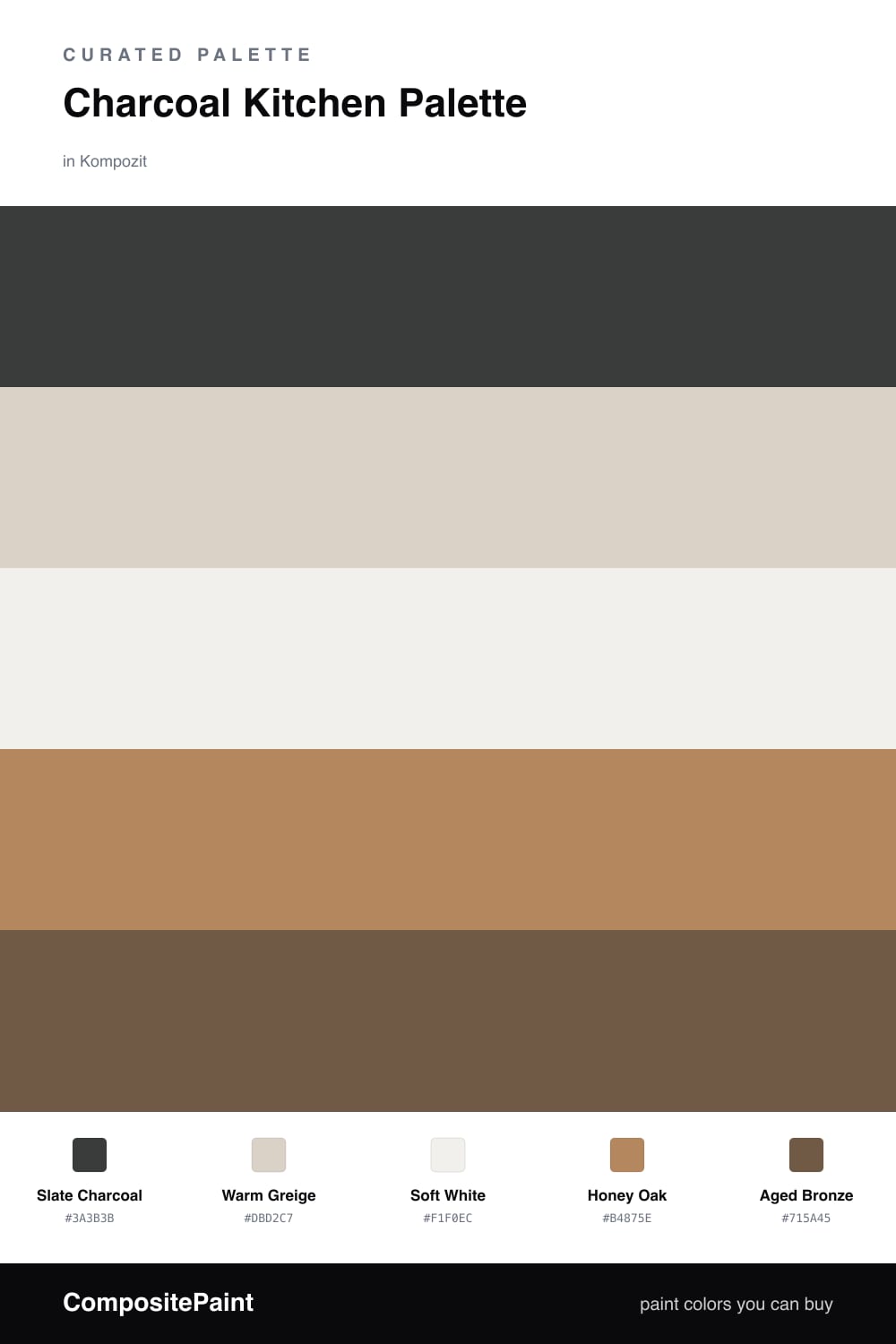
Charcoal Kitchen Palette — Slate Charcoal & Warm Greige

A moody five-color kitchen scheme led by deep charcoal cabinets, softened with warm greige walls, crisp white trim, oak wood tones, and a bronze accent — every color matched to real paint you can buy.

By Emily Roberts · DIY Editor & First-Timer's Guide

Slate Charcoal
Cabinets
Kompozit Black Licorice · 0529
#3A3B3B
LRV 4
Warm Greige
Walls
Kompozit Mossy Shade · 0195
#DBD2C7
LRV 65
Soft White
Trim & Ceiling
Kompozit White Shoulders · 1265
#F1F0EC
LRV 87
Honey Oak
Wood & Floors
Kompozit Safari Sun · 0248
#B4875E
LRV 28
Aged Bronze
Accent
Kompozit Alpha Male · 0193
#715A45
LRV 11
View palette in

Charcoal is having a real moment in kitchens right now, and honestly it is easier to live with than you might think. The trick is letting Slate Charcoal carry the lower cabinets and island while everything above stays light and open.

Warm Greige on the walls keeps things soft and current, and Soft White on the trim and ceiling gives your eye a place to rest. That balance is what stops a dark kitchen from feeling like a cave — the light colors do the quiet work up high.

For warmth, lean on Honey Oak floors and a few Aged Bronze touches in your hardware and pendant lights. Those wood and metal tones are what make the charcoal feel intentional and warm rather than cold, and they are exactly where 2026 kitchens are headed.

Buy These Colors

Each color matched to the closest real paint in every brand, by ΔE2000. Kompozit first; take any SKU to the store — these mix on demand.

Slate Charcoal
#383B3E · LRV 4 · Cabinets
Kompozit Black Licorice · 0529 ΔE 2.03
Backdrop After Hours · BD-AH ΔE 5.42
Behr Limousine Leather · MQ5-5 ΔE 2
Benjamin Moore Black Ink · 2127-20 ΔE 0.33
Clare Blackish · PNT100-DP-54 ΔE 5.48
Dunn-Edwards Black · DEA187 ΔE 2.75
Farrow & Ball Pitch Black · No. 256 ΔE 3.57
Magnolia Home Moments · JG-150 ΔE 7.73
PPG / Glidden Black Magic · 1001-7 ΔE 3.3
Sherwin-Williams Greenblack · SW 6994 ΔE 2.08
Valspar Black Heron · V120-3 ΔE 1.34
Warm Greige
#D8D1C5 · LRV 64 · Walls
Kompozit Mossy Shade · 0195 ΔE 1.3
Backdrop Real Real · BD-RR ΔE 2.23
Behr Mineral · UL170-15 ΔE 0.95
Benjamin Moore Bruton White · CW-710 ΔE 1.48
Clare Beigeing · PNT100-LT-18 ΔE 2.73
Dunn-Edwards Fine Grain · DE6213 ΔE 1.14
Farrow & Ball Shaded White · No. 201 ΔE 2.15
Magnolia Home Stoneware Pieces · JG-55 ΔE 3.54
PPG / Glidden Gray Beige · 14-30 ΔE 1.26
Sherwin-Williams Natural Tan · SW 7567 ΔE 1.59
Valspar Warm Putty · 6006-1A ΔE 0.59
Soft White
#F3EFE7 · LRV 87 · Trim & Ceiling
Kompozit White Shoulders · 1265 ΔE 2.07
Backdrop Tabula Rasa · BD-TR ΔE 1.96
Behr Nude W-f-210 · W-F-210 ΔE 1.54
Benjamin Moore Alabaster · 876 ΔE 0.57
Clare Wing It · PNT100-LT-24 ΔE 2.22
Dunn-Edwards Latte Froth · DE6239 ΔE 0.53
Farrow & Ball Pointing · No. 2003 ΔE 2.54
Magnolia Home Silos White · JG-107 ΔE 0.97
PPG / Glidden Crumb Cookie · 18-01 ΔE 1.54
Sherwin-Williams Arcade White · SW 7100 ΔE 0.82
Valspar Crisp Cotton · 7007-4 ΔE 0.5
Honey Oak
#B08A5A · LRV 28 · Wood & Floors
Kompozit Safari Sun · 0248 ΔE 3.56
Backdrop Anita · BD-AN ΔE 10.74
Behr Almond Roca · S260-5 ΔE 1.03
Benjamin Moore Bryan Ochre · CW-390 ΔE 0.6
Clare Good as Gold · PNT100-DP-59 ΔE 6.72
Dunn-Edwards Dark Sepia · DE6138 ΔE 2.66
Farrow & Ball Mouse's Back · No. 40 ΔE 9.99
Magnolia Home Vintage Crown · JG-152 ΔE 2.55
PPG / Glidden It Works · 1092-6 ΔE 0.34
Sherwin-Williams Peristyle Brass · SW 43 ΔE 3.23
Valspar Caramel Gold · 3006-7B ΔE 1.89
Aged Bronze
#6E5638 · LRV 10 · Accent
Kompozit Alpha Male · 0193 ΔE 3.76
Backdrop Buenos Aires · BD-BA ΔE 5.31
Behr Ancient Root · PPU4-20 ΔE 3.51
Benjamin Moore Brown Tar · 2110-20 ΔE 4.52
Clare Vintage · PNT100-DP-67 ΔE 16.97
Dunn-Edwards Log Cabin · DEA162 ΔE 4.03
Farrow & Ball Salon Drab · No. 290 ΔE 7.52
Magnolia Home Mosswood · JG-168 ΔE 8.75
PPG / Glidden Molasses · 1079-7 ΔE 3.82
Sherwin-Williams Umber · SW 6146 ΔE 2.85
Valspar Leather & Lace · V088-6 ΔE 2.42

Questions

Will charcoal cabinets make my kitchen feel dark?

Not if you keep the walls light. The warm greige walls and soft white trim bounce plenty of daylight around, so the charcoal reads cozy and grounded instead of gloomy — think of it as the anchor, not the whole room.

What countertop works with this palette?

A warm white or light marble-look quartz is your friend here. It keeps the charcoal from feeling heavy and ties back to the soft white trim, while the oak floors and bronze hardware add the warmth that makes the whole kitchen feel inviting.

Similar Palettes

Closest schemes by color — not by label.