Greige
Clare's literally named greige, reviewed honestly: the extra depth the chip hides, the rooms where it actually anchors a palette, and when a lighter greige is the better call.

Jessica has spec'd whites and neutrals for more than 300 rooms and keeps a sample wall of painted drawdowns in her studio. Every color review is checked against real reader rooms in the comments and re-tested when a formula changes. About the testing process →
- 1Dorian Gray39
- 2Pashmina44
- 3Greige49
- 4Agreeable Gray60
- 5Pale Oak69
The Fast Verdict
Greige is Clare doing what the name says: gray and beige in the same breath, warm enough that it never reads sterile, gray enough that it never goes sandy-tan.
The catch is depth. At LRV 49 it sits a full step below the whole-house greiges people screenshot — Agreeable Gray, Revere Pewter, Edgecomb Gray — so four walls of it feel like a color, not a backdrop. If you wanted that quieter mid-tone on purpose, it is one of the cleaner greiges in a small deck. If you wanted airy, you sampled the wrong chip.
Living rooms and bedrooms with real daylight · kitchens with oak, brass, and warm stone · open floors that can take a mid greige · anyone who found Agreeable Gray too light
You wanted a light whole-house greige · the room is dim and north-facing with no lamps · trim stays a cool bright white · your counters or floors are cool gray
- Honest gray-beige mix — warm without going tan, gray without going cold
- Deeper than the famous greiges, so sunny rooms still have presence
- Clare's greiges are edited not to flash pink or lavender
- Easy partner for oak, walnut, brass, and cream whites
- Named clearly, so it actually does the palette-anchor job
- Darker than most people mean when they say greige
- Goes muddy-taupe in dim north rooms with no lamps
- Looks dirty next to cool bright whites
- Fights cool gray quartz, LVP, and chrome-heavy baths
What Color Is Greige, Really?
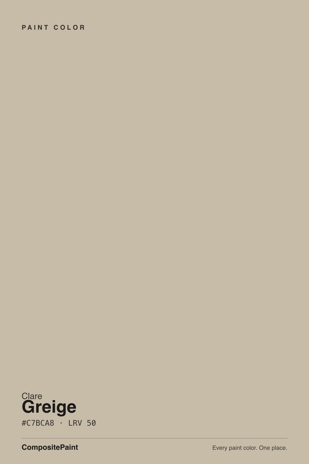
A medium greige named so bluntly it is almost a joke — and that is the point. Clare built a short deck and needed one color to sit in the exact middle of gray and beige, the shade the rest of the neutrals hang off. The warm side keeps it from going cold the way a straight gray will on a big wall. The gray in it keeps it from reading builder-tan. Clare's greiges as a group are edited not to flash pink the way some famous Sherwin greiges do in north light, and Greige is the mid-depth proof of that edit: taupe-beige, not violet, not green.
At LRV 49 it has real wall presence. Put it next to Sherwin-Williams Agreeable Gray (LRV 60) or Benjamin Moore Edgecomb Gray (LRV 63) and Greige suddenly looks like the grown-up in the photo — same family, more meat. Revere Pewter (LRV 56) is the closest famous cousin, and even that is a notch lighter. Plan for the painted room to read a step deeper and a touch browner than the peel-and-stick. That depth is useful in a south living room and a problem in a small, lamp-free hallway.
Undertone in one line: warm beige-taupe, grayed down — never green, never lavender. If your sample looks pink, that is usually a cool neighbor (gray quartz, cool-white trim, blue daylight bounce), not a hidden red in the can. If it looks muddy-gray, the room is too dim for this LRV.
Where It Shines
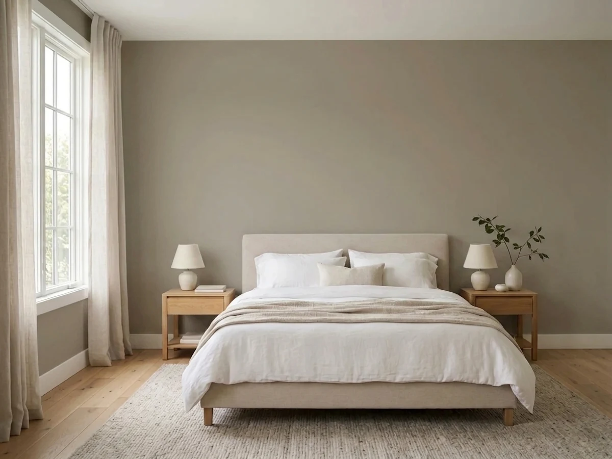
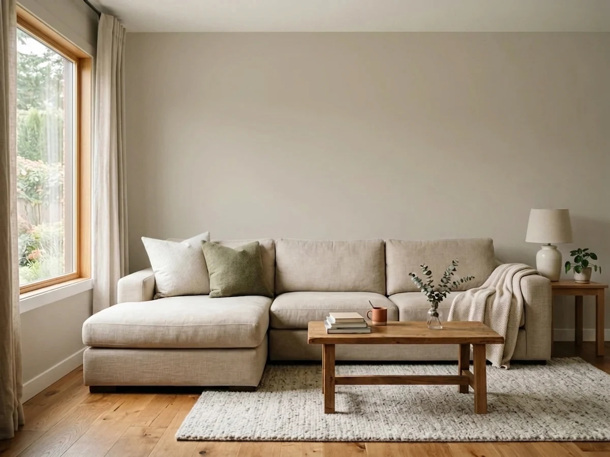
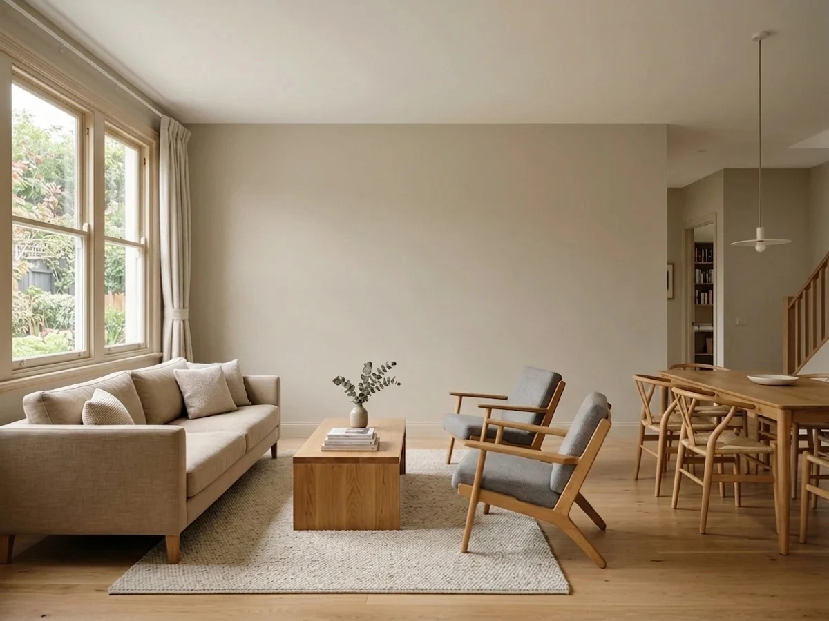
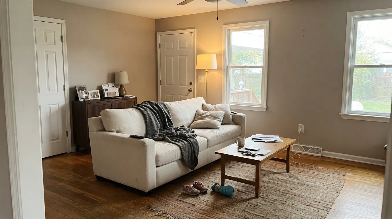
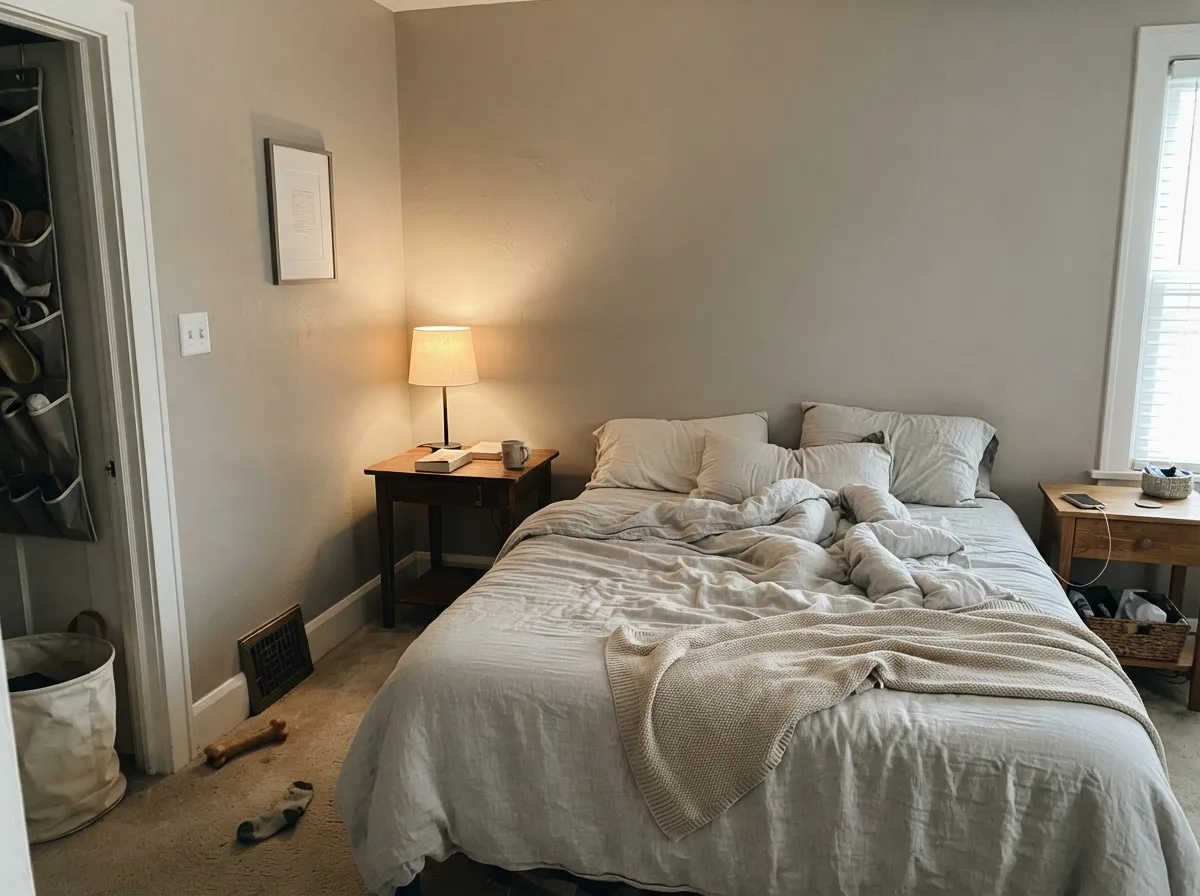
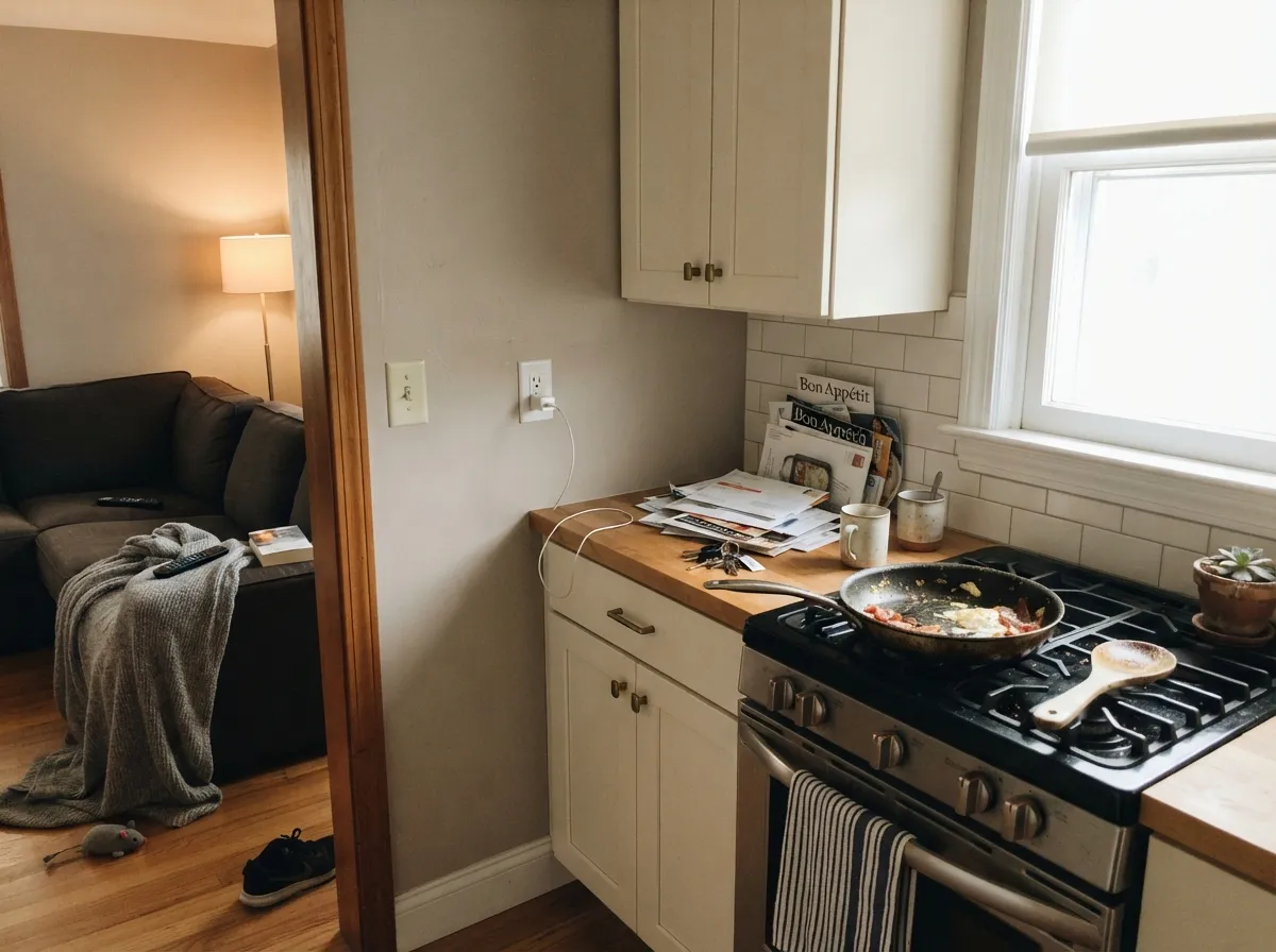
Give it daylight, warm wood, and a cream or soft-white trim and Greige does the job its name promised: the wall recedes, the furniture looks chosen, and nobody can quite say whether the room is gray or beige. Living rooms and bedrooms are its natural home. Kitchens work when the stone and metal are warm. It is also the right pick when you already tried a light greige and it washed out — this one holds.
Where It Fails
Almost every miss with Greige is a depth or temperature mismatch, and all three are visible on the sample wall before you buy a gallon. None of them are the formula's fault — but if your room matches one, a lighter greige will make you happier than another coat of this.
Most people shopping this name have Agreeable Gray (LRV 60) or Edgecomb Gray (LRV 63) in their camera roll. Greige is not that. On four walls it reads as a true mid-tone — cozy in a bright living room, heavy in a small room with one window. If airy was the goal, step up in LRV, not down in sheen.
Clare Snow Day and Fresh Kicks are bright, cool, and honest — and they make Greige look dingy-beige by comparison, the same dirty-wall trick every mid greige plays next to a gallery white. The fix is a warm white: White Dove, Alabaster, or Clare Whipped if you stay in-family. Same color family on trim (Penthouse) is even safer.
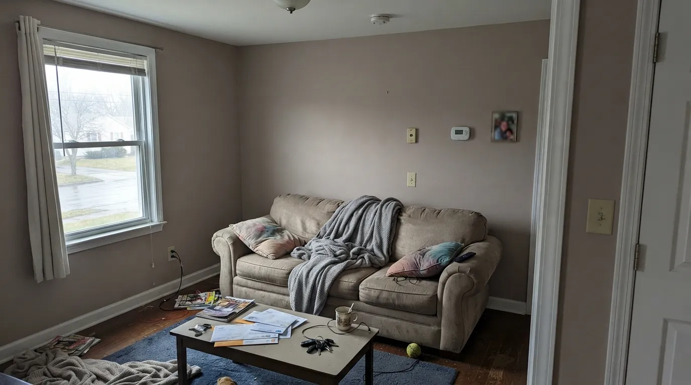
Warm greiges are the usual north-room advice, and at this depth the advice runs out. Cool gray daylight strips the beige and leaves a flat, slightly dirty taupe. Warm 2700K bulbs recover it after dark; they will not save a lamp-free north den at noon. In that room, Edgecomb Gray or a cream is the kinder test.
Room by Room
South or west light, oak or walnut, a cream sofa: this is the photo Clare is selling. Eggshell on the walls, a warm white on trim. The mid LRV keeps the big wall from going bland the way a 60-LRV greige can in a sunny room.
Soft at night under 2700K bulbs, calm in morning light. Matte or eggshell. Pair with White Dove or Whipped trim and linen, not cool gray bedding, or the taupe in it will come forward.
Oak, brass, cream quartz, butcher block — all of it sits well against Greige. Cool gray counters and stainless-only kitchens push it beige. Satin on cabinets if you go there; most people are happier leaving Greige on the walls and putting Alabaster on the boxes.
Open floors are why people buy a named greige, and Greige will run room to room without clashing with itself. The depth is the tax: windowless halls and stair landings will read a full step darker. Light the hallway or accept a moodier connector.
Warm tile, wood vanity, brass: fine. Carrara, gray porcelain, chrome: it argues and looks pink-beige. Sample over the actual vanity before you commit a small wet room to a mid greige.
Clare is an interior paint, and at LRV 49 a greige on siding reads dirty from the street unless the light is strong and the trim is darker, not whiter. A shaded front door on a cream house is the only exterior use worth sampling. Do not bet the facade on it.
Your Light Is the Risk
The beige and the gray stay in the same sentence. Warm, clean, not sandy. This is the light that makes the name true.
Cool gray daylight drains the beige and leaves a flat, slightly dirty taupe. Lamps help at night; they do not fix noon.
Warmer and more beige at the sun hours, quieter gray-beige once the direct light is gone. The swing is moderate, not a new color.
2700K bulbs pull the beige forward and it goes cozy. Cool white LEDs gray it out and can make it look tired — swap the bulbs before you repaint.
Most complaints about Greige are a light mismatch. Upload a photo of your actual room and see it on your walls — then ask for the same wall in north light or evening lamps before you buy a single sample.
Need It From Another Brand?
Any paint counter can custom-tint Clare PNT100-LT-13 directly. If you would rather stay in one brand's own deck, these are the closest stock matches, measured as ΔE2000. Under 2 is a difference you will not see on the wall.
| Brand | Closest color | ΔE | LRV | |
|---|---|---|---|---|
| Sherwin-Williams | Queen Anne LilacSW 21 · Sherwin-Williams | 2.2 | 48 | Color page → |
| Behr | Warm AshQE-57 · Behr | 2.1 | 48 | Color page → |
| Benjamin Moore | Hazelwood1005 · Benjamin Moore | 1.9 | 49 | Color page → |
| Valspar | Seagull Beach1002-10B · Valspar | 2.1 | 48.4 | Color page → |
| PPG / Glidden | LuxuriousPPG18-04 · PPG / Glidden | 2.1 | 49 | Color page → |
| Glidden | Silver Clamshell30YY 49/071 · Glidden | 2.8 | 49 | Color page → |
Similar Clare Colors
The nearest shades to Greige within Clare's own range, ranked by perceptual color distance — useful when you want the same look a touch lighter, darker, or warmer.
WCAG 2.1: AA is 4.5 : 1 for normal text, 3 : 1 for large text, AAA is 7 : 1.
Greige vs the Colors You're Also Considering
Every Greige sample board has the same rivals on it. The numbers show the real lightness gap — then it comes down to which risk you would rather live with.
Pick this when Agreeable Gray washed out on your walls and you still want gray-beige, not a new family.
Sherwin-Williams SW 7029 · LRV 60Agreeable GrayPick this if you want the lighter whole-house greige everyone already knows — just know cool light is its weak spot too.
Pick this for a slightly deeper, more taupe Clare version of the same idea, ordered as a peel-and-stick first.
Benjamin Moore HC-172 · LRV 56Revere PewterPick this if you want the famous BM greige a step lighter, with more painter coverage behind it.
Greige (PNT100-LT-13) sits at nearly the same lightness, LRV 49, but its hex leans more taupe and gray-mauve than golden. If Clare's Greige looks too tan on your walls, this cooler greige is the safer swap while keeping the same depth.
Motor City (PNT100-LT-09) at LRV 54 is a near-true gray with almost no warmth and slightly more reflectance. Choose it when you want a cooler, more modern neutral and Clare's Greige feels too beige for the room.
All The Sage (PNT100-LT-70) at LRV 60 is lighter and pulls clearly green. It reads as a soft sage-neutral rather than a warm greige, so it fits garden-facing or airy spaces, while Clare's Greige is the better pick when you want brown-based warmth and a slightly grounded, mid-tone feel.
Greige Coordinating Colors
Stay on the warm side of the fence. Greige wants cream whites, walnut and oak, muted sage, and one dark navy or charcoal — and it argues with icy whites, cool gray stone, and anything lavender-gray. These are the partners that keep it looking like greige instead of leftover beige:
Clare's Greige Ladder
Clare does not have a Color of the Year, and Greige is not a viral paint. It is the on-the-nose middle of a short DTC deck: the color you pick when you want gray-beige without shopping three brands. Bob Vila has listed it among greiges worth considering, which is about as famous as this SKU gets — and that is fine. The useful context is the ladder inside Clare, not a trend cycle.
Penthouse (LRV 79) is the light greige-white that borrows its mood from whatever sits next to it — use it on trim or a ceiling when you want less contrast than White Dove. Greige (LRV 49) is the wall. Dirty Chai (LRV 23) is the mushroom taupe a full two steps down, darker than its own marketing, and it belongs on an island or a powder room, not on four sunny walls. Stay on that ladder and the undertones agree. Jump to Snow Day or Fresh Kicks for trim and the ladder breaks.
Greige With Wood Tones and Floors
Warm wood is the easy pairing. White oak, walnut, and even slightly orange builder oak all meet Greige halfway because the beige in the wall takes the yellow out of the floor instead of amplifying it. Brass, unlacquered or not, belongs here. Honey-gold floors that already look orange under a cool gray will calm down against this color.
The floors that need a large sample first are cool gray LVP, gray-washed oak, and any blue-gray tile. Gray floors pull the warmth forward and Greige can read as leftover beige — or faintly pink if the floor has a blue cast. A large rug between the floor and the wall fixes most living rooms; it will not fix a kitchen where the LVP runs to the toe-kick. Test a peel-and-stick at the baseboard, not at eye level on a white foam board.
Three Ready Palettes Built on Greige
A color is never alone on the wall. These are complete combinations in the 60-30-10 pattern, with the reason each one holds together. Every one opens in the visualizer.
White Dove is warm enough that Greige stays gray-beige instead of dirty. The navy door is the one dark note an otherwise quiet main floor needs. Stay off cooler, brighter trim whites or the walls will look unwashed.
Try this palette in your roomAlabaster on the boxes keeps the kitchen light while Greige holds the walls. Dirty Chai on the island is the same Clare taupe family, two steps down — tonal, not a second idea. Works with oak and brass; skip it next to cool gray quartz.
Try this palette in your roomWhipped is Clare's warm white, so the temperature handshake with Greige is clean even at a big LRV gap. Evergreen Fog adds one muted green that reads restful next to a taupe greige, not decorated. Warm bulbs at night keep the beige from dropping out.
Try this palette in your roomGreige FAQ
Is Clare Greige warm or cool?
Warm — a beige-taupe greige, grayed enough that it does not go sandy. In south light it reads as the name on the can. In cold north light it drops toward taupe-gray. It is not a cool gray and it is not a cream.
Is it lighter or darker than Agreeable Gray?
Darker. Greige sits at LRV 49; Agreeable Gray is LRV 60. That is a clearly visible step on a wall. If you loved Agreeable Gray in photos and found it too pale in person, this is the direction to sample. If you wanted that airy look, do not use Greige as a substitute.
What trim white goes with Greige?
A warm one: White Dove, Alabaster, or Clare Whipped. Clare Penthouse (a light greige) is the lowest-risk in-family trim. Avoid Snow Day and Fresh Kicks — both are bright and cool, and they make Greige look dirty.
Will it work in a north-facing room?
Only with lamps, and only if you have sampled it on that wall for a few days. Warm greiges are the usual north-room advice, but at LRV 49 the beige can drain and leave muddy taupe. If the room stays dim at noon, Edgecomb Gray or a cream will be kinder.
Can I use it whole-house?
On an open, daylit main floor, yes — that is the job it was named for. Skip the windowless hall, the basement, and any north room you refuse to lamp. Whole-house greige only works when every connector still has some light.
How is it different from Clare Dirty Chai?
Same taupe-leaning family, different job. Greige at LRV 49 is a wall color. Dirty Chai at LRV 23 is a mushroom taupe that reads like furniture — islands, powder rooms, a den. Do not swap them. If Greige already feels heavy on your sample, Dirty Chai will feel like dusk.
Have you painted with Greige?
Rate it — one tap helps the next reader decide.
Ask a Question