Charcoal Color Palette — Sage Field at Dusk
A moody five-color scheme led by deep charcoal, softened with sage, warm greige, and pale linen, then lifted by a quiet brass accent — every color matched to real paint you can buy.
By Jessica Williams · Color Stylist & Interior Editor
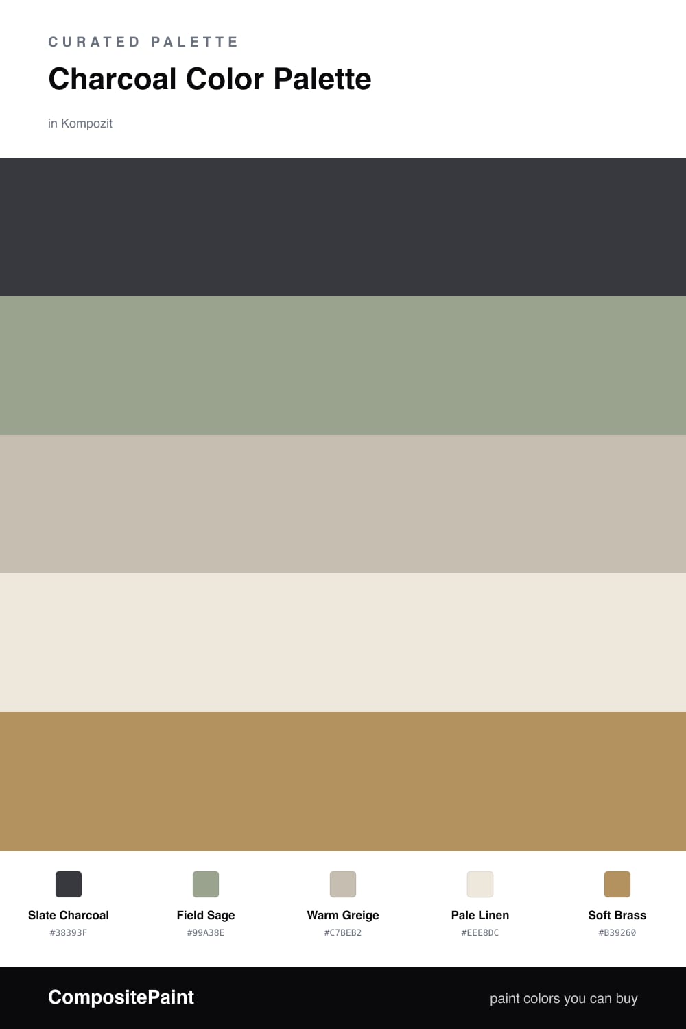
There is a hush to charcoal that I keep coming back to. This scheme leans into a deep, slightly warm Slate Charcoal and lets it do the heavy lifting, the way a slate sky makes a green field look greener after rain.
Against it, Field Sage brings a soft, dusty calm, while Warm Greige and Pale Linen open the room up and keep the charcoal from closing in. The neutrals are quiet on purpose, they give your eye somewhere to rest.
The spark is Soft Brass, used sparingly. A little warm metal against all that cool depth feels current and grown-up for 2026, more lived-in than shiny. Keep the charcoal everywhere your hand lands, and let the brass be the last thing you notice.
Buy These Colors
Each color matched to the closest real paint in every brand, by ΔE2000. Kompozit first; take any SKU to the store — these mix on demand.
Questions
Charcoal reads almost like a soft black but stays warm, so it grounds a room without feeling heavy. Pairing it with sage and warm neutrals keeps the depth while letting light move around it.
Let it carry the biggest planes, think roughly two-thirds of the space, then bring in sage and the greige neutrals around it and save the brass for small moments like hardware or a frame.
Similar Palettes
Closest schemes by color — not by label.