Navy Color Palette — Willow Bend
A calm four-color scheme led by deep navy, softened with willow green and warm neutrals — every color matched to real paint you can buy.
By Jessica Williams · Color Stylist & Interior Editor
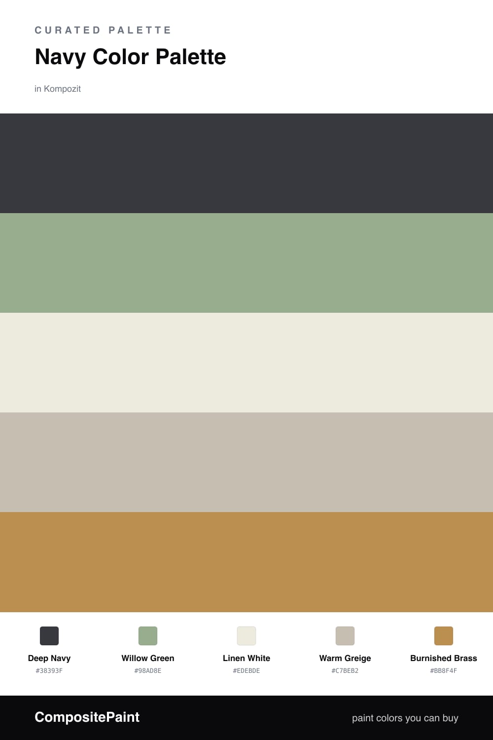
Navy has a way of settling a space the moment it lands on a wall. In this scheme Deep Navy does the heavy lifting, soft and inky rather than sharp, the kind of blue that looks expensive in low evening light and steady in the morning.
Against it, Willow Green brings something alive and a little dusty, like sage that has been outside a while. Linen White and Warm Greige keep the whole thing breathing, so the navy never tips into gloom. They are the colors you almost do not notice, which is exactly their job.
The spark is Burnished Brass, used sparingly. A little warm metal against all that cool blue is what makes this feel current for 2026 — composed, lived-in, and quietly confident rather than loud.
Buy These Colors
Each color matched to the closest real paint in every brand, by ΔE2000. Kompozit first; take any SKU to the store — these mix on demand.
Questions
Navy is deep enough to feel grounding without going fully black, so it carries a room the way a dark neutral would while still reading as color. The softer greens and creams around it keep it from feeling heavy.
Let navy dominate, roughly two-thirds of the space, with willow green as the quiet companion and the brass accent in small doses — think hardware, a frame, or a single chair.
Similar Palettes
Closest schemes by color — not by label.