Birchwood
The sandy Classics greige, reviewed honestly: the rooms where it reads like warm wood, the north light that turns it dingy, and why the wall is darker than the chip.

Jessica has spec'd whites and neutrals for more than 300 rooms and keeps a sample wall of painted drawdowns in her studio. Every color review is checked against real reader rooms in the comments and re-tested when a formula changes. About the testing process →
- 1Dorian Gray39
- 2Pashmina44
- 3Birchwood49
- 4Agreeable Gray60
- 5Pale Oak69
The Fast Verdict
Birchwood is a grayed sandy beige with real body — tan first, gray second — sitting in Dunn-Edwards' Classics collection among the Gray & Greiges. It is not the pale greige the name and the chip suggest. At LRV 49 it has the same depth as Mindful Gray, which is the whole plot: in south or west daylight it looks like warm wood on a wall; in a dim north room the sand drops out and you are left with a flat, slightly dirty taupe. Buy it for ranch living rooms, oak, leather, and kitchens that already have wood. Do not buy it hoping for airy beige.
Living rooms and bedrooms with real daylight · ranch and transitional rooms with oak · kitchens that already have wood · anyone who wants a sandy greige with actual body
You wanted a light beige · the room faces north and stays dim · you actually wanted gray · your floors and counters are cool gray
- Sandy mid-tone that makes oak, leather, and brass look chosen
- Grayed enough to stay greige, tan enough to never go cold in good light
- LRV 49 hides scuffs better than the pale greiges people actually wanted
- Lives in the Classics / Gray & Greiges family — a volume color, not a launch
- Kind to honey oak in a way cool greiges are not
- Reads a full step darker on the wall than it does on the chip
- Goes dingy taupe in dim north light — the sand just leaves
- Not a true gray; afternoon sun names the beige
- Looks yellow-dirty against cool gray floors and quartz
What Color Is Birchwood, Really?
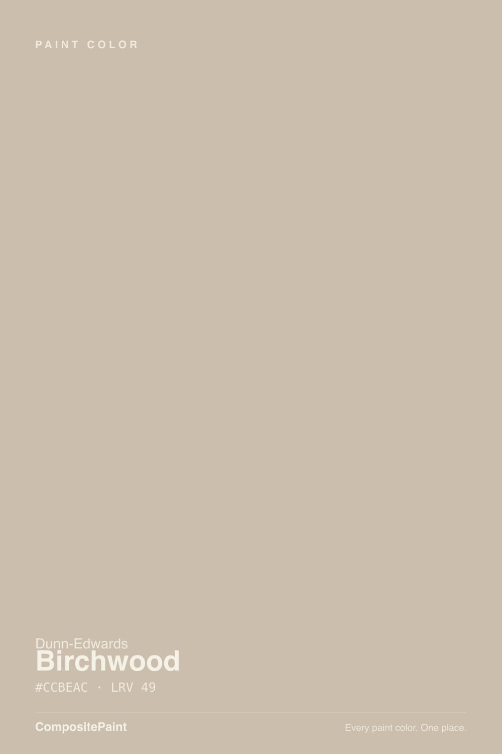
A grayed sandy beige — not a pale greige, not a clay, not a true gray. Dunn-Edwards files DEC752 in the Classics collection and in the Gray & Greiges family, which is the honest filing: the gray is there to mute the tan, not to win. Chroma is low (Munsell 0.16Y at 1.5), so the color has almost no loud pigment in it; what little there is leans yellow-red, the same family as dry sand and raw birch rather than adobe. That is why it reads as wood-adjacent instead of stucco-adjacent, and it is why it sits next to white oak and leather without a fight. It has never been a launch color. It does not need to be — it is a volume Classics chip, not a trend.
The number that matters is LRV 49, and it is the number the chip lies about. Porous Stone, the West's sandy whole-house greige, sits at LRV 57. Accessible Beige is 58. Agreeable Gray is 60. Birchwood is eight to eleven points deeper, in the same band as Mindful Gray (LRV 48) and Balanced Beige (LRV 47). On four walls that is the difference between a room that still feels bright and a room that feels held. Dunn-Edwards itself lists it among living-room colors and calls it a light warm neutral; the wall will not agree. If you have been looking at airy greige photos and assuming this is that color, it is not.
Undertone in one line: sandy yellow-tan first, a quiet gray second — never pink, never green-cold. If your sample looks beige, you have real sun. If it looks drab, slightly dirty, or just gray, that is cool or dim light stripping the sand, not a bad batch. West afternoon can push it a step more tan, almost peach-warm for an hour; that shift is the color being honest about the room, not a hidden pink.
Where It Shines
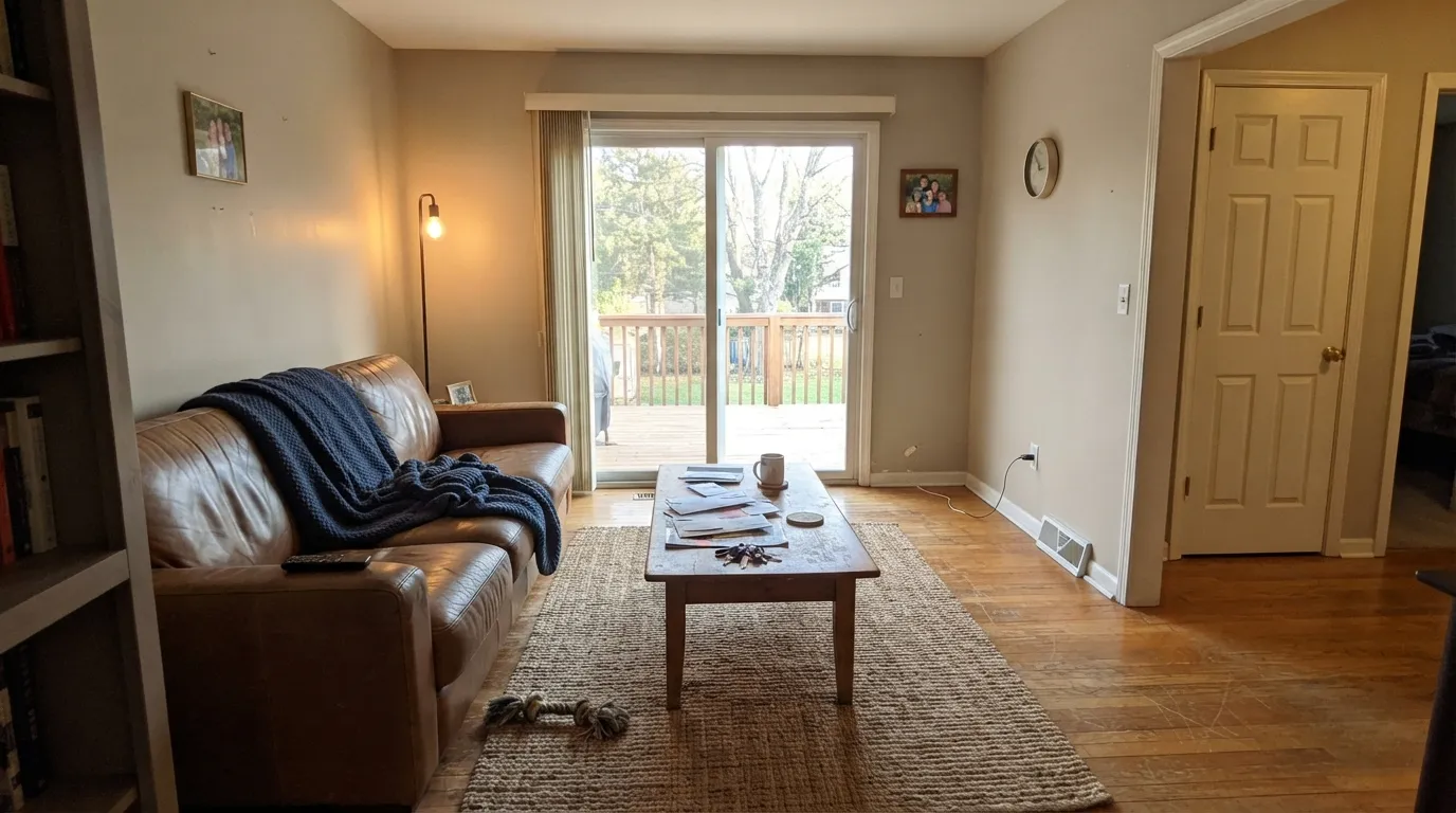
Give it real daylight, oak, and a warm white on the trim and Birchwood does the unglamorous thing a mid sandy greige is supposed to do: make the wood look chosen. South- and west-facing living rooms are the rooms it was mixed for — ranch and transitional spaces where leather, slate, and a woven rug already live. Kitchens are the second home, but only when the wood is staying: Dunn-Edwards itself points earth tones like this at wood-heavy rooms, not at cool quartz. Pair it with Swiss Coffee on the millwork, keep the bulbs warm, and the wall recedes into a finished house.
Where It Fails
Almost every unhappy Birchwood story is a depth-and-light story, and all three versions are visible on the sample wall before anyone opens a gallon. None of them are a bad mix — but if your room matches one, another coat will not hide it.
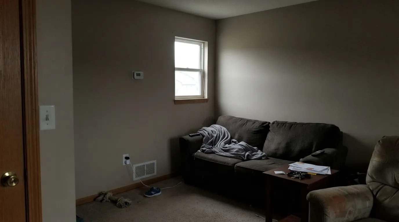
North light is cool and grey, and Birchwood only had a little sand to start with. The tan drops out and the wall goes flat — a dingy taupe people describe as dirty or unfinished. Warm lamps help after dark and do nothing at 2 p.m. Step up to Accessible Beige (LRV 58) and keep the warmth the cool light would steal, or keep this can for rooms with real sun.
On the chip, in a store, it can pass for a light sandy neutral. On four walls at LRV 49 it has the same weight as Mindful Gray. That is the most common surprise, and it is the same trap that color has lived with for years: people order it off a 2-inch square expecting airy and get a room that feels held. If light and open is the goal, Crisp Muslin (LRV 71) or Porous Stone (LRV 57) is the Dunn-Edwards can; this one is a mid-tone.
Gray LVP, gray-washed oak, and cool quartz sit on the blue side of neutral. Next to them Birchwood's sandy tan gets exposed and the walls read yellow-beige or slightly dirty rather than greige. The color wants white oak, walnut, leather, and warm stone — the company even lists those as its company. If the hard surfaces are already cool, pick a grayer mid-tone (Mindful Gray at LRV 48) or a true light greige, not this can.
Room by Room
South- and west-facing living rooms are where the sandy wood read shows up: warm, quiet, expensive next to oak and leather. Eggshell; Swiss Coffee on the trim in semi-gloss. Dunn-Edwards lists it for transitional and rustic-ranch living rooms for a reason — this is that room. A closed north parlor with one small window is the wrong place.
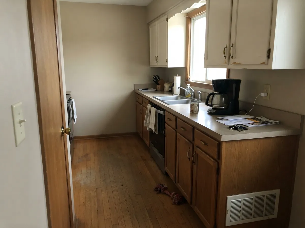
On the field around oak, butcher block, brass, and warm stone it looks considered rather than builder. Satin on a pantry or an island can work; a whole kitchen of mid-beige boxes is a stronger bet than most people think they are making. Cool gray quartz will argue — sample the wall above the actual slab. Pair the walls with Swiss Coffee on the cabinets so the sand has a soft edge to sit against.
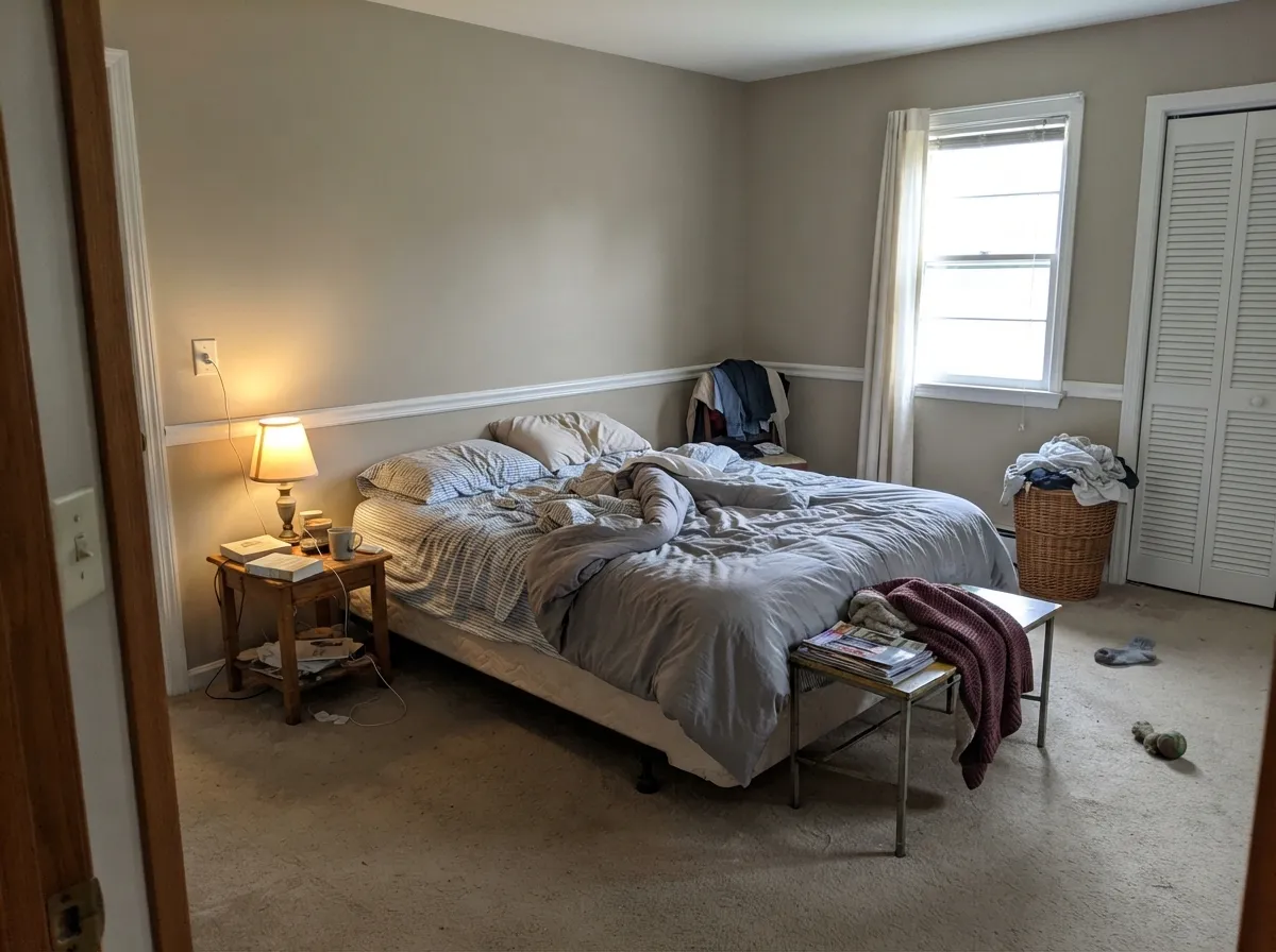
A south or west bedroom stays restful: sandy, quiet, not a color you wake up to. Matte or eggshell; the same warm white on the trim. A north cave needs a bigger sample and warm lamps, or pick Accessible Beige and keep the warmth the cool light would steal. Under 2700K bulbs it goes a touch more tan at night, which most people want in a bedroom.
These rooms usually share the living room's light and wood, so the color carries. Eggshell. If the dining room is a closed box with one north window, treat it like the fail case and sample the darkest wall first. Deep chocolate upholstery and a mossy sage on a hutch or interior door are the company Dunn-Edwards already names for it.
At LRV 49 a windowless hallway feels like a tunnel. The common fix is Birchwood in the daylit rooms and a lighter greige — Crisp Muslin — in the hall and stair. A home office by a real window is fine; the same office in a basement with cool LEDs is not.
Some Southwest HOA books list Birchwood as a stucco pop-out or accent, not the field color — that is the honest job. Full sun will bleach it a step and the sand will read as warm stucco; the shaded north elevation will go gray-taupe. For a whole-house body, Stonish Beige is the clay Dunn-Edwards already sells for that climate. Dark trim keeps a greige facade from looking unfinished.
Your Light Is the Risk
Hard warm sun is the light this greige was mixed for. The sand comes forward, the gray stays underneath, and the wall reads like dry wood all afternoon.
Cool grey daylight strips the tan and leaves a flat, slightly dirty taupe. Sample the darkest wall first, or pick a lighter, warmer can.
Grayer and quieter in morning east light; sandier and more tan through west afternoon and golden hour, sometimes a hint of peach-warm. Same paint, two honest reads.
2700K lamps push it cozy and beige. Cool 4000K LEDs pull the gray out and can make the wall look unfinished. Swap the bulbs before you repaint.
Most complaints about Birchwood are a light mismatch. Upload a photo of your actual room and see it on your walls — then ask for the same wall in north light or evening lamps before you buy a single sample.
Need It From Another Brand?
Any paint counter can custom-tint Dunn-Edwards DEC752 directly. If you would rather stay in one brand's own deck, these are the closest stock matches, measured as ΔE2000. Under 2 is a difference you will not see on the wall.
| Brand | Closest color | ΔE | LRV | |
|---|---|---|---|---|
| Sherwin-Williams | SandbarSW 7547 · Sherwin-Williams | 1.0 | 53 | Color page → |
| Behr | Bungalow BeigeHDC-AC-10 · Behr | 0.8 | 53 | Color page → |
| Benjamin Moore | Ashen Tan996 · Benjamin Moore | 1.5 | 51 | Color page → |
| Valspar | Hopsack3003-10B · Valspar | 2.1 | 53.3 | Color page → |
| PPG / Glidden | HideawayPPG14-26 · PPG / Glidden | 3.2 | 52 | Color page → |
| Glidden | Tawny Grey45YY 51/105 · Glidden | 2.5 | 51 | Color page → |
Similar Dunn-Edwards Colors
The nearest shades to Birchwood within Dunn-Edwards's own range, ranked by perceptual color distance — useful when you want the same look a touch lighter, darker, or warmer.
WCAG 2.1: AA is 4.5 : 1 for normal text, 3 : 1 for large text, AAA is 7 : 1.
Birchwood vs the Colors You're Also Considering
Every Birchwood sample board has the same rivals on it. The numbers show the real lightness gap — then it comes down to which risk you would rather live with.
Pick this when you want the same sand with real body, and you already have the daylight to support LRV 49.
Dunn-Edwards DE6220 · LRV 57Porous StonePick this for the lighter sandy whole-house greige — eight LRV points airier, and the Dunn-Edwards can that actually runs a main floor.
Pick this when you paint with Dunn-Edwards and want more gray in the mix, and a step more depth.
Sherwin-Williams SW 7036 · LRV 58Accessible BeigePick this if you want the safer, lighter national beige — it stays warmer in rooms where Birchwood would go drab.
Pick this when you want the sandier, more beige version of the same mid-neutral job, without the green tell.
Benjamin Moore HC-172 · LRV 56Revere PewterPick this if you want the famous greige every painter already knows — lighter, more gray, with a green risk in cool light.
Pick this when the sand is the point, not an accident, and you do not want a color people keep buying as a light one.
Sherwin-Williams SW 7016 · LRV 48Mindful GrayPick this for the same mid-tone depth with more gray and less tan — the Sherwin-Williams version of this weight class.
Birchwood Coordinating Colors
The rule for coordinating with Birchwood: stay on the warm, sandy side of the fence, and give it a white that is cream rather than glare. It flatters oak, leather, mossy sage, and deep chocolate — and it argues with icy blues, cool greys, and blue-gray stone. These are the partners that keep showing up in rooms that work:
A Classics Greige, Not a Famous One
Birchwood has sat in the Dunn-Edwards Classics collection through the entire greige decade without anyone asking for it by name. The brand files it in Gray & Greiges — one of twenty-four colors in that family — and puts it on the living-room list next to Cloud and Exclusive Ivory because it does ranch and transitional rooms without a speech. Painters on the West Coast already have it in the truck. The internet barely does.
That is not a slight. The colors that survive are the ones HOA books and job tickets keep specifying when nobody is watching: stucco pop-outs, a body color that had to clear a design-review board, a living room that had to work with the oak that was staying. If you wanted a color with a launch story, this is the wrong chip. If you wanted a sandy mid-tone that already behaves in Western light, it is exactly the chip.
Birchwood With Wood Tones and Floors
This decision gets made at the floor, not the paint store. White oak, pale unstained oak, walnut, and leather are the color's best friends — the sand in the wall meets the sand in the wood and both sides look finished. Honey oak, which fights cool greiges by going more orange, is kinder here: Birchwood's yellow-tan sits on the same side of the wheel, so it softens the orange instead of amplifying it. Slate, jute, and a worn leather sofa are the company the chip was mixed for.
The one honest no is cool gray: gray LVP, gray-washed wood, blue-gray porcelain, violet-gray quartz. Those surfaces pull the tan forward and the wall reads yellow-beige, sometimes slightly dirty. A large rug between a gray floor and this paint can save a room you already have; it will not save a kitchen where the counters are the problem. Metals are easy: unlacquered brass, bronze, and matte black all sit well; polished chrome is the one that leans cold against it.
Three Ready Palettes Built on Birchwood
A color is never alone on the wall. These are complete combinations in the 60-30-10 pattern, with the reason each one holds together. Every one opens in the visualizer.
Swiss Coffee is the Southwest's default warm white, so the wall-to-trim handoff stays on the sandy side of the fence. The navy door is the one dark note a ranch living room needs; Birchwood is too quiet to supply it alone.
Try this palette in your roomBirchwood wants wood in the room; Swiss Coffee on the boxes keeps the field from feeling like a beige cave. Evergreen Fog on the island is the moss-green note Dunn-Edwards already tells you to pair with this color, used where a cabinet sage actually belongs.
Try this palette in your roomAntique Paper is a parchment white, not a glare white, so the mid-tone walls do not look dingy next to the millwork. Bison Beige is the dusty deeper beige the West already uses — one family, two depths, no extra color story to invent.
Try this palette in your roomBirchwood FAQ
Is Birchwood beige or gray?
Beige — quietly, with a gray mute on top. In cool or dim light it can pass for a taupe-gray, and in west sun it is clearly sandy tan, but on four walls nobody will call it gray. If gray is what you actually want, this is the wrong can; Mindful Gray is the mid-tone that stays grayer.
Is it too dark for a whole house?
For most houses, yes. At LRV 49 it has the same weight as Mindful Gray, and windowless halls and north rooms will feel closed in. Use it in the daylit rooms and step to Crisp Muslin (LRV 71) in the halls. A bright, south-facing ranch can carry it farther than a chopped-up plan can.
What trim white goes with Birchwood?
A warm, slightly creamy white — Swiss Coffee is the default in this deck, Antique Paper if you want parchment instead of cream. Whisper will work if you want a crisper, White Dove-like edge, but live with a sample next to the wall; the LRV jump is large. A leftover builder antique-yellow on the millwork shoves Birchwood toward dirty gray.
Does Birchwood work with oak floors?
Yes — that is the pairing it was mixed for. White oak, walnut, and even honey oak sit comfortably against the sand; cool greiges make honey oak go orange, and Birchwood does the opposite. Gray-washed oak and cool gray LVP are the ones that need a sample: they pull the tan into relief and the wall can read yellow.
Can I use it on kitchen cabinets?
Yes, in doses. Dunn-Edwards already points earth tones like this at wood-heavy kitchens. Satin on an island, a pantry, or a hutch under Swiss Coffee walls is the low-risk version. A whole kitchen of LRV 49 boxes is a real commitment, and cool gray counters will fight it. Use a urethane-fortified cabinet enamel either way.
Is Birchwood a Color of the Year or a famous launch?
No. It is a Classics chip in the Gray & Greiges family, and Dunn-Edwards lists it among living-room colors because it behaves, not because it launched anything. Some Southwest HOA books specify it as a stucco pop-out accent. Honest obscurity is the point: it is a workhorse, not a story.
Have you painted with Birchwood?
Rate it — one tap helps the next reader decide.
Ask a Question