CP

Oatmeal Bedroom Palette — Soft Neutral & Calm Taupe

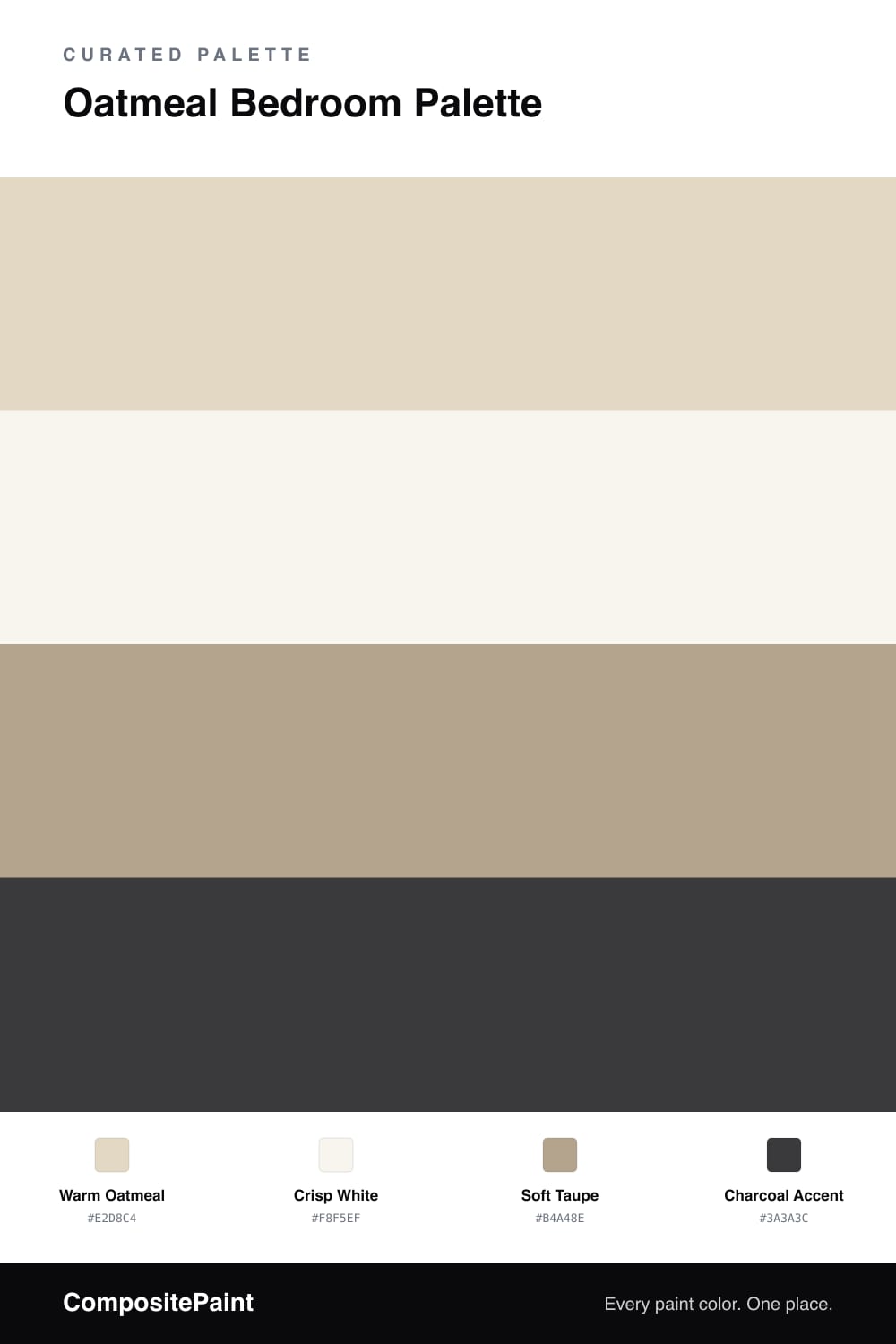
A soft, restful 4-color scheme for bedrooms: warm oatmeal walls, crisp white trim, soft taupe, and a charcoal accent for depth. Every color matched to real paint you can buy.

By Jessica Williams · Color Stylist & Interior Editor

An oatmeal bedroom is about gentle, easy calm — a soft warm off-white that feels like fresh linen and morning light. This palette puts warm oatmeal on the walls, lighter than beige and warmer than gray, so the room stays bright without ever feeling cold or clinical.

Crisp white on the trim and ceiling keeps the edges fresh and frames the oatmeal cleanly. Soft taupe can carry through on a headboard wall or alcove, adding a quiet step of depth so the scheme feels layered rather than washed out.

A few touches of charcoal accent — a lamp, a frame, a throw — give the eye somewhere to settle and add just enough contrast. Lean on texture too, in bedding, rugs, and linen, to keep the soft palette interesting. The result is a restful, uncluttered bedroom that feels serene and easy to live in every day.

View palette in
Warm Oatmeal
Walls
Dunn-Edwards Exclusive Ivory · DE6191
#E2D8C3
LRV 64
Crisp White
Trim & Ceiling
Dunn-Edwards Droplets · DEW381
#F6F4EF
LRV 83
Soft Taupe
Secondary Walls
Rodda Flagstone · CA087
#B2A28D
LRV 37
Charcoal Accent
Depth Accent
Glidden Onyx Black · 00NN 05/000
#3C3B3C
LRV 5

Buy These Colors

Each color matched to the closest real paint in every brand, by ΔE2000. Tap a swatch for its full guide or + to save it — take any SKU to the store, they mix on demand.

Warm Oatmeal
#E2D8C4 · LRV 69 · Walls
Sherwin-Williams · SW 9506 · ΔE 0.92
Behr · MQ3-17 · ΔE 0.82
Benjamin Moore · 964 · ΔE 1
Valspar · 3002-10C · ΔE 2.14
PPG / Glidden · PPG1085-2 · ΔE 1.19
Glidden · 40YY 69/112 · ΔE 0.56
Dutch Boy · 415-1DB · ΔE 1.62
HGTV Home by Sherwin-Williams · HGSW 4050 · ΔE 2.7
Dunn-Edwards · DE6191 · ΔE 0.39
Magnolia Home · JG-167 · ΔE 0.44
Farrow & Ball · NO. CC2 · ΔE 0.77
Diamond Vogel · 0335 · ΔE 0.4
Hirshfield's · 0363 · ΔE 1.76
Rodda · CA044 · ΔE 3.04
C2 Paint · BD3 · ΔE 2.05
Clare · PNT100-LT-20 · ΔE 3.42
Portola Paints · MARIPOSA · ΔE 2.79
Annie Sloan · OLD OCHRE · ΔE 6.24
Backdrop · BD-CC · ΔE 1.9
Rust-Oleum · 398641 · ΔE 6.16
Kompozit · 0363 · ΔE 1.76
Crisp White
#F8F5EF · LRV 91 · Trim & Ceiling
Sherwin-Williams · SW 7757 · ΔE 1.52
Behr · DC-001 · ΔE 1
Benjamin Moore · 2143-70 · ΔE 2.29
Valspar · V148 · ΔE 1.44
PPG / Glidden · PPG1001-1 · ΔE 2.19
Glidden · 61YY 89/040 · ΔE 1.37
Dutch Boy · 002W · ΔE 1.5
HGTV Home by Sherwin-Williams · HGSW 4001 · ΔE 1.52
Dunn-Edwards · DEW381 · ΔE 0.63
Magnolia Home · JG-21 · ΔE 1.91
Farrow & Ball · NO. 2005 · ΔE 1.55
Diamond Vogel · 0011 · ΔE 2.08
Hirshfield's · 0011 · ΔE 1.63
Rodda · R007 · ΔE 1.55
C2 Paint · C2-756 · ΔE 2.14
Clare · PNT100-LT-04 · ΔE 1.56
Portola Paints · ONE DROP · ΔE 5.61
Annie Sloan · OLD OCHRE · ΔE 14.17
Backdrop · BD-TR · ΔE 2.6
Rust-Oleum · 285140 · ΔE 4.1
Kompozit · 0011 · ΔE 1.63
Soft Taupe
#B4A48E · LRV 38 · Secondary Walls
Sherwin-Williams · SW 7507 · ΔE 1.12
Behr · ECC-53-2 · ΔE 0.87
Benjamin Moore · CSP-190 · ΔE 1.79
Valspar · V132-4 · ΔE 3.22
PPG / Glidden · PPG15-09 · ΔE 2.04
Glidden · 20YY 39/130 · ΔE 1.01
Dutch Boy · 420-3DB · ΔE 1.22
HGTV Home by Sherwin-Williams · HGSW 3445 · ΔE 1.12
Dunn-Edwards · DEC759 · ΔE 2.85
Magnolia Home · JG-166 · ΔE 4.88
Farrow & Ball · NO. 6 · ΔE 1.24
Diamond Vogel · 0337 · ΔE 1.85
Hirshfield's · 0226 · ΔE 1.79
Rodda · CA087 · ΔE 0.7
C2 Paint · BD34 · ΔE 1.61
Clare · PNT100-MD-64 · ΔE 12.3
Portola Paints · CODA · ΔE 4.75
Annie Sloan · FRENCH LINEN · ΔE 4.42
Backdrop · BD-CT · ΔE 3.48
Rust-Oleum · 371674 · ΔE 9.13
Kompozit · 0226 · ΔE 1.79
Charcoal Accent
#3A3A3C · LRV 4 · Depth Accent
Sherwin-Williams · SW 6994 · ΔE 2.63
Behr · MQ5-5 · ΔE 0.93
Benjamin Moore · 2132-20 · ΔE 1.28
Valspar · V120-3 · ΔE 1.69
PPG / Glidden · PPG0995-7 · ΔE 1.88
Glidden · 00NN 05/000 · ΔE 0.89
Dutch Boy · 445-7DB · ΔE 3.98
HGTV Home by Sherwin-Williams · HGSW 6988 · ΔE 3.45
Dunn-Edwards · DEA002 · ΔE 1.35
Magnolia Home · JG-150 · ΔE 5.93
Farrow & Ball · NO. G18 · ΔE 1.5
Diamond Vogel · H101 · ΔE 1.07
Hirshfield's · 0529 · ΔE 1.69
Rodda · CA210 · ΔE 4.65
C2 Paint · C2-981 · ΔE 1.4
Clare · PNT100-DP-54 · ΔE 5.02
Portola Paints · NOMAD · ΔE 5.13
Annie Sloan · AUBUSSON BLUE · ΔE 10.32
Backdrop · BD-AH · ΔE 5.86
Rust-Oleum · 285144 · ΔE 2.89
Kompozit · 0529 · ΔE 1.69

Questions

What color is oatmeal exactly?

Oatmeal is a soft, warm off-white with a hint of beige and gray, like the cereal it is named for. It is lighter than beige and warmer than gray, which makes it one of the calmest, most forgiving wall colors for a bedroom.

How do I stop an oatmeal bedroom from feeling boring?

Add a little depth and contrast. A soft taupe on one wall and a few touches of charcoal in lamps or frames give the room shape, while keeping the trim crisp white. Texture in bedding and rugs does the rest.

KEEP EXPLORING

Similar Palettes

Closest schemes by color — not by label.