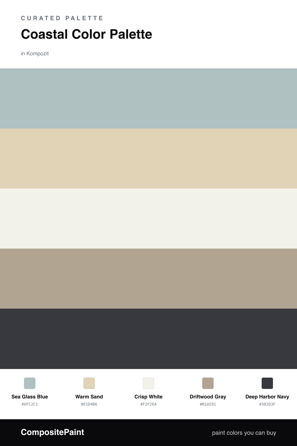
Coastal Color Palette — Coastal Haze
A breezy five-color coastal scheme of soft sea blue, sun-warmed sand, weathered driftwood, and crisp white anchored by a deep navy — every color matched to real paint you can buy.
By Jessica Williams · Color Stylist & Interior Editor
This is the palette I reach for when I want a room to feel like the morning after a foggy night by the shore — calm, washed clean, a little hazy. Sea Glass Blue leads the way, soft enough to read almost gray in low light, which is exactly what makes it feel so easy to live with.
Around it, Warm Sand and Driftwood Gray do the grounding. They keep the blue from drifting too cool, and they add that lived-in, weathered texture you find on a piece of wood that has spent a season in the tide. Crisp White opens everything up, so nothing feels closed in.
Then comes Deep Harbor Navy, my favorite move here. Used in small doses on a front door, a window sash, or a single cabinet, it gives the whole scheme a backbone. For 2026 I love pairing these soft tones with natural oak and unlacquered brass — it keeps the look fresh rather than nautical-themed.
Buy These Colors
Each color matched to the closest real paint in every brand, by ΔE2000. Kompozit first; take any SKU to the store — these mix on demand.
Questions
They all share a soft, hazy quality, as if the light came off the water. The sea blue and sand are barely-there neutrals, so the deep navy can step in as a quiet anchor without feeling heavy.
Let the sea blue lead and keep the navy small, roughly a one-fifth share used on a door or a single piece. Sand and driftwood carry the middle, and crisp white keeps the whole thing breathing.
Similar Palettes
Closest schemes by color — not by label.