Coastal Color Palette — Driftwood Tide
A breezy five-color coastal scheme pairing soft sea blue with sand and driftwood, balanced by crisp white and a deep navy anchor — every color matched to real paint you can buy.
By Jessica Williams · Color Stylist & Interior Editor
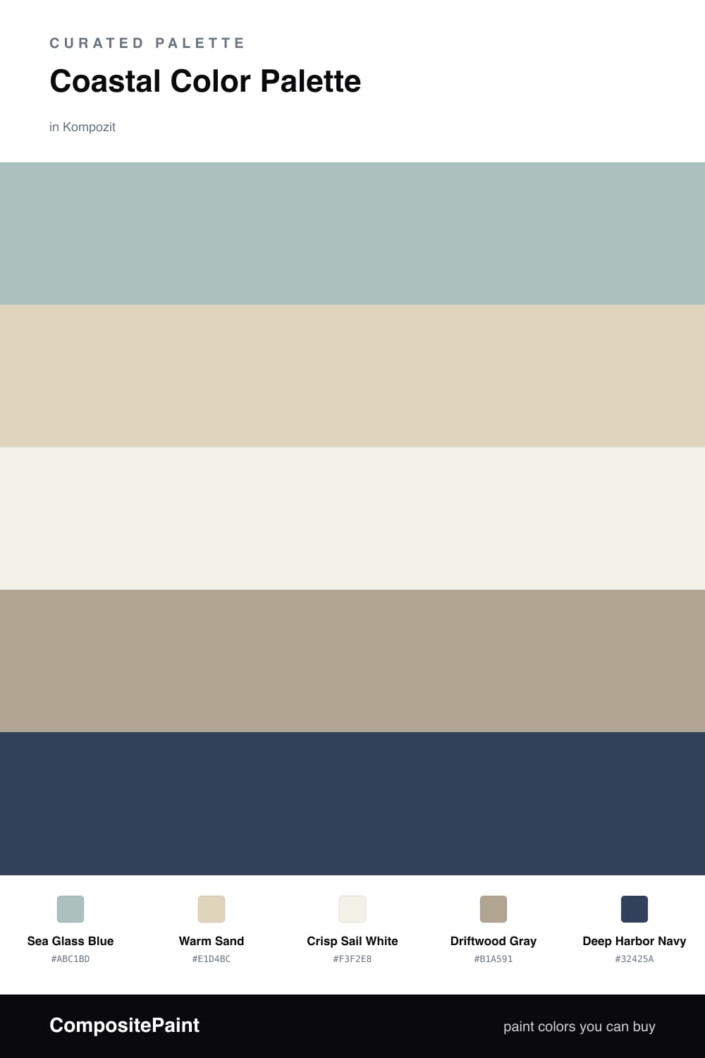
There is a particular light at the coast, soft and salted, that washes every color down to its calmest version. This palette chases that feeling. Sea Glass Blue leads the way, breezy and a little hazy, the shade of water seen through morning fog rather than a bright postcard blue.
Around it, Warm Sand and Driftwood Gray do the grounding work, holding that weathered, sun-bleached quality you find in old beach houses. Crisp Sail White keeps everything light and open so the room can breathe, the way air moves through a screened porch.
For 2026 the move is restraint, so let the airy tones carry most of the space and bring in Deep Harbor Navy only where you want a quiet anchor — a single door, a band of trim, a piece of furniture. That one deep note is what makes the rest feel intentional instead of washed out.
Buy These Colors
Each color matched to the closest real paint in every brand, by ΔE2000. Kompozit first; take any SKU to the store — these mix on demand.
Questions
They share the soft, sun-washed quality you see at the shore, so they slip into one another with no hard edges. The deep navy gives the breezy blues and sandy neutrals something solid to lean on.
Let the sea blue lead and keep the white and sand as your calm backdrop, then save the navy for small grounding moments — a roughly 70/30 split between the airy tones and the deeper anchor.
Similar Palettes
Closest schemes by color — not by label.