CP

Coastal Color Palette — Coastal Glow

A breezy five-color coastal scheme built on soft sea blue, sand, and driftwood with a deep navy anchor — every color matched to real paint you can buy.

By Maya Patel · Reviews Editor & Product Tester

Sea Glass Blue
Dominant
Kompozit Bluette · 0616
#9EBED8
LRV 49
Warm Sand
Secondary
Kompozit Palest of Lemon · 0264
#E6D6BB
LRV 69
Crisp White
Base
Kompozit Cyprus Spring · 0411
#F2F2EA
LRV 88
Weathered Driftwood
Support
Kompozit Delicate Honeysweet · 0189
#BCAB99
LRV 42
Deep Navy
Accent
Kompozit Star-Studded · 0620
#32425A
LRV 5
View palette in

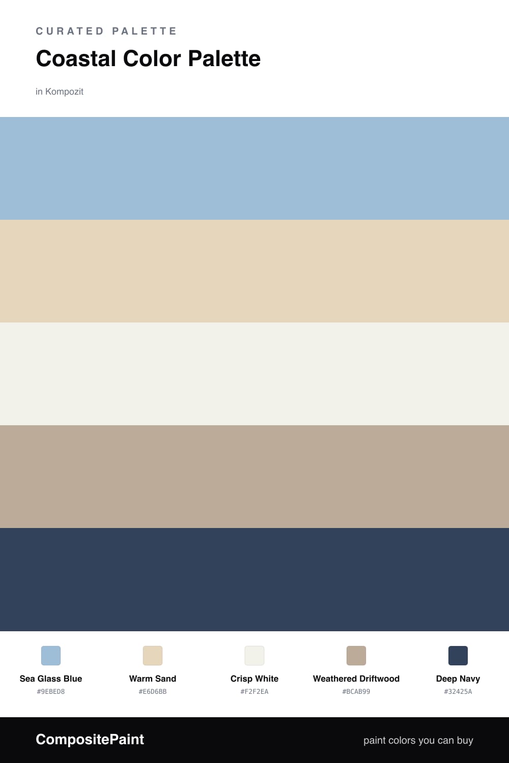
Coastal done right in 2026 is less beach-house cliche and more calm, airy, and clean. This scheme leans on Sea Glass Blue as the lead — soft, slightly green, the color of light coming off shallow water — paired with Warm Sand so the whole thing stays warm instead of chilly.

Crisp White is your workhorse base on the big surfaces, and Weathered Driftwood is the quiet glue that ties the blue and the sand together without adding noise. These three do most of the heavy lifting and read effortless in real light.

Then there is Deep Navy, the anchor. Use it in small, deliberate doses — a single wall, cabinetry, a door — so it grounds the airiness and gives the eye somewhere to land. That contrast between pale and deep is what makes this palette feel current rather than dated.

Buy These Colors

Each color matched to the closest real paint in every brand, by ΔE2000. Kompozit first; take any SKU to the store — these mix on demand.

Sea Glass Blue
#9CC0CC · LRV 49 · Dominant
Kompozit Bluette · 0616 ΔE 6.4
Backdrop Lost in the 80s · BD-LO ΔE 3.1
Behr Blue Willow · 570F-4 ΔE 0.49
Benjamin Moore Northern Air · 1676 ΔE 2.98
Clare Cloud Watching · PNT100-MD-73 ΔE 6.29
Dunn-Edwards Frozen Tundra · DE5793 ΔE 2.32
Farrow & Ball Blue Ground · No. 210 ΔE 4.25
Magnolia Home It Is Well · JG-76 ΔE 5.03
PPG / Glidden Graceful · 1152-3 ΔE 4.14
Sherwin-Williams Rest Assured · SW 9061 ΔE 0.95
Valspar High Noon · 5001-5B ΔE 2.16
Warm Sand
#E4D6BC · LRV 68 · Secondary
Kompozit Palest of Lemon · 0264 ΔE 0.83
Backdrop Cookies & Cream · BD-CC ΔE 2.48
Behr Scribe · MQ2-31 ΔE 1.43
Benjamin Moore Mohair · 1058 ΔE 0.92
Clare Turbinado · PNT100-LT-21 ΔE 2.89
Dunn-Edwards Sand Dollar · DE6171 ΔE 0.86
Farrow & Ball Matchstick · No. 2013 ΔE 0.72
Magnolia Home Morning Snow · JG-167 ΔE 2.15
PPG / Glidden Alpaca Wool · 14-19 ΔE 0.72
Sherwin-Williams Echelon Ecru · SW 7574 ΔE 0.68
Valspar Lovely Bluff · 3004-10C ΔE 2.14
Crisp White
#F5F2EA · LRV 89 · Base
Kompozit Cyprus Spring · 0411 ΔE 1.48
Backdrop Tabula Rasa · BD-TR ΔE 1.56
Behr White Flour · OR-W10 ΔE 1.11
Benjamin Moore Opulence · 879 ΔE 1.45
Clare Wing It · PNT100-LT-24 ΔE 2.68
Dunn-Edwards Dove's Wing · DE6267 ΔE 0.5
Farrow & Ball Wimborne White · No. 239 ΔE 1.31
Magnolia Home Silos White · JG-107 ΔE 0.87
PPG / Glidden Delicate White · 1001-1 ΔE 2.37
Sherwin-Williams White Flour · SW 7102 ΔE 1.26
Valspar Santa's Beard · 8007-6E ΔE 1.49
Weathered Driftwood
#B7AC9B · LRV 42 · Support
Kompozit Delicate Honeysweet · 0189 ΔE 2.78
Backdrop Le Freak · BD-LF ΔE 9.47
Behr Stone Walkway · QE-35 ΔE 2.52
Benjamin Moore Baja Dunes · 997 ΔE 1.33
Clare Money Moves · PNT100-MD-48 ΔE 8.12
Dunn-Edwards Shaggy Barked · DEC771 ΔE 2.08
Farrow & Ball Hardwick White · No. 5 ΔE 2.47
Magnolia Home Drawing Room · JG-157 ΔE 1.9
PPG / Glidden Desert Dune · 1023-4 ΔE 0.87
Sherwin-Williams Perfect Greige · SW 6073 ΔE 2.56
Valspar Ivory Brown · 6006-1C ΔE 1.38
Deep Navy
#1F3A53 · LRV 4 · Accent
Kompozit Star-Studded · 0620 ΔE 4.34
Backdrop Last Call · BD-LC ΔE 8.55
Behr Midnight Dream · 570F-7 ΔE 1.8
Benjamin Moore Marine Blue · 2059-10 ΔE 1.7
Clare Blackish · PNT100-DP-54 ΔE 15.46
Dunn-Edwards Old Mill · DEA185 ΔE 6.52
Farrow & Ball Pitch Black · No. 256 ΔE 14.18
Magnolia Home Blackboard · JG-05 ΔE 9.7
PPG / Glidden Victory Blue · 1165-7 ΔE 8.33
Sherwin-Williams In the Navy · SW 9178 ΔE 3.39
Valspar Indigo Streamer · 4010-4 ΔE 3.54

Questions

Why do these colors feel coastal without looking like a theme room?

They pull from real shoreline materials — soft sea blue, dry sand, sun-bleached driftwood — so the mood reads coastal while the colors stay quiet and grown-up. The crisp white keeps it from going kitschy.

How do I balance them?

Let the sea glass blue lead and the white carry the big surfaces, then use sand and driftwood as the soft middle. Save the deep navy for one strong moment so it stays special.

Similar Palettes

Closest schemes by color — not by label.