Bit Of Sugar
The bright white parked exactly between Chantilly Lace and Alabaster, reviewed honestly: why paint blogs can't agree if it's warm or cool, and where it actually earns its keep.

Jessica has spec'd whites and neutrals for more than 300 rooms and keeps a sample wall of painted drawdowns in her studio. Every color review is checked against real reader rooms in the comments and re-tested when a formula changes. About the testing process →
- 1Classic Gray74
- 2Alabaster82
- 3Bit Of Sugar89
- 4Ultra Pure White97
The Fast Verdict
Bit of Sugar is Behr's quiet in-between white: bright enough to trust on trim, warm enough to avoid the stark hospital look, and vague enough about its undertone that four different paint bloggers will describe it four different ways. That is not a flaw so much as its whole personality — it leans toward whatever room it's in. Nobody is naming it Color of the Year and nobody has a viral horror story about it either; it is a solid, sellable, slightly forgettable bright white that does its job.
Trim, doors and exterior body where you want bright without stark · cabinets over warm wood or granite · whole-house neutral in rooms with decent daylight · anyone who wants "a nice white" without a strong opinion either way
You need a color that reads identically in every room · your room is dim and north-facing · you specifically want the coldest, cleanest white in the deck · you want a famous, Pinterest-searched name
- Bright enough for trim and ceilings without reading stark
- Warm undertone stays soft — never the blue-white glare of a true cool white
- Genuinely versatile: reads fine warm or neutral depending on the room
- Solid exterior and trim performer against brick, stone and dark shutters
- A safe, unopinionated pick when a client can't choose between a warm and a cool white
- No fixed identity — undertone shifts enough that reviewers can't agree if it's warm or cool
- Goes flat and chalky in dim, north-facing rooms
- Looks faintly dingy next to a truly cool bright white
- Not a famous name — no design-blog cachet if that matters to you
What Color Is Bit Of Sugar, Really?
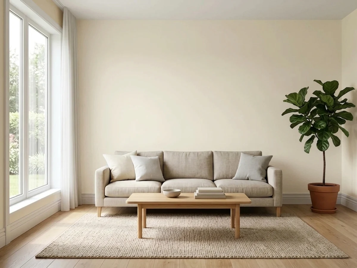
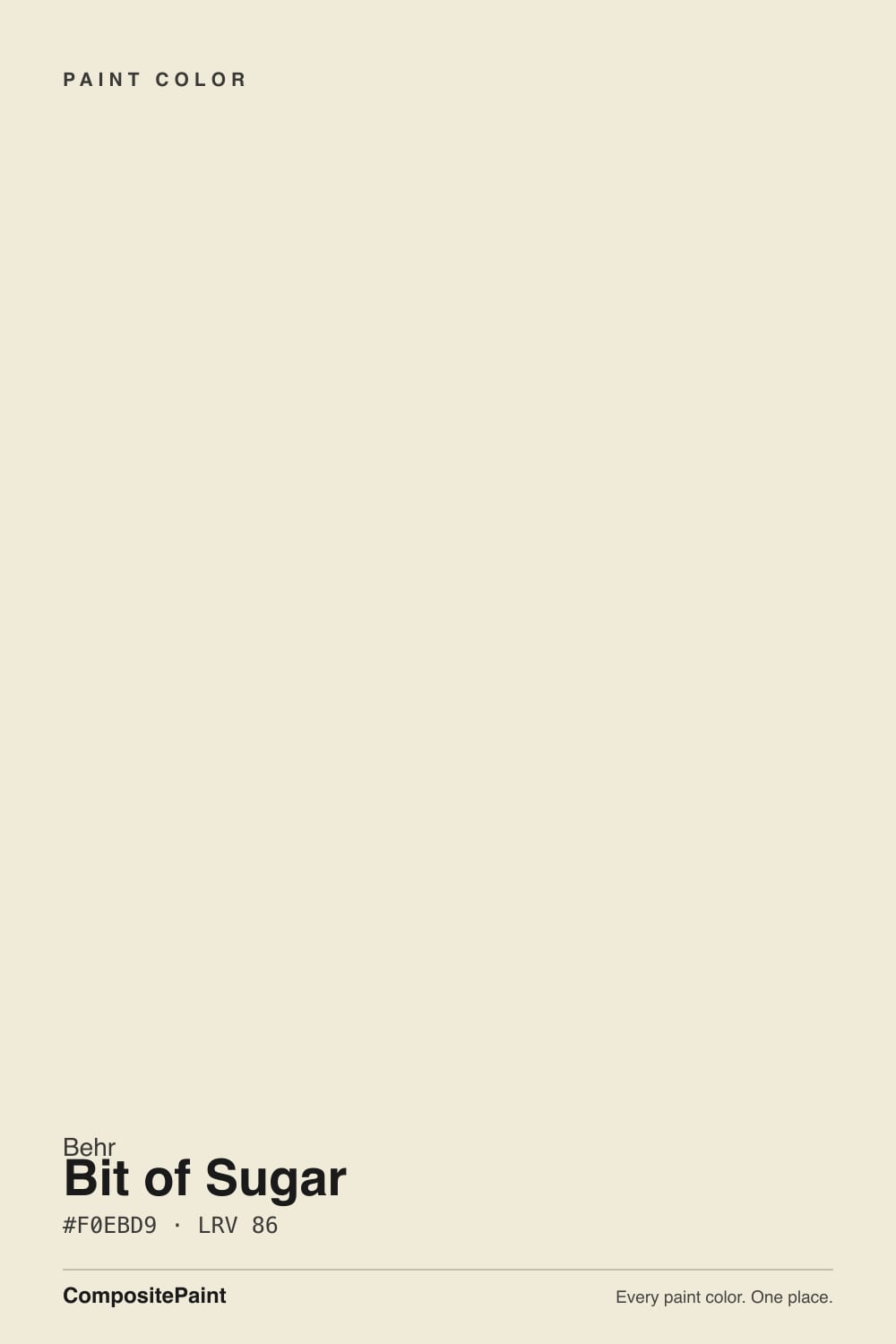
A bright off-white with a soft, warm-leaning base — creamy enough to avoid the blue-white glare of a true cool white, restrained enough that most rooms will not read it as cream. At LRV 86 it sits in the same reflectance band as Behr's own Polar Bear and Benjamin Moore's Oxford White: bright enough to work as a ceiling or trim color, a full step short of the LRV 90-plus club (Chantilly Lace, Simply White, Whisper White) that reads as a true, no-argument white.
The honest story here is how little story there is. Bit of Sugar has never been a Color of the Year, has no viral "I painted my whole house" moment behind it, and does not show up on the famous-color lists the way White Dove or Alabaster do. Paint bloggers who cover it describe it as sitting between Chantilly Lace's crisp cool and Alabaster's warm softness — which is a fair read of a color built to not pick a fight with either camp. That is its market position: the safe middle option when a client can't decide between the two famous ones.
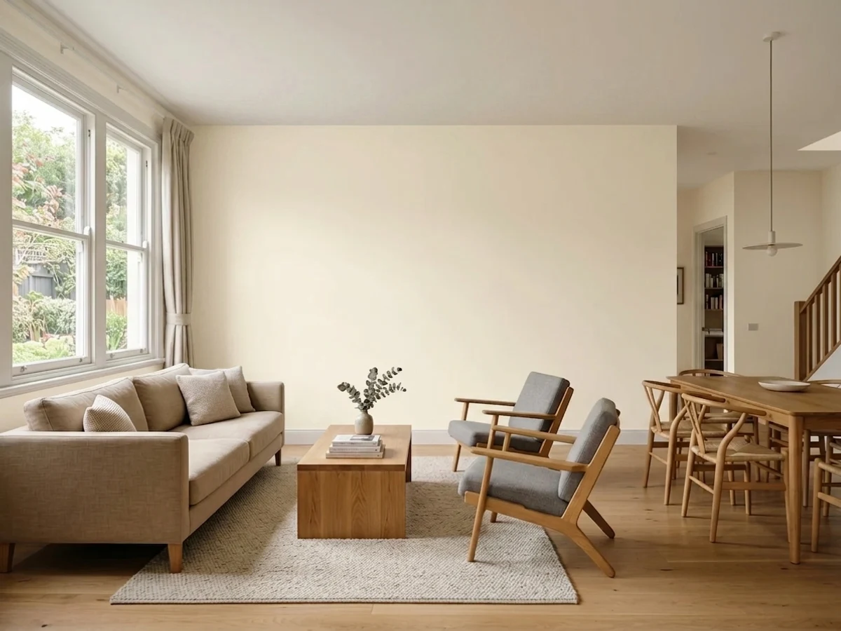
Undertone in one line: warm cream base, muted almost to neutral. Put it next to warm wood and brass and the cream shows; put it next to grey stone or cool LED light and it quiets down toward a plain soft white. Several review sites disagree on whether to call it warm or cool for exactly this reason — the color genuinely shifts more than a fixed, opinionated white would.
Where It Shines
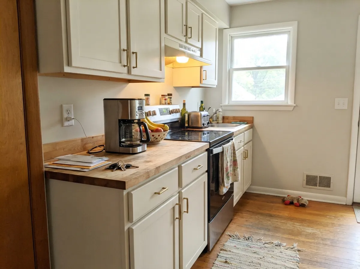
Give it a job with a clear opposite number — dark floors, warm wood cabinets, black hardware, brick or stone exterior trim — and it reads clean and bright without turning stark. It is at its best on the surfaces the research keeps pointing to: trim and doors under a mid-tone wall color, exterior siding or fascia, and cabinets over granite or butcher block. On those surfaces the slight warmth reads as "finished," not "off-white by accident."

Where It Fails
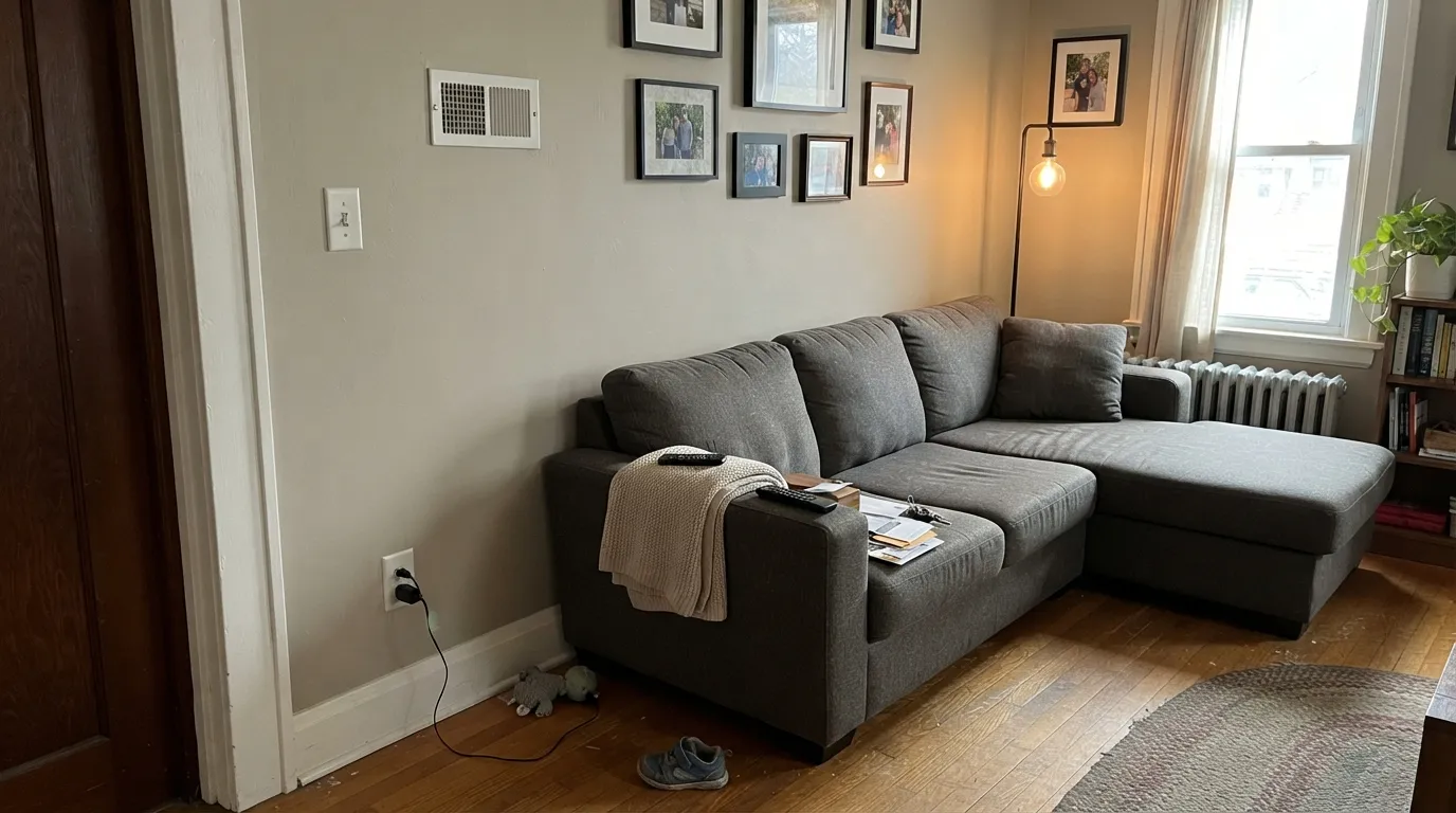
Bit of Sugar does not have a famous horror-story complaint the way some deck colors do — it is too quiet a color to generate one. What it does have are the three predictable ways any bright, undertone-soft white goes wrong, and all three are avoidable if you sample first.
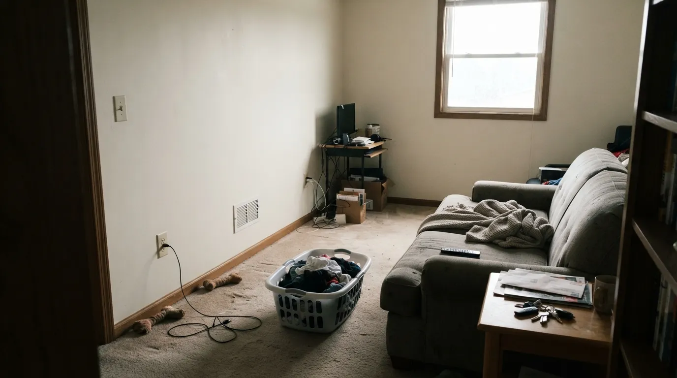
Cold daylight strips out the cream and leaves a flat, slightly chalky white with no warmth left to carry it. This is true of almost every bright white at LRV 85 and up, and Bit of Sugar is not the exception. If the room is dim, warm the light with 2700K bulbs or step down to a deeper cream like Behr Blank Canvas.
Put Bit of Sugar beside SW Extra White or Chantilly Lace and the cream becomes obvious — it will read faintly dingy by comparison, the same trick that makes any warm white look dirty next to a colder one. Don't split trim and wall between the two families; keep Bit of Sugar as the only white in the room.
Because the undertone genuinely shifts with the room, buyers hoping for a fixed, describable white sometimes come away unsure what they painted. If you need a color that reads the same in every light — pick a more committed white like Chantilly Lace (cool) or Swiss Coffee (warm), not this one.
Room by Room
Semi-gloss Bit of Sugar trim under a mid-tone wall color (greige, sage, navy) reads crisp without the glare of a colder white. This is the surface the research keeps coming back to, and it is the easiest way to use the color well.
Full sun brightens it further and the warmth keeps it from looking flat or institutional against brick, stone or dark shutters. It matched a homeowner's white PVC trim well from a distance in one review, which is the exact job most exterior whites are asked to do.
Over butcher block, warm granite or a brass pull it looks intentional and soft. Satin, urethane-fortified cabinet enamel; expect two coats over any existing tan or beige cabinet color.
With real daylight it is a safe, quiet backdrop. It will not carry a room the way a more opinionated white does — treat it as the wall that gets out of the way, not the one that makes a statement.
Under 2700K lamps the cream comes forward and it reads cozy rather than clinical. In a north-facing bedroom with cool LEDs it goes flat; swap the bulbs before you swap the paint.
Warm-veined marble and brass fixtures flatter it. Cool grey-blue tile pulls it toward plain, slightly cold white — sample against your actual tile before committing.
Your Light Is the Risk
South or west daylight brings the cream forward and the color reads bright and finished, never stark.
Cool, flat daylight drains the warmth and leaves a chalky, slightly grey white. Sample here before committing to walls.
Crisper and closer to a true white at midday, softer and creamier as the light warms toward evening. The shift is gentle, not dramatic.
2700K bulbs deepen the cream and make it feel warmer at night. Cool white LEDs flatten it back toward plain, slightly cold white.
Most complaints about Bit Of Sugar are a light mismatch. Upload a photo of your actual room and see it on your walls — then ask for the same wall in north light or evening lamps before you buy a single sample.
Need It From Another Brand?
Any paint counter can custom-tint Behr PR-W14 directly. If you would rather stay in one brand's own deck, these are the closest stock matches, measured as ΔE2000. Under 2 is a difference you will not see on the wall.
| Brand | Closest color | ΔE | LRV | |
|---|---|---|---|---|
| Sherwin-Williams | White SnowSW 9541 · Sherwin-Williams | 0.6 | 90 | Color page → |
| Benjamin Moore | Opulence879 · Benjamin Moore | 0.8 | 89 | Color page → |
| Valspar | Santa's Beard8007-6E · Valspar | 0.6 | 89 | Color page → |
| PPG / Glidden | Delicate WhitePPG1001-1 · PPG / Glidden | 1.6 | 88 | Color page → |
| Glidden | Crisp Linen White61YY 89/040 · Glidden | 1.5 | 89 | Color page → |
| Dutch Boy | Birched White004W · Dutch Boy | 0.9 | 89 | Color page → |
Similar Behr Colors
The nearest shades to Bit Of Sugar within Behr's own range, ranked by perceptual color distance — useful when you want the same look a touch lighter, darker, or warmer.
WCAG 2.1: AA is 4.5 : 1 for normal text, 3 : 1 for large text, AAA is 7 : 1.
Bit Of Sugar vs the Colors You're Also Considering
Every Bit Of Sugar sample board has the same rivals on it. The numbers show the real lightness gap — then it comes down to which risk you would rather live with.
Pick this if you want that same soft brightness but slightly cooler and a touch lighter.
Benjamin Moore OC-17 · LRV 85White DovePick this if you want committed, unmistakable warmth — White Dove never wavers between warm and neutral the way this one does.
Pick this if stark-white glare worries you and you want a white with some give in it.
Benjamin Moore OC-65 · LRV 92Chantilly LacePick this for the coldest, cleanest, most decisive white in this comparison — no undertone debate, ever.
Behr has several near twins, and the differences come down to a few points of light and a slight shift in warmth.
Original White (N290-1), at LRV 83, is the closest sibling. It carries a touch more visible cream, so walls look a shade softer and less bright. Choose Original White when you want the room to feel warmer overall; choose Bit of Sugar when you want maximum light with only a hint of warmth, especially in dim rooms.
Coastal Beige (PPU7-13), at LRV 82, tips slightly further toward beige. Side by side it reads as the beginning of a tan family rather than a white, which makes it better for walls paired with a white trim, while Bit of Sugar can do both jobs. Summer Jasmine (PPU9-15), also LRV 82, sits between the two with a faintly greener cast; it suits schemes built around sage and olive tones, where Bit of Sugar can look a touch more yellow.
Bit of Sugar Coordinating Colors
Because the color itself doesn't commit hard to warm or cool, it pairs comfortably with both warm greiges and cooler charcoals — it is genuinely one of the easier whites to build a palette around for that reason. These are the partners that keep showing up in rooms that use it well:
Bit of Sugar on Exteriors
This is arguably the color's strongest job. Full outdoor sun brightens the LRV 86 base further, and the warm cream keeps it from reading as flat or institutional the way a colder white can on a large expanse of siding — one review specifically noted it matching white PVC trim well from a distance, which is the exact test most exterior whites are asked to pass.
Dark shutters, black or charcoal trim, and stone or brick foundations all give it the contrast it needs to read crisp rather than washed-out. Walk the house before committing: the shaded side will read noticeably cooler and flatter than the sun-facing side, and that gap is bigger outdoors than it is inside.
Why This White Never Got Famous
Bit of Sugar has no Color of the Year run, no viral before-and-after, no design-blog origin story — it is simply a bright white Behr has sold quietly for years, filed a step below the deck's headline whites. Paint bloggers who do cover it tend to describe it the same way, as the practical middle option between Chantilly Lace's cool crispness and Alabaster's warm softness, useful precisely because it doesn't ask a homeowner to pick a side.
That obscurity is not a red flag. Plenty of the best-performing whites in any brand's deck are the ones nobody talks about, because they simply do the job without generating drama in either direction. If you came here chasing a famous name, this isn't it; if you want a bright, low-risk white that behaves reasonably in most rooms, the lack of hype is not a mark against it.
Three Ready Palettes Built on Bit Of Sugar
A color is never alone on the wall. These are complete combinations in the 60-30-10 pattern, with the reason each one holds together. Every one opens in the visualizer.
Bit of Sugar's warmth softens the handoff to Agreeable Gray walls instead of fighting it, and the navy island supplies the one dark note the kitchen needs. Brass hardware ties all three together.
Try this palette in your roomBoth whites-and-neutrals share the same warm base, so hallways and open doorways flow instead of clashing. Kendall Charcoal on the door is the single anchor the scheme needs.
Try this palette in your roomFull sun brightens Bit of Sugar's warmth without letting it go stark, and the near-black shutters keep the softness from reading washed-out. The navy door is the one color note against an otherwise all-neutral face.
Try this palette in your roomBit Of Sugar FAQ
Is Bit of Sugar a warm white or a cool white?
Warm-leaning but mild about it. It carries a soft cream base that shows against warm materials and quiets down near cool ones — which is exactly why different reviewers describe it as warm, cool, or "true neutral." It genuinely shifts more than a fixed, opinionated white does.
How does it compare to Benjamin Moore White Dove or Chantilly Lace?
It sits between them. White Dove is more committed to warmth and Chantilly Lace is more committed to cool and bright — Bit of Sugar splits the difference at LRV 86, a step darker than Chantilly Lace and close in brightness to White Dove but with less obvious cream.
Is it good for exterior trim and siding?
Yes — this is one of the surfaces it is most often used for. In full sun it reads bright without the flat glare of a colder white, and it holds up well against brick, stone and dark shutters.
Can I use it on kitchen cabinets?
Yes. Over butcher block, warm granite or brass hardware it looks soft and intentional rather than stark. Use a satin, urethane-fortified cabinet enamel and expect two coats over an existing tan or beige finish.
Will it look the same in every room of my house?
Not exactly — that is the color's defining trait. It leans slightly warmer in south and west light and against warm wood, and slightly cooler and flatter in north-facing rooms or under cool LED bulbs. If you need one fixed look everywhere, a more decisive white is the safer bet.
How many coats does it take?
Two coats over most existing light colors. Going over a darker or more saturated wall, prime first with a tinted primer — three finish coats over a bold color is the expensive way to find that out.
Have you painted with Bit Of Sugar?
Rate it — one tap helps the next reader decide.
Ask a Question