CP

Coastal Color Palette — Coastal Mist

A breezy five-color coastal scheme of soft sea blue, warm sand, driftwood gray, and crisp white anchored by deep navy — every color matched to real paint you can buy.

By Emily Roberts · DIY Editor & First-Timer's Guide

Sea Mist Blue
Dominant
Kompozit Indulgence · 0483
#AFC2C1
LRV 52
Warm Sand
Secondary
Kompozit Barberry Sand · 0278
#E1D4BC
LRV 67
Crisp White
Base
Kompozit Cyprus Spring · 0411
#F2F2EA
LRV 88
Driftwood Gray
Support
Kompozit Smoky Wings · 0553
#B2ACA9
LRV 42
Deep Navy
Accent
Kompozit Star-Studded · 0620
#32425A
LRV 5
View palette in

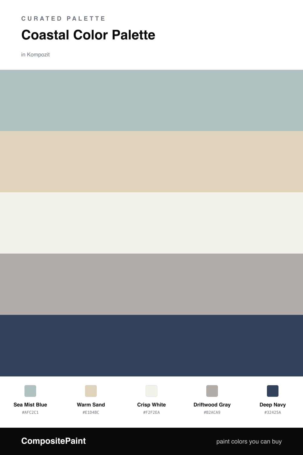
There is a reason coastal colors never really go out of style. They borrow straight from the view — the soft haze of the water, sun-bleached sand, weathered wood. This palette leans on a gentle Sea Mist Blue as the lead, the kind of soft sea blue that reads almost like a neutral in good light.

Warm Sand and Crisp White keep everything light and breezy, while Driftwood Gray adds that lived-in, sun-faded texture that stops the whole thing from looking too sweet. It is the quiet glue that makes a coastal room feel real instead of themed.

Then comes Deep Navy, your anchor. A little goes a long way — use it on a door, some trim, or one piece of furniture. For a 2026 feel, skip the seashells and rope and let the colors do the work — clean, airy, and grown-up coastal.

Buy These Colors

Each color matched to the closest real paint in every brand, by ΔE2000. Kompozit first; take any SKU to the store — these mix on demand.

Sea Mist Blue
#A7C4C9 · LRV 52 · Dominant
Kompozit Indulgence · 0483 ΔE 3.66
Backdrop Lost in the 80s · BD-LO ΔE 4.9
Behr Shaved Ice · N490-3 ΔE 1.04
Benjamin Moore Paradiso · 717 ΔE 1.08
Clare Summer Friday · PNT100-LT-37 ΔE 2.6
Dunn-Edwards Blue Spruce · DE5772 ΔE 1.54
Farrow & Ball Blue Ground · No. 210 ΔE 2.44
Magnolia Home It Is Well · JG-76 ΔE 1.81
PPG / Glidden Chambray · 1153-4 ΔE 4.81
Sherwin-Williams Agua Fría · SW 9053 ΔE 2.31
Valspar Robin's Pride · T623 ΔE 1.51
Warm Sand
#E2D4BC · LRV 67 · Secondary
Kompozit Barberry Sand · 0278 ΔE 0.47
Backdrop Cookies & Cream · BD-CC ΔE 2.86
Behr Wax Sculpture · PPU7-17 ΔE 0.74
Benjamin Moore Cayman Islands · 952 ΔE 0.38
Clare Turbinado · PNT100-LT-21 ΔE 2.2
Dunn-Edwards Sand Dollar · DE6171 ΔE 1.19
Farrow & Ball Off-White · No. 3 ΔE 1.32
Magnolia Home Morning Snow · JG-167 ΔE 2.06
PPG / Glidden Alpaca Wool · 14-19 ΔE 0.52
Sherwin-Williams Patience · SW 7555 ΔE 1.84
Valspar Dance With the Wind · 8004-22B ΔE 2.27
Crisp White
#F4F1E9 · LRV 88 · Base
Kompozit Cyprus Spring · 0411 ΔE 1.48
Backdrop Tabula Rasa · BD-TR ΔE 1.56
Behr Solid Opal · BWC-06 ΔE 1.9
Benjamin Moore Gardenia · AF-10 ΔE 0.51
Clare Wing It · PNT100-LT-24 ΔE 2.68
Dunn-Edwards Wishful White · DE6260 ΔE 0.46
Farrow & Ball Wimborne White · No. 239 ΔE 1.35
Magnolia Home Silos White · JG-107 ΔE 0.73
PPG / Glidden Crumb Cookie · 18-01 ΔE 1.19
Sherwin-Williams White Flour · SW 7102 ΔE 1.18
Valspar Crisp Cotton · 7007-4 ΔE 1.05
Driftwood Gray
#B3AAA0 · LRV 41 · Support
Kompozit Smoky Wings · 0553 ΔE 3.49
Backdrop Nuevo · BD-NU ΔE 6.81
Behr Perfect Taupe · PPU18-13 ΔE 0.73
Benjamin Moore Evening Gown · CSP-375 ΔE 1.42
Clare Make Waves · PNT100-MD-43 ΔE 13.53
Dunn-Edwards Shaggy Barked · DEC771 ΔE 4.27
Farrow & Ball Hardwick White · No. 5 ΔE 3.44
Magnolia Home Rustic Oak · JG-110 ΔE 2.16
PPG / Glidden Shadow Taupe · 14-01 ΔE 0.51
Sherwin-Williams Perfect Greige · SW 6073 ΔE 1.47
Valspar London Coach · 4002-1B ΔE 3.65
Deep Navy
#1F3A52 · LRV 4 · Accent
Kompozit Star-Studded · 0620 ΔE 4.55
Backdrop Last Call · BD-LC ΔE 8.71
Behr Midnight Dream · 570F-7 ΔE 2.28
Benjamin Moore Marine Blue · 2059-10 ΔE 1.71
Clare Blackish · PNT100-DP-54 ΔE 15.22
Dunn-Edwards Old Mill · DEA185 ΔE 6.66
Farrow & Ball Pitch Black · No. 256 ΔE 13.97
Magnolia Home Blackboard · JG-05 ΔE 9.49
PPG / Glidden Victory Blue · 1165-7 ΔE 8.62
Sherwin-Williams In the Navy · SW 9178 ΔE 3.16
Valspar Indigo Streamer · 4010-4 ΔE 3.08

Questions

Why does this palette feel so calm?

The colors are all soft and a little muted, the way things look on a hazy beach morning. Nothing shouts, so your eye relaxes — and the one deep navy gives it just enough backbone to not feel washed out.

Where should I use the navy?

Use it in small doses — a front door, a single island, some trim, or a few pillows. Think of it as the anchor that keeps all the airy colors from floating away.

Similar Palettes

Closest schemes by color — not by label.