Coastal Color Palette — Driftwood Shore
A breezy five-color coastal scheme pairing soft sea blue and warm sand with driftwood and crisp white, anchored by a deep navy — every color matched to real paint you can buy.
By Emily Roberts · DIY Editor & First-Timer's Guide
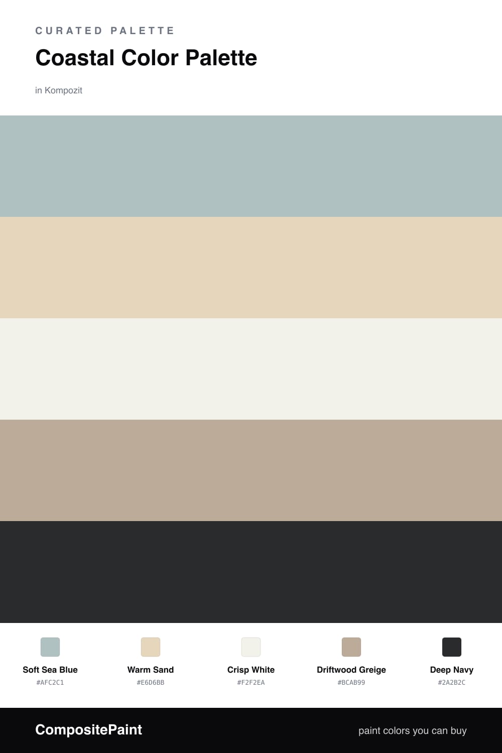
This is the coastal look without any of the cliche. Instead of a loud nautical blue, the star here is a Soft Sea Blue — gentle, slightly grayed, the color of shallow water on an overcast morning. It feels current and calm rather than themed.
Around it, Warm Sand and Driftwood Greige do the heavy lifting. They are the colors of dune grass and bleached wood, and they keep everything grounded and warm so the blue never tips cold. A clean Crisp White opens it all up and lets the soft tones breathe.
Then comes the one strong move — Deep Navy as your accent. Use it sparingly, on a front door or a single piece of furniture, and it pulls the whole palette into focus. That mix of airy neutrals with one deep anchor is exactly where coastal style is headed in 2026.
Buy These Colors
Each color matched to the closest real paint in every brand, by ΔE2000. Kompozit first; take any SKU to the store — these mix on demand.
Questions
They borrow straight from the shore — pale water-washed blue, sun-bleached sand, and weathered driftwood. Keeping them soft and a little gray (not bright) is what makes it read like a calm beach day instead of a beach towel.
Just a little. Treat the deep navy as your anchor and use it in small doses — a door, a stripe of cabinetry, or trim — so it grounds all the soft colors without taking over.
Similar Palettes
Closest schemes by color — not by label.