CP

Coastal Color Palette — Driftwood Tide

A breezy five-color coastal scheme pairing soft sea blue with sand, driftwood, and crisp white, anchored by deep navy — every color matched to real paint you can buy.

By Jessica Williams · Color Stylist & Interior Editor

Soft Sea Blue
Dominant
Kompozit Dancing in the Rain · 0644
#ABC5D6
LRV 53
Warm Sand
Secondary
Kompozit Barberry Sand · 0278
#E1D4BC
LRV 67
Crisp White
Base
Kompozit Cyprus Spring · 0411
#F2F2EA
LRV 88
Driftwood Gray
Support
Kompozit Sedge · 0226
#B1A591
LRV 38
Deep Navy
Accent
Kompozit Silent Sea · 0515
#2A2B2C
LRV 2
View palette in

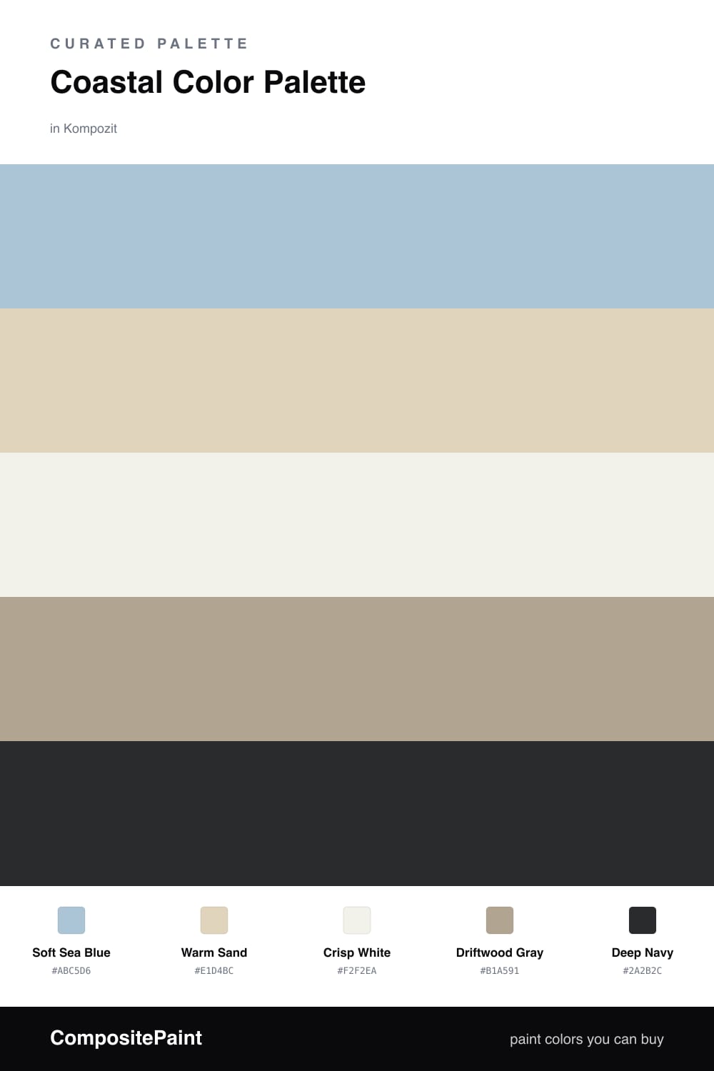
This is the palette I reach for when a space needs to breathe. Soft Sea Blue carries the whole scheme with that hazy, just-off-the-water calm, and Crisp White keeps everything feeling sun-washed and clean rather than chilly.

Warm Sand and Driftwood Gray are the textural middle, the colors of bare feet and salt-faded wood, so the room reads relaxed instead of flat. They warm the blue up and pull it toward something you actually want to live in.

Then comes Deep Navy, the anchor. A little goes a long way in 2026 — one navy door, one cabinet run, one chair — and suddenly the soft colors around it look intentional and quietly expensive.

Buy These Colors

Each color matched to the closest real paint in every brand, by ΔE2000. Kompozit first; take any SKU to the store — these mix on demand.

Soft Sea Blue
#A7C4CC · LRV 52 · Dominant
Kompozit Dancing in the Rain · 0644 ΔE 4.57
Backdrop Lost in the 80s · BD-LO ΔE 3.5
Behr Shaved Ice · N490-3 ΔE 1.63
Benjamin Moore Paradiso · 717 ΔE 2.23
Clare Summer Friday · PNT100-LT-37 ΔE 2.7
Dunn-Edwards Blue Spruce · DE5772 ΔE 2
Farrow & Ball Blue Ground · No. 210 ΔE 3.57
Magnolia Home It Is Well · JG-76 ΔE 2.88
PPG / Glidden Graceful · 1152-3 ΔE 3.8
Sherwin-Williams Agua Fría · SW 9053 ΔE 2.74
Valspar Juliet Blue · M328 ΔE 1.83
Warm Sand
#E3D5BC · LRV 68 · Secondary
Kompozit Barberry Sand · 0278 ΔE 0.53
Backdrop Cookies & Cream · BD-CC ΔE 2.64
Behr Wax Sculpture · PPU7-17 ΔE 1.03
Benjamin Moore Cayman Islands · 952 ΔE 0.78
Clare Turbinado · PNT100-LT-21 ΔE 2.54
Dunn-Edwards Sand Dollar · DE6171 ΔE 0.95
Farrow & Ball Matchstick · No. 2013 ΔE 0.47
Magnolia Home Morning Snow · JG-167 ΔE 2.06
PPG / Glidden Alpaca Wool · 14-19 ΔE 0.47
Sherwin-Williams Patience · SW 7555 ΔE 2.22
Valspar Lovely Bluff · 3004-10C ΔE 1.86
Crisp White
#F5F2EA · LRV 89 · Base
Kompozit Cyprus Spring · 0411 ΔE 1.48
Backdrop Tabula Rasa · BD-TR ΔE 1.56
Behr White Flour · OR-W10 ΔE 1.11
Benjamin Moore Opulence · 879 ΔE 1.45
Clare Wing It · PNT100-LT-24 ΔE 2.68
Dunn-Edwards Dove's Wing · DE6267 ΔE 0.5
Farrow & Ball Wimborne White · No. 239 ΔE 1.31
Magnolia Home Silos White · JG-107 ΔE 0.87
PPG / Glidden Delicate White · 1001-1 ΔE 2.37
Sherwin-Williams White Flour · SW 7102 ΔE 1.26
Valspar Santa's Beard · 8007-6E ΔE 1.49
Driftwood Gray
#B0A593 · LRV 38 · Support
Kompozit Sedge · 0226 ΔE 0.78
Backdrop Nuevo · BD-NU ΔE 7.62
Behr Garden Wall · 730D-4 ΔE 1.34
Benjamin Moore Rocky Beach · CSP-190 ΔE 0.78
Clare Mellow Mood · PNT100-DP-78 ΔE 12.8
Dunn-Edwards Hickory · DEC759 ΔE 4.52
Farrow & Ball Light Gray · No. 17 ΔE 1.45
Magnolia Home Quaint Cottage · JG-114 ΔE 2.74
PPG / Glidden Aldabra · 14-28 ΔE 2.66
Sherwin-Williams Ethereal Mood · SW 7639 ΔE 0.95
Valspar Ashen Gray · 6004-1C ΔE 2.58
Deep Navy
#1F2F44 · LRV 3 · Accent
Kompozit Silent Sea · 0515 ΔE 10.65
Backdrop Hocus Pocus · BD-HP ΔE 9.47
Behr Deep Space · 750F-7 ΔE 8.8
Benjamin Moore Winding Waterway · 2063-10 ΔE 4.2
Clare Blackish · PNT100-DP-54 ΔE 15.14
Dunn-Edwards Old Mill · DEA185 ΔE 5.37
Farrow & Ball Pitch Black · No. 256 ΔE 12.83
Magnolia Home Blackboard · JG-05 ΔE 7.88
PPG / Glidden Victory Blue · 1165-7 ΔE 7.93
Sherwin-Williams Anchors Aweigh · SW 9179 ΔE 4.13
Valspar Blue Coal · 4011-3 ΔE 3.95

Questions

Why do these coastal colors work together?

They all share a soft, weathered quality, like sea glass and bleached wood after a long summer. The blue and sand stay gentle while the navy gives one strong place for your eye to rest.

How do I balance them in a room?

Let the sea blue and white lead across walls and trim, bring in sand and driftwood through textiles and wood tones, then use navy in small doses on a door or a single piece of furniture.

Similar Palettes

Closest schemes by color — not by label.