CP

Coastal Color Palette — Coastal Dawn

A breezy five-color coastal scheme that pairs soft sea blue and warm sand with driftwood, crisp white, and a deep navy anchor — every color matched to real paint you can buy.

By Emily Roberts · DIY Editor & First-Timer's Guide

Soft Sea Blue
Dominant
Kompozit Bluette · 0616
#9EBED8
LRV 49
Warm Sand
Secondary
Kompozit Palest of Lemon · 0264
#E6D6BB
LRV 69
Crisp White
Base
Kompozit Cyprus Spring · 0411
#F2F2EA
LRV 88
Driftwood Gray
Support
Kompozit Young Colt · 0198
#A79B8C
LRV 34
Deep Navy
Accent
Kompozit Silent Sea · 0515
#2A2B2C
LRV 2
View palette in

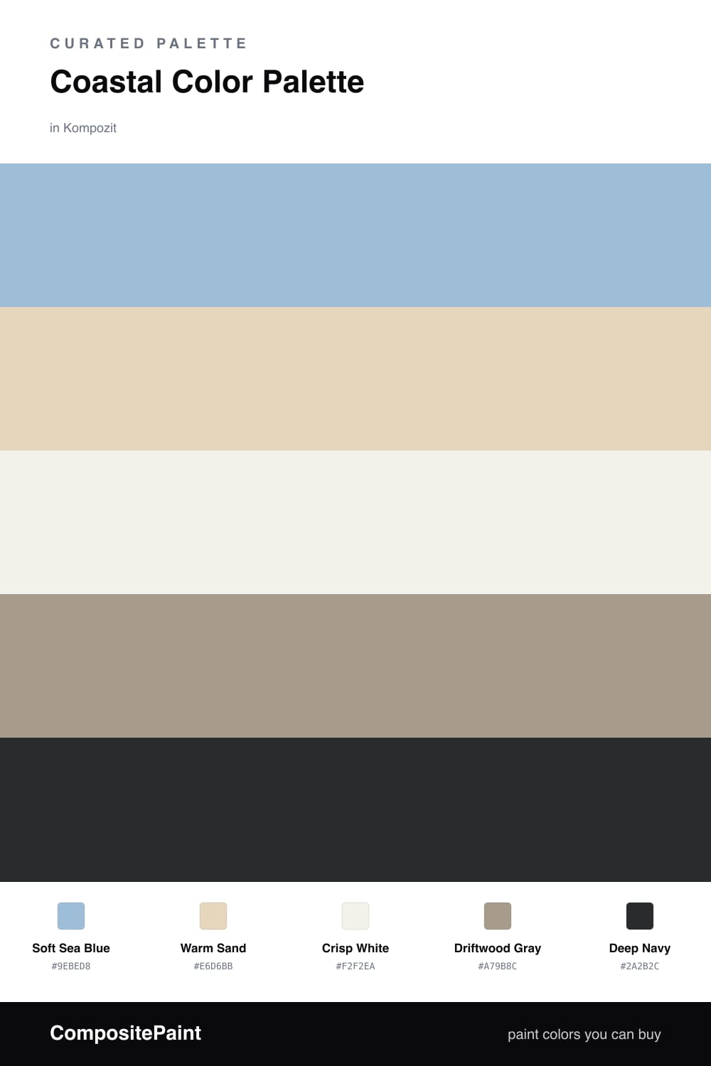
This is the palette I reach for when someone tells me they want their home to feel like a deep breath. Soft Sea Blue leads the way — it is that hazy, early-morning water color, gentle enough to live on big walls without ever feeling cold. Warm Sand comes in right behind it to keep everything grounded and sunny.

Crisp White is your breathing room. Use it on trim, ceilings, and anywhere you want light to bounce, and it keeps the whole scheme feeling clean and current rather than themed or kitschy. Driftwood Gray is the quiet glue — that soft weathered-wood tone is perfect for a cabinet, a built-in, or a moody hallway.

Then there is Deep Navy, the anchor. A little goes a long way here. A navy front door, an island, or a single accent wall gives the breezy colors something solid to lean on. Lead with the blue, let the sand and white do the soft work, and save the navy for the moments you want to feel intentional.

Buy These Colors

Each color matched to the closest real paint in every brand, by ΔE2000. Kompozit first; take any SKU to the store — these mix on demand.

Soft Sea Blue
#9DBFC9 · LRV 49 · Dominant
Kompozit Bluette · 0616 ΔE 6.98
Backdrop Lost in the 80s · BD-LO ΔE 3.53
Behr Blue Willow · 570F-4 ΔE 1.21
Benjamin Moore Northern Air · 1676 ΔE 3.37
Clare Cloud Watching · PNT100-MD-73 ΔE 6.28
Dunn-Edwards Frozen Tundra · DE5793 ΔE 2.35
Farrow & Ball Blue Ground · No. 210 ΔE 3.71
Magnolia Home Texas Summer · JG-64 ΔE 9.58
PPG / Glidden Colonial Aqua · 1148-4 ΔE 3.53
Sherwin-Williams Rest Assured · SW 9061 ΔE 0.56
Valspar Memorybook Blue · 4007-5C ΔE 2
Warm Sand
#E4D5BB · LRV 68 · Secondary
Kompozit Palest of Lemon · 0264 ΔE 0.51
Backdrop Cookies & Cream · BD-CC ΔE 2.96
Behr Wax Sculpture · PPU7-17 ΔE 1.39
Benjamin Moore Mohair · 1058 ΔE 0.53
Clare Turbinado · PNT100-LT-21 ΔE 2.91
Dunn-Edwards Sand Dollar · DE6171 ΔE 1.29
Farrow & Ball Matchstick · No. 2013 ΔE 0.37
Magnolia Home Morning Snow · JG-167 ΔE 2.47
PPG / Glidden Alpaca Wool · 14-19 ΔE 0.37
Sherwin-Williams Irish Cream · SW 7537 ΔE 1.1
Valspar Lovely Bluff · 3004-10C ΔE 1.76
Crisp White
#F6F3EC · LRV 90 · Base
Kompozit Cyprus Spring · 0411 ΔE 1.71
Backdrop Tabula Rasa · BD-TR ΔE 2.04
Behr Whisper White · HDC-MD-08 ΔE 0.58
Benjamin Moore Opulence · 879 ΔE 0.99
Clare Timeless · PNT100-LT-04 ΔE 1.25
Dunn-Edwards Droplets · DEW381 ΔE 0.97
Farrow & Ball Wimborne White · No. 239 ΔE 1.74
Magnolia Home True White · JG-21 ΔE 2.01
PPG / Glidden Delicate White · 1001-1 ΔE 2.15
Sherwin-Williams High Reflective White · SW 7757 ΔE 1.6
Valspar Ivory Keys · 8007-4A ΔE 0.95
Driftwood Gray
#A89A8A · LRV 33 · Support
Kompozit Young Colt · 0198 ΔE 0.93
Backdrop Anita · BD-AN ΔE 1.14
Behr Chic Taupe · N230-4 ΔE 2.59
Benjamin Moore Creekbed · 1006 ΔE 1.7
Clare Set In Stone · PNT100-LT-15 ΔE 12.46
Dunn-Edwards Wooden Peg · DE6215 ΔE 2.45
Farrow & Ball Pigeon · No. 25 ΔE 6.6
Magnolia Home Antiquing · JG-128 ΔE 3.56
PPG / Glidden Diversion · 1021-4 ΔE 0.5
Sherwin-Williams Threshold Taupe · SW 7501 ΔE 1.95
Valspar Land of Nod · T589 ΔE 3.14
Deep Navy
#1F3148 · LRV 3 · Accent
Kompozit Silent Sea · 0515 ΔE 11.44
Backdrop Hocus Pocus · BD-HP ΔE 10.43
Behr Sorcerer · 760F-7 ΔE 3.94
Benjamin Moore Winding Waterway · 2063-10 ΔE 4.29
Clare Blackish · PNT100-DP-54 ΔE 15.46
Dunn-Edwards Old Mill · DEA185 ΔE 5.27
Farrow & Ball Pitch Black · No. 256 ΔE 13.38
Magnolia Home Blackboard · JG-05 ΔE 8.5
PPG / Glidden Victory Blue · 1165-7 ΔE 7.52
Sherwin-Williams Anchors Aweigh · SW 9179 ΔE 4.65
Valspar Blue Coal · 4011-3 ΔE 4.56

Questions

Why do these colors feel so calm together?

They all come from the same coastline — sky, sand, weathered wood, and water. Because they share that soft, slightly grayed tone, nothing fights for attention, so the room reads as easygoing and fresh.

How much navy should I actually use?

Just a little. Think of the deep navy as your anchor — a door, a console, or cushions. Roughly one-tenth of the room is plenty to add depth without making things feel heavy.

Similar Palettes

Closest schemes by color — not by label.