Coastal Color Palette — Coastal Drift
A breezy five-color coastal scheme built on soft sea blue, warm sand, weathered driftwood, and crisp white, with a deep navy anchor — every color matched to real paint you can buy.
By Maya Patel · Reviews Editor & Product Tester
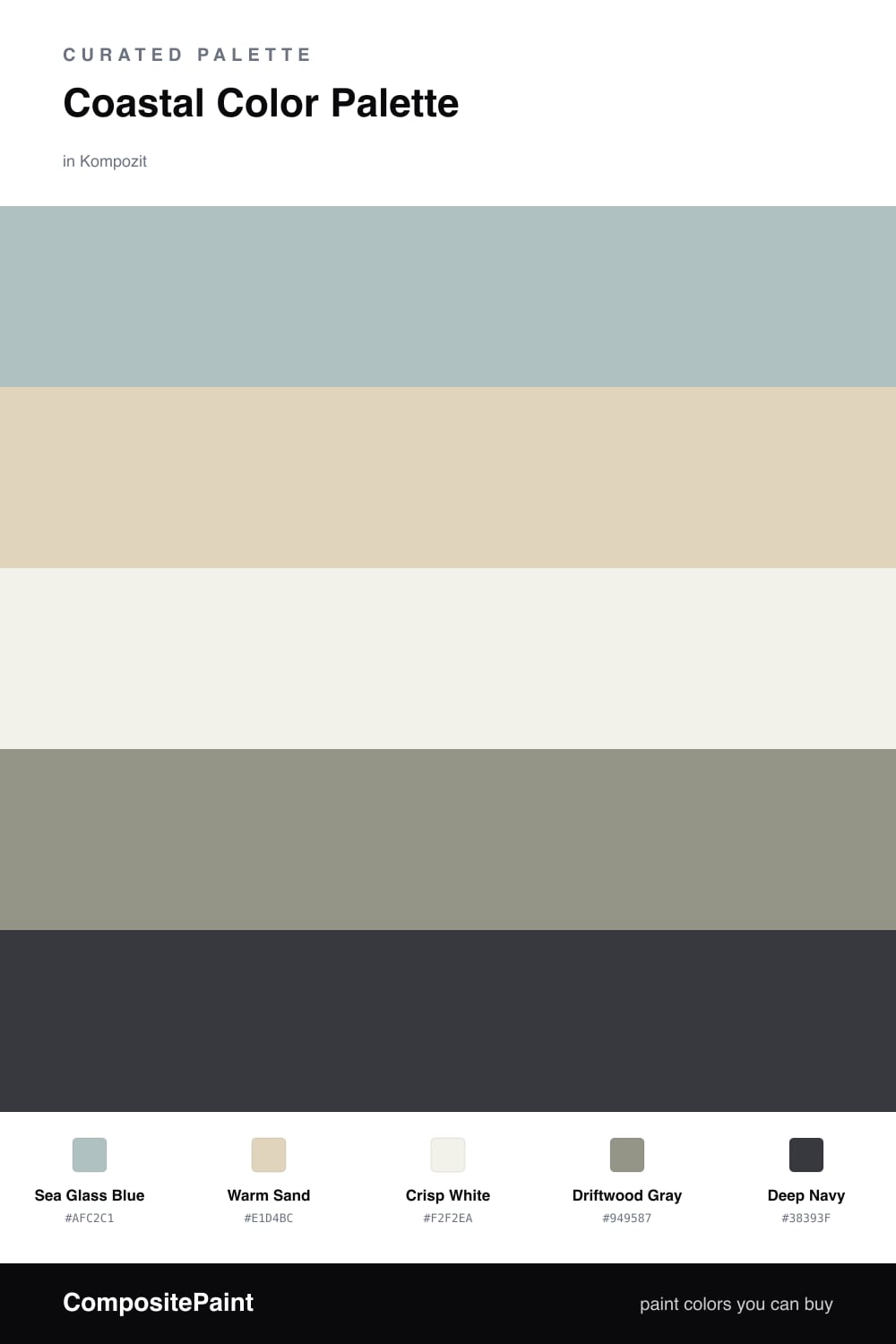
Coastal does not have to mean tired nautical stripes. This is the cleaner, quieter version for 2026 — soft and sun-washed, with one color doing the heavy lifting and the rest staying out of the way. Sea Glass Blue leads, that pale gray-blue you see in beach glass and shallow water, and it sets the whole mood.
Around it, Warm Sand and Driftwood Gray add the texture you actually want from a coastal room without going beige and boring. Crisp White keeps everything bright and airy, the way light off the water looks at midday. These four are the easy part, and you can move between them freely.
The color that makes it feel intentional is Deep Navy. Use it sparingly — a front door, a single accent wall, or cabinetry — and it grounds all that softness so the palette reads designed rather than washed out. That is the trade-off worth getting right here: too much navy and you lose the breeziness, too little and the room drifts. One strong dose is the sweet spot.
Buy These Colors
Each color matched to the closest real paint in every brand, by ΔE2000. Kompozit first; take any SKU to the store — these mix on demand.
Questions
They borrow straight from the shoreline — a soft sea blue, pale sand, and gray driftwood all sit in the same muted family, so nothing fights. The deep navy is the one strong note that keeps the whole thing from going flat.
Let the sea glass blue and white carry most of the room, lean on sand and driftwood for warmth, and save the navy for a single anchor like a door or one wall. A rough 60/30/10 split between light, mid, and dark reads calm rather than busy.
Similar Palettes
Closest schemes by color — not by label.