CP

Coastal Color Palette — Linen & Tide

A breezy five-color coastal scheme pairing soft sea blue and warm sand with crisp linen white and a deep navy anchor, every color matched to real paint you can buy.

By David Chen · Formulation Lead & Resident Chemist

Sea Mist Blue
Dominant
Kompozit Dancing in the Rain · 0644
#ABC5D6
LRV 53
Warm Sand
Secondary
Kompozit Golden Buff · 0288
#DEC8A3
LRV 59
Linen White
Base
Kompozit Queen Anne's Lace · 0558
#F0ECE2
LRV 84
Driftwood Gray
Support
Kompozit Sultry Castle · 0562
#948D84
LRV 27
Deep Navy
Accent
Kompozit Octavius · 0522
#38393F
LRV 4
View palette in

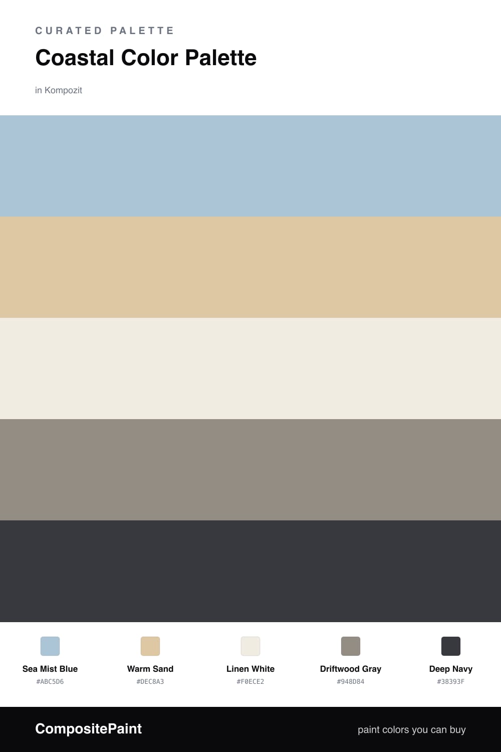
Think of this palette as a salt-washed morning at the shore. Sea Mist Blue leads the way with that soft, hazy quality you get when the sky and the water blur together, and Warm Sand answers it with a low, earthy warmth so the scheme never turns cold or clinical.

Linen White is the breathing room here. It is not a stark white but a gentle, paper-soft one, the way real linen looks in afternoon light. Driftwood Gray sits in the middle as a quiet connector, the weathered-wood tone that ties the blue and the sand together without asking for attention.

The whole thing would float away without an anchor, which is where Deep Navy earns its keep. Used in small, deliberate doses it reads as the deep water just past the breakers. This is a slightly more contemporary take on coastal for 2026 — grayer, calmer, and a little more grown-up than the bright nautical look.

Buy These Colors

Each color matched to the closest real paint in every brand, by ΔE2000. Kompozit first; take any SKU to the store — these mix on demand.

Sea Mist Blue
#A9C4CC · LRV 52 · Dominant
Kompozit Dancing in the Rain · 0644 ΔE 4.23
Backdrop Lost in the 80s · BD-LO ΔE 3.34
Behr Stargazer · N510-3 ΔE 1.85
Benjamin Moore Soft Chinchilla · 2135-50 ΔE 1.7
Clare Summer Friday · PNT100-LT-37 ΔE 2.29
Dunn-Edwards Blue Spruce · DE5772 ΔE 1.82
Farrow & Ball Blue Ground · No. 210 ΔE 4.08
Magnolia Home It Is Well · JG-76 ΔE 2.94
PPG / Glidden Twinkle · 1154-4 ΔE 2.74
Sherwin-Williams Billowy Breeze · SW 9055 ΔE 1.37
Valspar Juliet Blue · M328 ΔE 1.25
Warm Sand
#DCC8A8 · LRV 59 · Secondary
Kompozit Golden Buff · 0288 ΔE 1.47
Backdrop August · BD-AU ΔE 8.43
Behr Louvre · N280-3 ΔE 1.15
Benjamin Moore Antique Parchment · 959 ΔE 1.19
Clare High Vibe · PNT100-MD-63 ΔE 8.97
Dunn-Edwards Travertine · DEC738 ΔE 3.04
Farrow & Ball Savage Ground · No. 213 ΔE 1.67
Magnolia Home Tapestry Thread · JG-105 ΔE 5.22
PPG / Glidden Cookie Dough · 1096-3 ΔE 1.32
Sherwin-Williams Believable Buff · SW 6120 ΔE 0.41
Valspar Dakota Trail · 6008-3B ΔE 1.59
Linen White
#F2EDE2 · LRV 85 · Base
Kompozit Queen Anne's Lace · 0558 ΔE 0.6
Backdrop Jane · BD-JA ΔE 1.42
Behr Bleached Linen · PPU5-09 ΔE 1.58
Benjamin Moore Arbor White · ES-01 ΔE 1.3
Clare Wing It · PNT100-LT-24 ΔE 2.92
Dunn-Edwards Bone China · DEW339 ΔE 1.62
Farrow & Ball White Tie · No. 2002 ΔE 3.21
Magnolia Home Silos White · JG-107 ΔE 2.01
PPG / Glidden Accolade · 1208-1 ΔE 1.2
Sherwin-Williams Westhighland White · SW 7566 ΔE 0.21
Valspar Cream Delight · 7002-14 ΔE 0
Driftwood Gray
#9A9085 · LRV 29 · Support
Kompozit Sultry Castle · 0562 ΔE 1.92
Backdrop Anita · BD-AN ΔE 4.39
Behr Country Club · 770B-5 ΔE 1.9
Benjamin Moore Studio Clay · CSP-380 ΔE 3.68
Clare Shade · PNT100-MD-14 ΔE 5.71
Dunn-Edwards Bison Beige · DEC750 ΔE 2.74
Farrow & Ball Charleston Gray · No. 243 ΔE 1.75
Magnolia Home Homebody · JG-136 ΔE 3.22
PPG / Glidden Nut Shell · 14-02 ΔE 1.41
Sherwin-Williams Elephant Ear · SW 9168 ΔE 0.68
Valspar State of Mind · 8005-10E ΔE 2.06
Deep Navy
#27384C · LRV 4 · Accent
Kompozit Octavius · 0522 ΔE 8.02
Backdrop Last Call · BD-LC ΔE 6.92
Behr Sorcerer · 760F-7 ΔE 2.43
Benjamin Moore North Sea · CC-932 ΔE 1.77
Clare Blackish · PNT100-DP-54 ΔE 13.59
Dunn-Edwards Old Mill · DEA185 ΔE 4.36
Farrow & Ball Pitch Black · No. 256 ΔE 12
Magnolia Home Blackboard · JG-05 ΔE 7.35
PPG / Glidden Victory Blue · 1165-7 ΔE 7.04
Sherwin-Williams In the Navy · SW 9178 ΔE 1.43
Valspar Indigo Streamer · 4010-4 ΔE 3.39

Questions

Why do these coastal colors work together?

They share the same soft, slightly grayed quality you see on a hazy beach morning, so nothing feels too bright. The deep navy gives the eye a place to rest and keeps the lighter tones from drifting into mush.

How do I balance them in a space?

Let the sea blue lead and the linen white carry most of the open surfaces. Use sand and driftwood as quiet middle tones, then save the navy for one grounding moment such as a door or a single piece of furniture.

Similar Palettes

Closest schemes by color — not by label.