Coastal Color Palette — Driftwood Dusk
A breezy five-color coastal scheme built from soft sea blue, warm sand, weathered driftwood, and crisp white, anchored by a deep navy — every color matched to real paint you can buy.
By David Chen · Formulation Lead & Resident Chemist
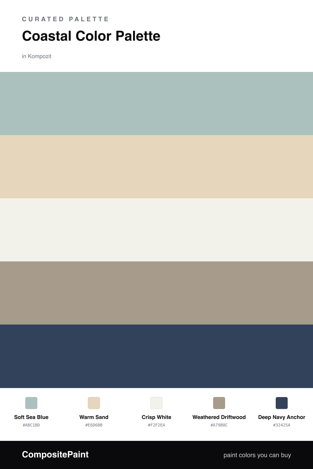
Think of a quiet beach just after the sun drops. The water turns a soft, hazy blue, the sand cools to a warm gray, and the old driftwood glows for a few minutes before the dark sets in. That moment is the whole idea behind this palette. Soft Sea Blue leads, calm and a little faded, the way real coastal light always looks washed rather than bright.
Warm Sand and Weathered Driftwood do the steady work in the middle. They are close enough in tone that they read as one easy, breezy backdrop, while Crisp White keeps everything feeling open and clean instead of murky. This is the part that makes a coastal room feel airy rather than themed.
Then there is Deep Navy Anchor, and a little goes a long way. Use it like the dark line of the horizon at dusk — one strong edge that makes all the soft colors feel intentional. For 2026 I like it on a single door or a built-in, not the walls, so the room stays light and the navy stays the moment your eye keeps coming back to.
Buy These Colors
Each color matched to the closest real paint in every brand, by ΔE2000. Kompozit first; take any SKU to the store — these mix on demand.
Questions
They all share a soft, slightly grayed quality, like light bouncing off water at the end of the day. The sea blue, sand, and driftwood are close in tone, so they blend gently, while the deep navy gives the eye one strong place to land.
Let the soft sea blue lead and the white open things up, with sand and driftwood as quiet middle tones. Save the deep navy for one small move — a door, a shelf, or trim — so it reads as an anchor and not a weight.
Similar Palettes
Closest schemes by color — not by label.