CP

Coastal Color Palette — Driftwood & Wren

A breezy five-color coastal scheme pairing soft sea blue and warm sand with driftwood, crisp white, and a deep navy anchor — every color matched to real paint you can buy.

By Emily Roberts · DIY Editor & First-Timer's Guide

Sea Blue
Dominant
Kompozit Bluette · 0616
#9EBED8
LRV 49
Soft Sand
Secondary
Kompozit Palest of Lemon · 0264
#E6D6BB
LRV 69
Crisp White
Base
Kompozit Sugar Dust · 0011
#F8F6ED
LRV 92
Driftwood Gray
Support
Kompozit Sedge · 0226
#B1A591
LRV 38
Deep Navy
Accent
Kompozit Atlantic Waves · 0473
#264243
LRV 5
View palette in

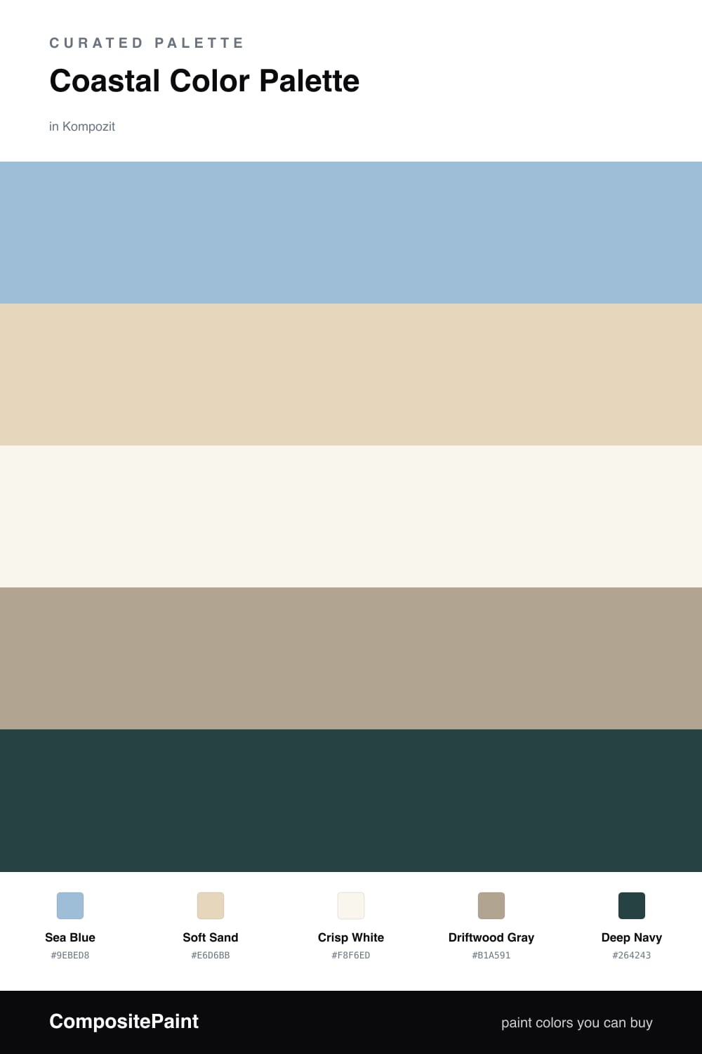
Coastal does not have to mean beach-house clichés. This scheme leans on a soft, airy Sea Blue as the dominant color, the kind of hazy blue you get when water meets a hot sky. It feels fresh and very 2026 without trying too hard.

Around it, Soft Sand and Crisp White keep everything light and easy, while Driftwood Gray adds that weathered, lived-in warmth so the room does not read as cold. These three are your calm middle — the colors you can live with every day.

Then comes Deep Navy, your anchor. Use it in small doses on a front door, a single wall, or a bit of trim. A little goes a long way, and that one deep note is what makes the soft colors feel intentional instead of washed out.

Buy These Colors

Each color matched to the closest real paint in every brand, by ΔE2000. Kompozit first; take any SKU to the store — these mix on demand.

Sea Blue
#9FC1CC · LRV 50 · Dominant
Kompozit Bluette · 0616 ΔE 6.55
Backdrop Lost in the 80s · BD-LO ΔE 2.99
Behr Blue Willow · 570F-4 ΔE 1.09
Benjamin Moore Mediterranean Sky · 1662 ΔE 1.74
Clare Cloud Watching · PNT100-MD-73 ΔE 5.98
Dunn-Edwards Frozen Tundra · DE5793 ΔE 2.03
Farrow & Ball Blue Ground · No. 210 ΔE 3.99
Magnolia Home It Is Well · JG-76 ΔE 4.46
PPG / Glidden Graceful · 1152-3 ΔE 3.88
Sherwin-Williams Rest Assured · SW 9061 ΔE 1.07
Valspar High Noon · 5001-5B ΔE 1.84
Soft Sand
#E4D7BE · LRV 69 · Secondary
Kompozit Palest of Lemon · 0264 ΔE 1.27
Backdrop Cookies & Cream · BD-CC ΔE 2.03
Behr Scribe · MQ2-31 ΔE 1.13
Benjamin Moore Mohair · 1058 ΔE 1.28
Clare Neutral Territory · PNT100-LT-20 ΔE 4.3
Dunn-Edwards Sand Dollar · DE6171 ΔE 0.54
Farrow & Ball Matchstick · No. 2013 ΔE 1
Magnolia Home Morning Snow · JG-167 ΔE 1.66
PPG / Glidden Alpaca Wool · 14-19 ΔE 1
Sherwin-Williams Echelon Ecru · SW 7574 ΔE 0.89
Valspar Lovely Bluff · 3004-10C ΔE 2.3
Crisp White
#F6F4ED · LRV 90 · Base
Kompozit Sugar Dust · 0011 ΔE 0.99
Backdrop Tabula Rasa · BD-TR ΔE 1.87
Behr Whisper White · HDC-MD-08 ΔE 0.51
Benjamin Moore Mountain Peak White · 2148-70 ΔE 1.38
Clare Timeless · PNT100-LT-04 ΔE 0.78
Dunn-Edwards Droplets · DEW381 ΔE 0.97
Farrow & Ball Wimborne White · No. 239 ΔE 1.8
Magnolia Home True White · JG-21 ΔE 1.57
PPG / Glidden Delicate White · 1001-1 ΔE 1.86
Sherwin-Williams High Reflective White · SW 7757 ΔE 1.12
Valspar Ivory Keys · 8007-4A ΔE 0.91
Driftwood Gray
#B3A892 · LRV 40 · Support
Kompozit Sedge · 0226 ΔE 1.35
Backdrop Le Freak · BD-LF ΔE 8.54
Behr Stone Walls · PPU8-19 ΔE 1.49
Benjamin Moore Clarksville Gray · HC-102 ΔE 1.75
Clare Mellow Mood · PNT100-DP-78 ΔE 13.06
Dunn-Edwards Shaggy Barked · DEC771 ΔE 1.73
Farrow & Ball Light Gray · No. 17 ΔE 2.33
Magnolia Home Rustic Oak · JG-110 ΔE 3.99
PPG / Glidden Olive Gray · 1027-4 ΔE 2.5
Sherwin-Williams Universal Khaki · SW 6150 ΔE 1.92
Valspar Earthy Beige · M351 ΔE 1.23
Deep Navy
#1F3A4D · LRV 4 · Accent
Kompozit Atlantic Waves · 0473 ΔE 10.78
Backdrop Last Call · BD-LC ΔE 9.91
Behr Midnight Dream · 570F-7 ΔE 4.88
Benjamin Moore North Sea · CC-932 ΔE 3.17
Clare Blackish · PNT100-DP-54 ΔE 14.11
Dunn-Edwards Old Mill · DEA185 ΔE 7.85
Farrow & Ball Pitch Black · No. 256 ΔE 13.05
Magnolia Home Blackboard · JG-05 ΔE 8.73
PPG / Glidden Victory Blue · 1165-7 ΔE 10.41
Sherwin-Williams In the Navy · SW 9178 ΔE 3.14
Valspar Indigo Streamer · 4010-4 ΔE 1

Questions

Why do these coastal colors work together?

They copy what you see at the shore — pale water, warm sand, weathered wood, and a dark navy that acts like the deep ocean. Because they all come from the same calm family, nothing fights for attention.

How do I balance them in a room?

Let the soft Sea Blue lead and keep the white and sand as the quiet middle. Save the Deep Navy for small moments like a door or a chair, roughly one-fifth of the space, so it stays a punch and not a weight.

Similar Palettes

Closest schemes by color — not by label.