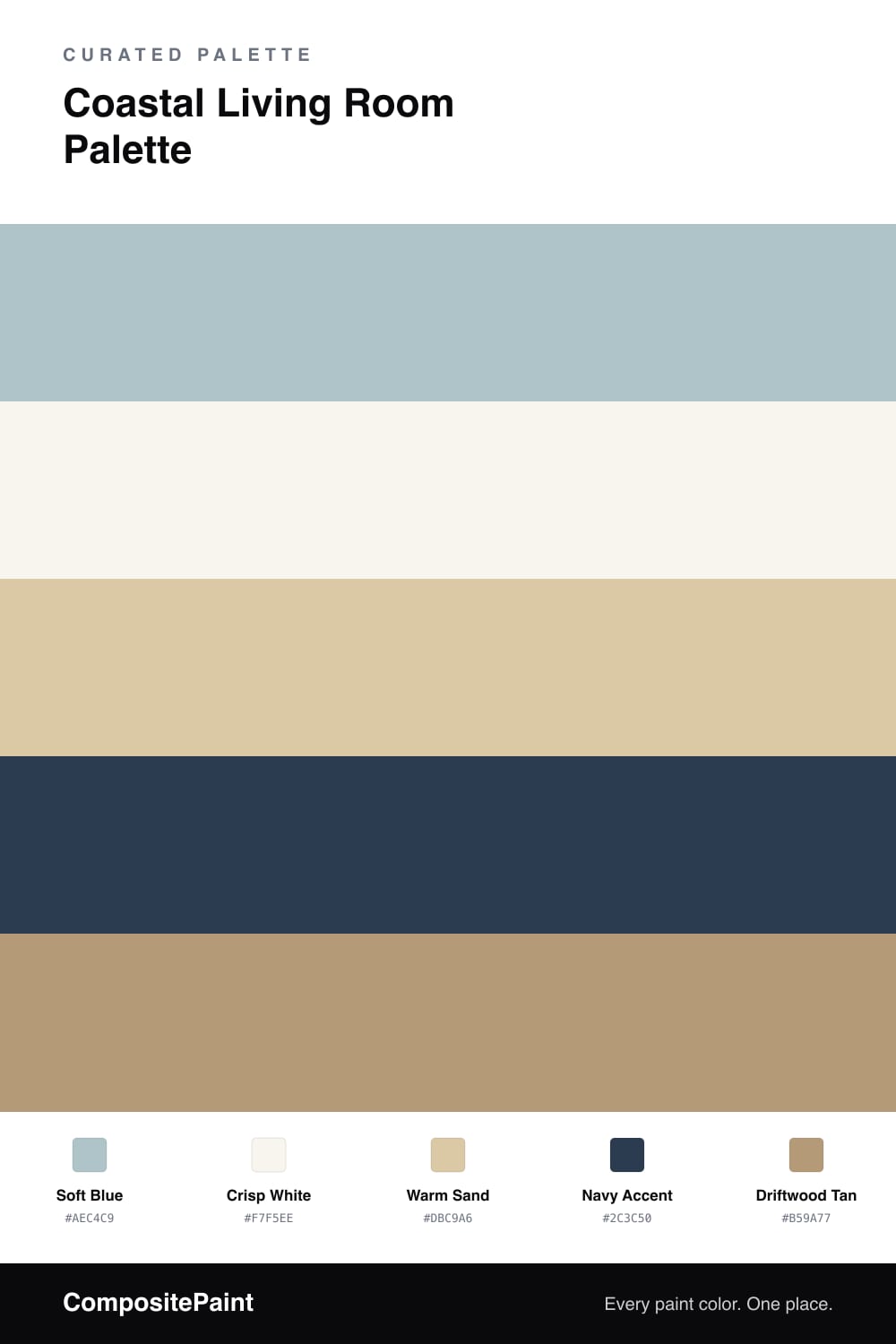
Coastal Living Room Palette — Soft Blue & Crisp White
A breezy, calming 5-color scheme for coastal living rooms: soft blue walls, crisp white trim, warm sand, a navy anchor, and driftwood tan. Every color matched to real paint you can buy.
By Jessica Williams · Color Stylist & Interior Editor
A coastal living room should feel like a breeze off the water, light and unhurried. This palette starts with soft blue on the walls — a gently grayed shade that reads like sea glass and sky, calm rather than bright, so the room feels airy and relaxed.
Crisp white on the trim and ceiling keeps the edges clean and the space bright, the way a beach house catches every bit of sun. Warm sand softens it through slipcovered furniture, natural rugs, and woven baskets, echoing the shoreline and keeping the blue from feeling cool.
A navy accent gives the scheme its backbone on cushions, a lamp, or striped textiles — the deep, classic note that makes coastal feel crisp instead of washed out. Driftwood tan ties it together through floors and wood furniture. Let blue lead, white brighten, and navy anchor the calm.
Buy These Colors
Each color matched to the closest real paint in every brand, by ΔE2000. Tap a swatch for its full guide or + to save it — take any SKU to the store, they mix on demand.
Questions
A soft, slightly grayed blue like this one. It reads like sea glass and sky rather than a bright nautical blue, so the room feels calm and airy instead of themed, and it stays easy to live with year-round.
Keep navy on small surfaces — cushions, a lamp, a single chair, or striped textiles. It is the deep anchor that gives a light coastal palette some backbone, but spread too wide it loses that crisp, nautical pop.
Similar Palettes
Closest schemes by color — not by label.