CP

Burgundy Color Palette — Sable & Wine

A rich five-color scheme led by deep burgundy and warmed by soft sable and clay, with a touch of gold to lift it — every color matched to real paint you can buy.

By Emily Roberts · DIY Editor & First-Timer's Guide

Deep Burgundy
Dominant
Kompozit Purple Shadow · 1215
#493843
LRV 5
Dusty Clay
Secondary
Kompozit Summer's Eve · 0120
#A97069
LRV 21
Soft Sable
Base
Kompozit Pale Gingersnap · 0173
#EADDCA
LRV 73
Warm Greige
Support
Kompozit Soft Leather · 0336
#C5BAA6
LRV 50
Antique Gold
Accent
Kompozit Gold Finch · 0871
#BA9B5D
LRV 35
View palette in

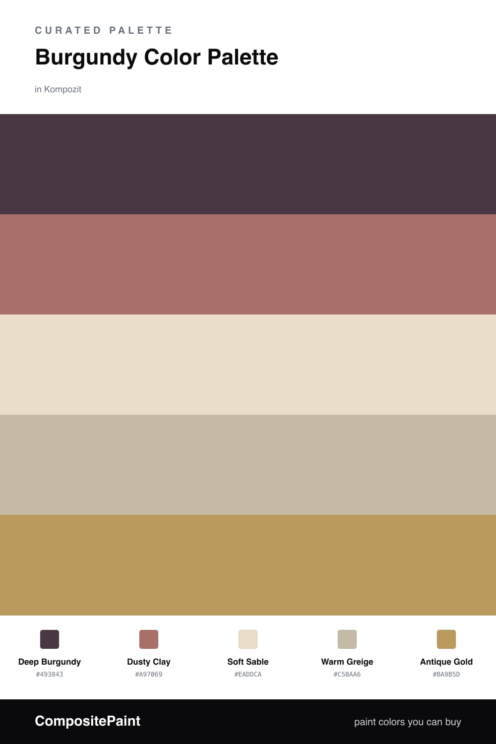
Burgundy is having a real moment right now, and honestly I get it. It feels grown-up and cozy at the same time. In this scheme Deep Burgundy does the heavy lifting as your main color, the one you commit to on a feature wall or a set of cabinets.

To keep it from feeling too serious, I leaned on warm, lived-in neutrals. Dusty Clay softens the edge between the bold and the calm, while Soft Sable and Warm Greige give your eyes a place to rest. These are the colors you can put almost anywhere and never tire of.

Then there is the fun part. A little Antique Gold in a frame, a lamp base, or a single trim detail is all you need to make the whole palette feel rich rather than flat. Use it sparingly and it reads as a quiet luxury, very much in step with where 2026 interiors are heading.

Buy These Colors

Each color matched to the closest real paint in every brand, by ΔE2000. Kompozit first; take any SKU to the store — these mix on demand.

Deep Burgundy
#5C2433 · LRV 4 · Dominant
Kompozit Purple Shadow · 1215 ΔE 12.27
Backdrop Stage Beauty · BD-SB ΔE 11.99
Behr Cimarron · BXC-69 ΔE 2.28
Benjamin Moore Bewitched · CSP-450 ΔE 6.42
Clare Blackish · PNT100-DP-54 ΔE 22.1
Dunn-Edwards Mulberry · DEA194 ΔE 10.2
Farrow & Ball Brinjal · No. 222 ΔE 7.72
Magnolia Home By The Fireplace · JG-29 ΔE 6.63
PPG / Glidden Gooseberry · 1048-7 ΔE 9.24
Sherwin-Williams Rookwood Red · SW 2802 ΔE 7.23
Valspar Royal Garnet · 1011-5 ΔE 5.02
Dusty Clay
#A9786A · LRV 23 · Secondary
Kompozit Summer's Eve · 0120 ΔE 4.21
Backdrop Hartford · BD-HF ΔE 25.4
Behr Cider Spice · S210-5 ΔE 3.34
Benjamin Moore Drenched Sienna · 1182 ΔE 0.96
Clare Dirty Chai · PNT100-DP-52 ΔE 15.42
Dunn-Edwards Handmade Red · DE6026 ΔE 6.83
Farrow & Ball Sulking Room Pink · No. 295 ΔE 7.17
Magnolia Home Work Worn Wood · JG-35 ΔE 7.42
PPG / Glidden Cinnamon Diamonds · 1055-5 ΔE 4.78
Sherwin-Williams Salon Rose · SW 61 ΔE 6.04
Valspar Clay Dusk · 1008-9B ΔE 3.25
Soft Sable
#E8DDCE · LRV 73 · Base
Kompozit Pale Gingersnap · 0173 ΔE 1.55
Backdrop Cookies & Cream · BD-CC ΔE 4.09
Behr Aged Parchment · UL150-10 ΔE 0.82
Benjamin Moore Ionic Column · 1016 ΔE 0.5
Clare No Filter · PNT100-LT-19 ΔE 3.34
Dunn-Edwards Stucco Tan · DE6205 ΔE 0.79
Farrow & Ball School House White · No. 291 ΔE 1.86
Magnolia Home Castle Cream · JG-153 ΔE 1.69
PPG / Glidden Southern Breeze · 1097-2 ΔE 2.83
Sherwin-Williams Moderate White · SW 6140 ΔE 0.22
Valspar Balance · 2004-10C ΔE 0.9
Warm Greige
#C8B8A4 · LRV 49 · Support
Kompozit Soft Leather · 0336 ΔE 2.45
Backdrop Boy Meets Girl · BD-BG ΔE 10.75
Behr Windsor Tan · MQ2-26 ΔE 1.88
Benjamin Moore Shabby Chic · 1018 ΔE 1.62
Clare Greige · PNT100-LT-13 ΔE 5.99
Dunn-Edwards Rustic Taupe · DE6129 ΔE 1.71
Farrow & Ball Drop Cloth · No. 283 ΔE 2.65
Magnolia Home Solid Wood · JG-109 ΔE 2.84
PPG / Glidden Summer Suede · 14-14 ΔE 0.48
Sherwin-Williams Loggia · SW 7506 ΔE 1.36
Valspar Tailored Tan · V132-3 ΔE 2.06
Antique Gold
#C29A4D · LRV 35 · Accent
Kompozit Gold Finch · 0871 ΔE 3.37
Backdrop Carry the Two · BD-CT ΔE 15.01
Behr Solid Gold · M280-6 ΔE 2.26
Benjamin Moore Antique Bronze · 217 ΔE 0
Clare Good as Gold · PNT100-DP-59 ΔE 4.54
Dunn-Edwards Laredo Road · DE5369 ΔE 2.08
Farrow & Ball India Yellow · No. 66 ΔE 2.96
Magnolia Home Juniper Tree · JG-166 ΔE 13.1
PPG / Glidden Amaretto Sours · 1106-6 ΔE 2.2
Sherwin-Williams Alchemy · SW 6395 ΔE 1.76
Valspar Spontaneous Sprig · V055-5 ΔE 2.32

Questions

Why does burgundy work so well with these neutrals?

Burgundy is a warm, red-based color, so it loves company that is also warm. The sable and greige share those same cozy undertones, which lets the burgundy feel deep and grounded instead of heavy.

How much burgundy is too much?

Let burgundy lead but not take over. A good rule is about half the room in burgundy, a third in the soft neutrals, and just small touches of the gold to make it feel intentional.

Similar Palettes

Closest schemes by color — not by label.