CP

Burgundy Color Palette — Cedar Cellar

A warm five-color scheme led by deep burgundy and grounded in cedar, oatmeal, and soft stone, with a brass accent — every color matched to real paint you can buy.

By David Chen · Formulation Lead & Resident Chemist

Cellar Burgundy
Dominant
Kompozit Purple Shadow · 1215
#493843
LRV 5
Cedar Brown
Secondary
Kompozit Mover and Shaker · 0158
#855D44
LRV 13
Oatmeal Linen
Base
Kompozit Sedona · 0334
#E7E0CF
LRV 75
Soft Stone
Support
Kompozit Thistle Gray · 0197
#C0B6A8
LRV 47
Aged Brass
Accent
Kompozit Golden Cadillac · 0879
#AC864B
LRV 26
View palette in

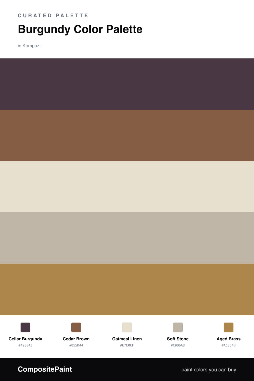
Burgundy is one of those colors that feels expensive without trying. Here Cellar Burgundy does the heavy lifting, a deep wine red that turns almost black in shadow and glows warm in lamplight. It sets the whole mood.

Cedar Brown is the bridge. It pulls the burgundy toward something natural and lived-in, the way a wood beam softens a bold wall. Around them, Oatmeal Linen and Soft Stone keep things breathable so the richness never tips into heavy.

For 2026 I would skip the polished gold and reach for Aged Brass instead, used sparingly. A little tarnish reads more modern than high shine, and against all that wine red it looks like candlelight rather than bling.

Buy These Colors

Each color matched to the closest real paint in every brand, by ΔE2000. Kompozit first; take any SKU to the store — these mix on demand.

Cellar Burgundy
#5C2230 · LRV 4 · Dominant
Kompozit Purple Shadow · 1215 ΔE 12.88
Backdrop Stage Beauty · BD-SB ΔE 11.42
Behr Cimarron · BXC-69 ΔE 2.3
Benjamin Moore Bewitched · CSP-450 ΔE 6.28
Clare Blackish · PNT100-DP-54 ΔE 22.4
Dunn-Edwards Mulberry · DEA194 ΔE 11.07
Farrow & Ball Brinjal · No. 222 ΔE 8.25
Magnolia Home By The Fireplace · JG-29 ΔE 6.26
PPG / Glidden Gooseberry · 1048-7 ΔE 9.75
Sherwin-Williams Rookwood Red · SW 2802 ΔE 6.81
Valspar Royal Garnet · 1011-5 ΔE 4.18
Cedar Brown
#8A5A3C · LRV 13 · Secondary
Kompozit Mover and Shaker · 0158 ΔE 2.52
Backdrop Buenos Aires · BD-BA ΔE 5.93
Behr Sable Brown · 240F-6 ΔE 2.09
Benjamin Moore Log Cabin · 2163-10 ΔE 2.03
Clare Vintage · PNT100-DP-67 ΔE 12.79
Dunn-Edwards Hope Chest · DEA160 ΔE 2.5
Farrow & Ball Eating Room Red · No. 43 ΔE 12.85
Magnolia Home Cognac · JG-164 ΔE 3.99
PPG / Glidden Spiced Cider · 1068-7 ΔE 2.72
Sherwin-Williams Jute Brown · SW 6096 ΔE 3.7
Valspar Natural Cork · 2008-7A ΔE 1.15
Oatmeal Linen
#E7DECE · LRV 74 · Base
Kompozit Sedona · 0334 ΔE 1.24
Backdrop Cookies & Cream · BD-CC ΔE 3.17
Behr Crisp Linen · MQ3-13 ΔE 1.31
Benjamin Moore First Crush · CSP-310 ΔE 0.77
Clare No Filter · PNT100-LT-19 ΔE 2.36
Dunn-Edwards Stucco Tan · DE6205 ΔE 0.49
Farrow & Ball School House White · No. 291 ΔE 1.04
Magnolia Home Castle Cream · JG-153 ΔE 0.49
PPG / Glidden Southern Breeze · 1097-2 ΔE 1.85
Sherwin-Williams Aged White · SW 9180 ΔE 0.5
Valspar Balance · 2004-10C ΔE 1.94
Soft Stone
#C3B6A4 · LRV 48 · Support
Kompozit Thistle Gray · 0197 ΔE 1.76
Backdrop Underdog · BD-UD ΔE 15.3
Behr Ranch Tan · QE-28 ΔE 1.77
Benjamin Moore Gallery Buff · CSP-225 ΔE 1.56
Clare Greige · PNT100-LT-13 ΔE 5.35
Dunn-Edwards Steveareno Beige · DEC766 ΔE 1.7
Farrow & Ball Jitney · No. 293 ΔE 3
Magnolia Home Sunday Stroll · JG-19 ΔE 3.67
PPG / Glidden Summer Suede · 14-14 ΔE 1.13
Sherwin-Williams Pavilion Beige · SW 7512 ΔE 0.98
Valspar Counterpoint · 8005-5C ΔE 0.9
Aged Brass
#B08A4A · LRV 28 · Accent
Kompozit Golden Cadillac · 0879 ΔE 1.7
Backdrop Anita · BD-AN ΔE 13.41
Behr Rice Curry · MQ4-9 ΔE 2.92
Benjamin Moore Goldenhurst · 196 ΔE 1.41
Clare Good as Gold · PNT100-DP-59 ΔE 6.8
Dunn-Edwards Bread Crust · DE5370 ΔE 2.08
Farrow & Ball Mouse's Back · No. 40 ΔE 12.61
Magnolia Home Vintage Crown · JG-152 ΔE 5.72
PPG / Glidden Butterscotch Ripple · 1106-7 ΔE 1.15
Sherwin-Williams Chamois · SW 6131 ΔE 3.88
Valspar Corduroy · 3007-5A ΔE 2.46

Questions

Why does burgundy work with cedar and these warm neutrals?

They all live on the warm side of the wheel, so they share an undertone and never fight. Burgundy is just a red with the volume turned down, and cedar is its lighter, woodier cousin, so the two read like family while the pale neutrals give your eye a place to rest.

How much burgundy should I actually use?

Let it lead but not flood the room — think roughly two-thirds burgundy and cedar together, one-third neutrals, with the brass showing up only in small metallic moments like hardware or a frame.

Similar Palettes

Closest schemes by color — not by label.