Rust Study Palette — Burnt Rust & Warm Linen
A grounded five-color study scheme led by burnt rust walls, warmed with linen, oak, and a deep umber accent — every color matched to real paint you can buy.
By Jessica Williams · Color Stylist & Interior Editor
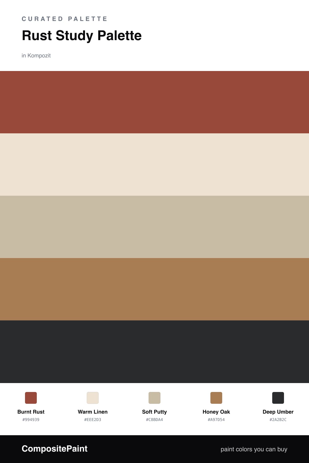
A study is where you go to think, so the color should hold you still. Burnt Rust does exactly that on the walls — it has the warmth of terracotta but more depth, the kind of shade that reads rich in lamplight and soft in the morning. It is the 2026 way to use earth tones, less rustic and more quietly confident.
To keep the room breathing, I framed the rust with Warm Linen on the trim and ceiling and Soft Putty on built-in cabinets. Those two lighten the load and let the rust feel chosen rather than heavy. Honey Oak ties it to real wood, whether that is your floor, a desk, or open shelving.
The last move is the smallest one. Deep Umber shows up only where you want weight — a chair, a frame, the inside of a bookcase. Used in tiny amounts it sharpens everything else and gives the whole study a grounded, lived-in finish.
Buy These Colors
Each color matched to the closest real paint in every brand, by ΔE2000. Kompozit first; take any SKU to the store — these mix on demand.
Questions
Rust is a warm, low-glare red-brown that feels settled rather than loud, so it wraps a small room in focus without tiring your eyes the way a true red would.
Lean on the lighter players — a warm linen ceiling and putty cabinets bounce light back, while the rust holds the walls and the umber shows up only in small grounding doses.
Similar Palettes
Closest schemes by color — not by label.