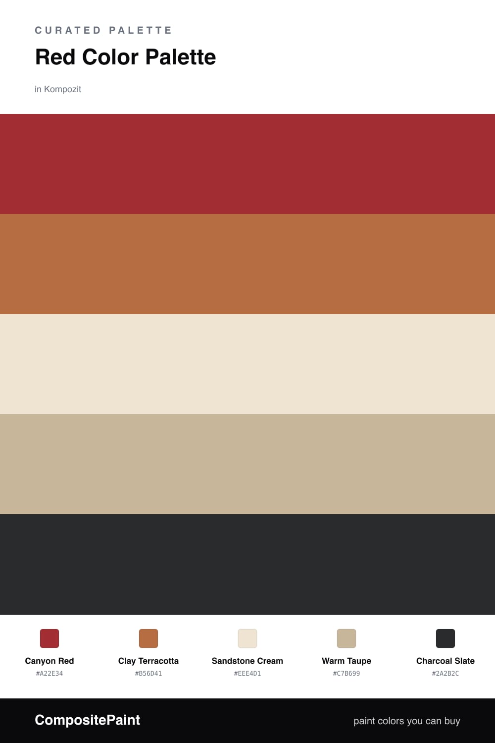
Red Color Palette — Red Canyon
A warm five-color scheme led by deep canyon red with clay, sandstone, and a soft cream, grounded by a charcoal accent — every color matched to real paint you can buy.
By Emily Roberts · DIY Editor & First-Timer's Guide
Red gets a bad rap for being hard to live with, but this scheme proves it does not have to be. Canyon Red leads the way with that deep, dusty warmth you see in the desert at golden hour, and Clay Terracotta softens right alongside it so the red never feels harsh.
The quiet work happens in the middle. Sandstone Cream opens everything up and keeps a room feeling light, while Warm Taupe bridges the gap between the bold reds and the calm base. This is where the palette earns its easygoing, lived-in feel.
For 2026 I love finishing this off with just a touch of Charcoal Slate in your fixtures or trim. Let the red dominate, keep the neutrals doing most of the surface area, and use that charcoal sparingly. The result feels current, warm, and like a place you actually want to settle into.
Buy These Colors
Each color matched to the closest real paint in every brand, by ΔE2000. Kompozit first; take any SKU to the store — these mix on demand.
Questions
The trick is letting the warm neutrals breathe between the reds. Sandstone cream and warm taupe cool things down, so the deep canyon red reads as cozy and grounded instead of loud.
Keep it small and intentional — think a metal lamp base, a picture frame, or door hardware. A little dark anchors all the warmth and makes the reds look richer.
Similar Palettes
Closest schemes by color — not by label.