CP

Charcoal Color Palette — Charcoal Loam

A grounded five-color scheme led by deep charcoal, softened with greige, warm linen, and a single clay accent — every color matched to real paint you can buy.

By Jessica Williams · Color Stylist & Interior Editor

Loam Charcoal
Dominant
Kompozit Silent Sea · 0515
#2A2B2C
LRV 2
Stone Greige
Secondary
Kompozit Cloudy Today · 0568
#A6A096
LRV 35
Warm Linen
Base
Kompozit Bleached Meadow · 0376
#EAE5D5
LRV 78
Soft Taupe
Support
Kompozit Soft Leather · 0336
#C5BAA6
LRV 50
Burnt Clay
Accent
Kompozit Flickering Flame · 1005
#AA6E49
LRV 20
View palette in

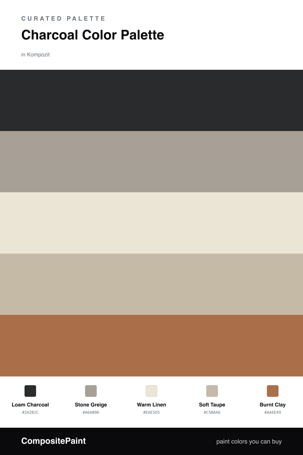
Charcoal is having a quiet moment in 2026, and this scheme shows why. Loam Charcoal leads with the soft, soil-deep feel of freshly turned earth — moody, but never cold, because it carries a whisper of brown in it.

Around it, Stone Greige and Soft Taupe do the calm middle work, and Warm Linen opens everything back up with light. These three keep the charcoal from feeling like a weight and let it breathe across a wall or a cabinet front.

The spark is Burnt Clay, a sun-baked terracotta used sparingly. A single chair, a throw, or a stretch of trim is enough to wake the whole palette up and tie that earthy, lived-in mood together.

Buy These Colors

Each color matched to the closest real paint in every brand, by ΔE2000. Kompozit first; take any SKU to the store — these mix on demand.

Loam Charcoal
#33312E · LRV 3 · Dominant
Kompozit Silent Sea · 0515 ΔE 3.61
Backdrop After Hours · BD-AH ΔE 6.73
Behr Blackout · N510-7 ΔE 5.62
Benjamin Moore Black · 2132-10 ΔE 2.76
Clare Blackish · PNT100-DP-54 ΔE 7.21
Dunn-Edwards Black · DEA187 ΔE 3.53
Farrow & Ball Pitch Black · No. 256 ΔE 2.97
Magnolia Home Blackboard · JG-05 ΔE 6.06
PPG / Glidden Black Magic · 1001-7 ΔE 5.27
Sherwin-Williams Black Magic · SW 6991 ΔE 2.71
Valspar Tomcat · 8006-12G ΔE 2.26
Stone Greige
#A9A195 · LRV 36 · Secondary
Kompozit Cloudy Today · 0568 ΔE 1.19
Backdrop Carry the Two · BD-CT ΔE 3.4
Behr Abbey Stone · MQ2-56 ΔE 2.15
Benjamin Moore Rockport Gray · HC-105 ΔE 1.32
Clare Set In Stone · PNT100-LT-15 ΔE 9.85
Dunn-Edwards Northgate Green · DE6235 ΔE 6.22
Farrow & Ball Pigeon · No. 25 ΔE 3.97
Magnolia Home Quaint Cottage · JG-114 ΔE 1.51
PPG / Glidden Simmering Smoke · 1019-4 ΔE 2.17
Sherwin-Williams Intellectual Gray · SW 7045 ΔE 0.57
Valspar Graceful Gray · 8006-2E ΔE 1.16
Warm Linen
#ECE5D8 · LRV 79 · Base
Kompozit Bleached Meadow · 0376 ΔE 1.85
Backdrop Don't Eat the Yellow Snow · BD-DS ΔE 4.27
Behr Natural Linen · W-F-120 ΔE 0.52
Benjamin Moore White Down · 970 ΔE 1.51
Clare Like Buttah · PNT100-LT-62 ΔE 2.26
Dunn-Edwards Whisper Gray · DEC785 ΔE 1.45
Farrow & Ball Dimity · No. 2008 ΔE 1.89
Magnolia Home Carter Crème · JG-16 ΔE 2.1
PPG / Glidden China White · 1101-1 ΔE 1.49
Sherwin-Williams Ivory Lace · SW 7013 ΔE 0
Valspar Bubble Bath · V154 ΔE 0.53
Soft Taupe
#C7BBA8 · LRV 51 · Support
Kompozit Soft Leather · 0336 ΔE 0.83
Backdrop Boy Meets Girl · BD-BG ΔE 12.18
Behr Celery Powder · PPU8-18 ΔE 2.42
Benjamin Moore Brick House Tan · CW-145 ΔE 0.84
Clare Greige · PNT100-LT-13 ΔE 5.85
Dunn-Edwards Rustic Taupe · DE6129 ΔE 3.37
Farrow & Ball Drop Cloth · No. 283 ΔE 0.88
Magnolia Home Solid Wood · JG-109 ΔE 1.58
PPG / Glidden Stonington · 15-25 ΔE 0.9
Sherwin-Williams Shiitake · SW 9173 ΔE 0.9
Valspar Dust Bunny · 2005-10B ΔE 5.13
Burnt Clay
#B06B4A · LRV 20 · Accent
Kompozit Flickering Flame · 1005 ΔE 2.85
Backdrop Old Soul · BD-OS ΔE 22.69
Behr Maple Glaze · PPU3-16 ΔE 2.7
Benjamin Moore Audubon Russet · HC-51 ΔE 3.71
Clare Sriracha · PNT100-DP-29 ΔE 10.3
Dunn-Edwards Autumn Umber · DE5216 ΔE 1.95
Farrow & Ball Picture Gallery Red · No. 42 ΔE 9.2
Magnolia Home Work Worn Wood · JG-35 ΔE 1.55
PPG / Glidden Mincemeat · 1200-7 ΔE 3.6
Sherwin-Williams Reynard · SW 6348 ΔE 1.64
Valspar Sienna Sky · T524 ΔE 0.93

Questions

Why does charcoal need warm neutrals around it?

On its own charcoal can read cold and heavy. Pairing it with linen, greige, and a touch of clay warms the whole room and keeps the depth feeling cozy instead of severe.

How much charcoal is too much?

Let it lead but not swallow the space. Think roughly two-thirds charcoal and neutrals, with the burnt clay used in small doses for a pillow, a chair, or a single wall.

Similar Palettes

Closest schemes by color — not by label.