CP

Greige Study Palette — Dawn Greige & Inkwell

A calm five-color study scheme led by soft dawn greige, with a warm backdrop neutral, crisp trim white, oak wood tone, and a deep inky accent — every color matched to real paint you can buy.

By Jessica Williams · Color Stylist & Interior Editor

Dawn Greige
Walls
Kompozit Soft Leather · 0336
#C5BAA6
LRV 50
Soft Linen
Cabinets or Vanity
Kompozit Feather Stone · 0229
#E3DED2
LRV 73
Quiet White
Trim & Ceiling
Kompozit Bunny Cake · 0012
#F5EFE2
LRV 87
Warm Oak
Wood & Floors
Kompozit Prince Paris · 0241
#9D7957
LRV 22
Inkwell
Accent
Kompozit Silent Sea · 0515
#2A2B2C
LRV 2
View palette in

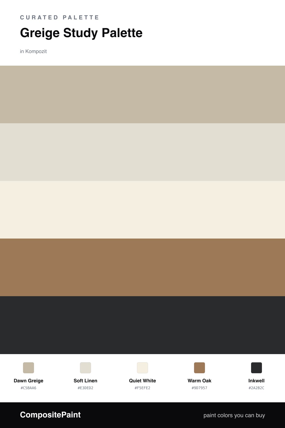
A study should feel quiet the moment you walk in, and greige does that gently. Dawn Greige on the walls reads soft and warm in morning light, then settles into a steady neutral as the day goes on, which makes it easy to think and work against.

Soft Linen lifts the cabinets and built-ins just enough to separate them from the walls, while Quiet White keeps the trim and ceiling clean and bright. Together they give the room air without any harsh contrast, so nothing pulls your eye away from the desk.

The warmth comes from Warm Oak underfoot and in the wood details, and the whole scheme finds its footing with Inkwell, a deep near-black I love for a desk or a run of shelves. It feels current for 2026 — calm, grounded, and just a little moody where it counts.

Buy These Colors

Each color matched to the closest real paint in every brand, by ΔE2000. Kompozit first; take any SKU to the store — these mix on demand.

Dawn Greige
#C7BCA9 · LRV 51 · Walls
Kompozit Soft Leather · 0336 ΔE 0.68
Backdrop Boy Meets Girl · BD-BG ΔE 12.63
Behr Celery Powder · PPU8-18 ΔE 1.95
Benjamin Moore Brick House Tan · CW-145 ΔE 0.75
Clare Greige · PNT100-LT-13 ΔE 6.01
Dunn-Edwards Birchwood · DEC752 ΔE 1.84
Farrow & Ball Drop Cloth · No. 283 ΔE 0.52
Magnolia Home Solid Wood · JG-109 ΔE 1.59
PPG / Glidden Stonington · 15-25 ΔE 1.15
Sherwin-Williams Shiitake · SW 9173 ΔE 1.15
Valspar Mother Nature · 8004-26C ΔE 3.82
Soft Linen
#E6DECF · LRV 74 · Cabinets or Vanity
Kompozit Feather Stone · 0229 ΔE 1.59
Backdrop Cookies & Cream · BD-CC ΔE 3.42
Behr Crisp Linen · MQ3-13 ΔE 0.85
Benjamin Moore Maritime White · 963 ΔE 0.76
Clare No Filter · PNT100-LT-19 ΔE 1.92
Dunn-Edwards Stucco Tan · DE6205 ΔE 0.9
Farrow & Ball School House White · No. 291 ΔE 0.56
Magnolia Home Castle Cream · JG-153 ΔE 0.42
PPG / Glidden Southern Breeze · 1097-2 ΔE 1.4
Sherwin-Williams Aged White · SW 9180 ΔE 1.01
Valspar Balance · 2004-10C ΔE 2
Quiet White
#F3EFE6 · LRV 87 · Trim & Ceiling
Kompozit Bunny Cake · 0012 ΔE 1.72
Backdrop Tabula Rasa · BD-TR ΔE 1.59
Behr Nude W-f-210 · W-F-210 ΔE 1.21
Benjamin Moore Alabaster · 876 ΔE 0.91
Clare Wing It · PNT100-LT-24 ΔE 2.52
Dunn-Edwards Latte Froth · DE6239 ΔE 0.59
Farrow & Ball Pointing · No. 2003 ΔE 2.13
Magnolia Home Silos White · JG-107 ΔE 1.14
PPG / Glidden Crumb Cookie · 18-01 ΔE 1.21
Sherwin-Williams White Flour · SW 7102 ΔE 0.55
Valspar Wedding Cake · V151 ΔE 0.5
Warm Oak
#9C7B55 · LRV 22 · Wood & Floors
Kompozit Prince Paris · 0241 ΔE 2.04
Backdrop Old Soul · BD-OS ΔE 13.09
Behr New Chestnut · 280F-5 ΔE 2.9
Benjamin Moore Caramel Apple · 1042 ΔE 1.38
Clare Dirty Chai · PNT100-DP-52 ΔE 11.86
Dunn-Edwards Pyramid · DE6153 ΔE 2.33
Farrow & Ball Mouse's Back · No. 40 ΔE 8.63
Magnolia Home Vintage Crown · JG-152 ΔE 4.31
PPG / Glidden Caramelized Pecan · 1089-7 ΔE 2.3
Sherwin-Williams Cardboard · SW 6124 ΔE 0.89
Valspar Haute Hickory · 8004-17F ΔE 0.89
Inkwell
#2C3338 · LRV 3 · Accent
Kompozit Silent Sea · 0515 ΔE 4.22
Backdrop After Hours · BD-AH ΔE 7.5
Behr Bauhaus · BXC-02 ΔE 1.04
Benjamin Moore Black Satin · 2131-10 ΔE 2.86
Clare Blackish · PNT100-DP-54 ΔE 8.88
Dunn-Edwards Black · DEA187 ΔE 5.6
Farrow & Ball Pitch Black · No. 256 ΔE 6.2
Magnolia Home Blackboard · JG-05 ΔE 2.67
PPG / Glidden Black Magic · 1001-7 ΔE 6.75
Sherwin-Williams Black Magic · SW 6991 ΔE 4.74
Valspar Very Black · 5011-2 ΔE 2.61

Questions

Why does greige work so well in a study?

Greige sits right between gray and beige, so it stays calm without going cold. That balance keeps a study restful for long hours of focus while still feeling warm and lived-in.

How much of the deep accent should I use?

Keep it small — think shelving, a desk, or a single feature wall. Roughly one-fifth of the room is plenty to ground the lighter tones without making the space feel heavy.

Similar Palettes

Closest schemes by color — not by label.