Navy Color Palette — Clay & Tide
A grounded five-color scheme led by deep navy and warmed by earthy clay, with soft greige and oat neutrals — every color matched to real paint you can buy.
By Jessica Williams · Color Stylist & Interior Editor
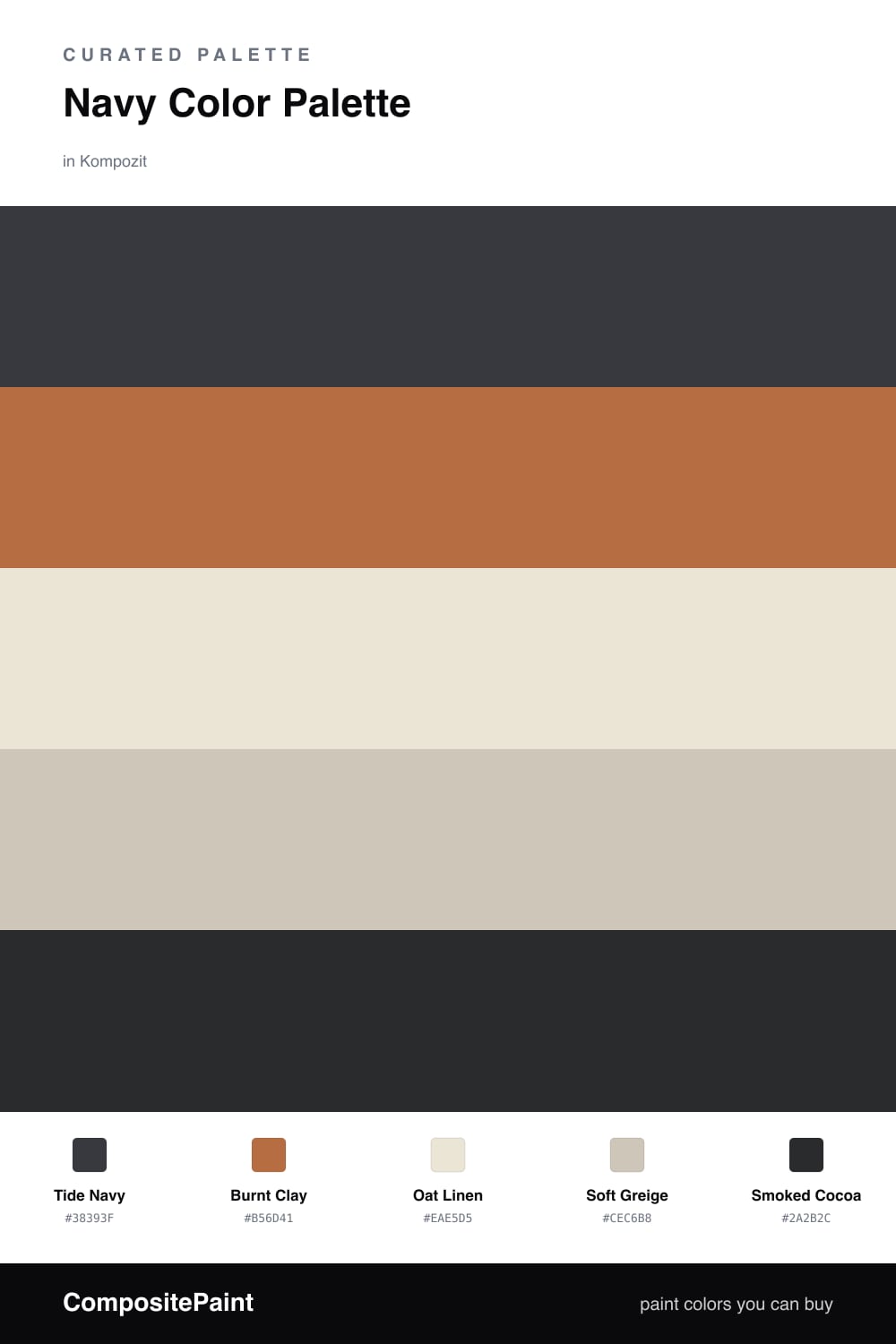
Navy and clay is the pairing I keep coming back to in 2026. Tide Navy sets a deep, dusky mood that feels calm rather than corporate, and Burnt Clay answers it with a warm, hand-thrown earthiness that softens every edge.
The quiet middle does most of the work here. Oat Linen opens the scheme up like morning light, and Soft Greige bridges the cool navy and the warm clay so they never argue. A touch of Smoked Cocoa in a frame or a leg grounds the whole thing.
Lean on the navy as your dominant color, let the clay be the spark, and keep the neutrals generous. It is a scheme that feels lived-in and grown-up — moody at night, soft and sunlit by day.
Buy These Colors
Each color matched to the closest real paint in every brand, by ΔE2000. Kompozit first; take any SKU to the store — these mix on demand.
Questions
Navy reads cool and steady, while clay brings a sun-warmed earthiness — together they feel like dusk over terracotta rooftops. The warmth keeps the navy from going cold, and the navy keeps the clay from going sweet.
Let navy carry most of the room, roughly two-thirds, with clay showing up in smaller doses like a chair, a vase, or a single wall. The oat and greige neutrals fill the space between so nothing feels heavy.
Similar Palettes
Closest schemes by color — not by label.