Terracotta Color Palette — Terracotta & Fern
A warm five-color scheme led by rich terracotta, balanced with soft fern green, oat cream, and putty neutrals, with every color matched to real paint you can buy.
By Maya Patel · Reviews Editor & Product Tester
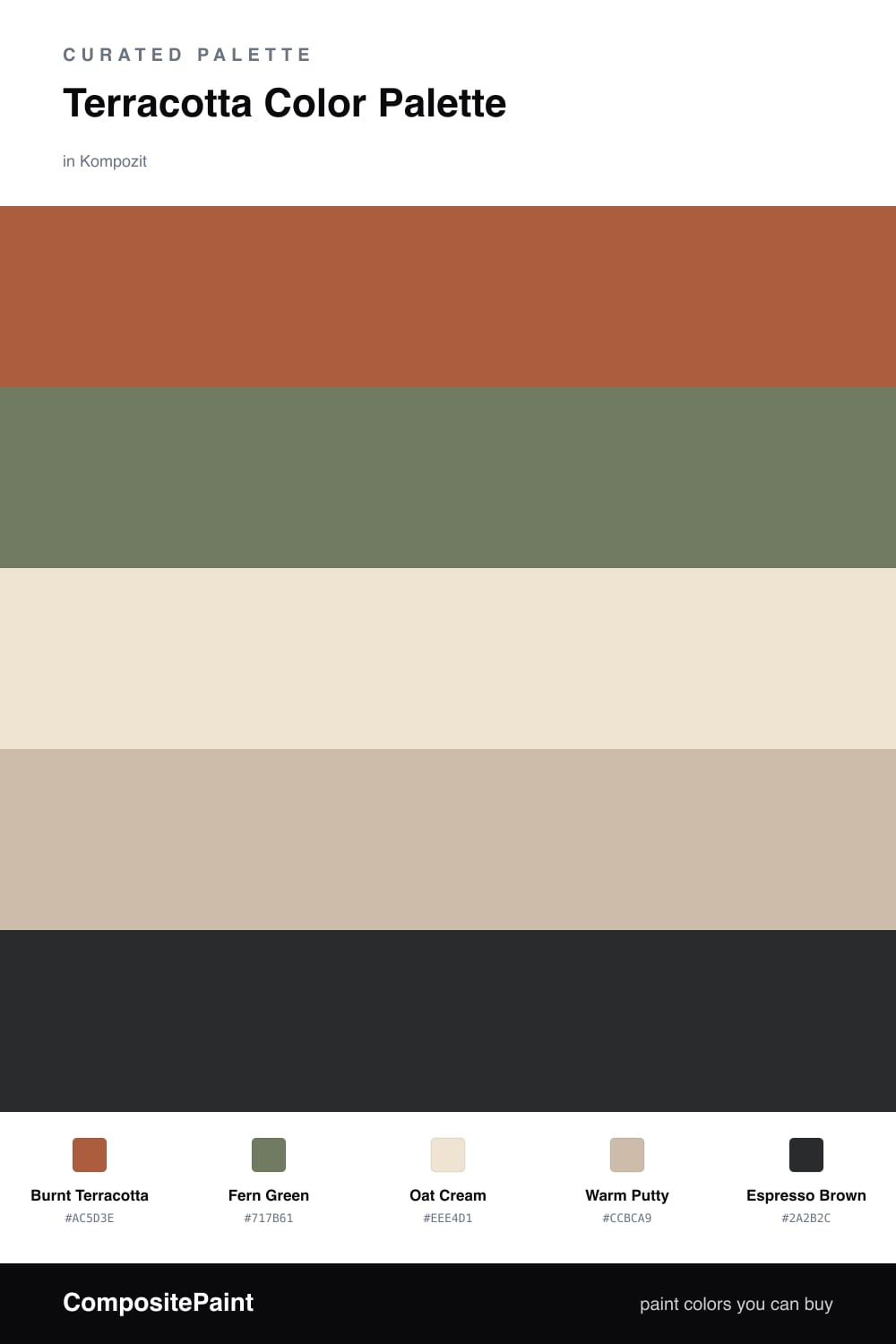
Terracotta is having a real moment in 2026, and for good reason. It reads as warm and lived-in without tipping into the heavy reds people feared a decade ago. Here Burnt Terracotta carries the whole scheme, and it is the color I would put on the biggest surface you have.
Fern Green is the move that makes it modern. It echoes the clay tones found in nature, so the pairing feels intentional rather than trendy. Between them, Oat Cream and Warm Putty keep things soft and stop the two strong colors from competing.
The one color to use sparingly is Espresso Brown. A little goes a long way, on a frame, a handle, or a single piece of furniture, and it gives the palette a clean point to land on.
Buy These Colors
Each color matched to the closest real paint in every brand, by ΔE2000. Kompozit first; take any SKU to the store — these mix on demand.
Questions
Terracotta and green sit near opposite sides of the color wheel, so they sharpen each other without clashing. Both are muted, earthy tones, which keeps the contrast warm and grounded instead of loud.
Let it lead, roughly two-thirds of the scheme, then use fern green as the secondary and the creams as breathing room. Save the espresso brown for the smallest details.
Similar Palettes
Closest schemes by color — not by label.