CP

Orange Bedroom Palette — Spiced Terracotta & Warm Linen

A cozy five-color bedroom scheme led by spiced terracotta orange, softened with warm linen and oak, and grounded by a deep clove accent — every color matched to real paint you can buy.

By Jessica Williams · Color Stylist & Interior Editor

Spiced Terracotta
Walls
Kompozit Semolina · 1011
#B6774F
LRV 24
Warm Linen
Trim & Ceiling
Kompozit Eugenia · 0285
#F2E8D4
LRV 81
Soft Putty
Cabinets or Vanity
Kompozit Garden Country · 0279
#D6C5A9
LRV 57
Honeyed Oak
Wood & Floors
Kompozit Cavern Sand · 0165
#947054
LRV 19
Deep Clove
Accent
Kompozit Silent Sea · 0515
#2A2B2C
LRV 2
View palette in

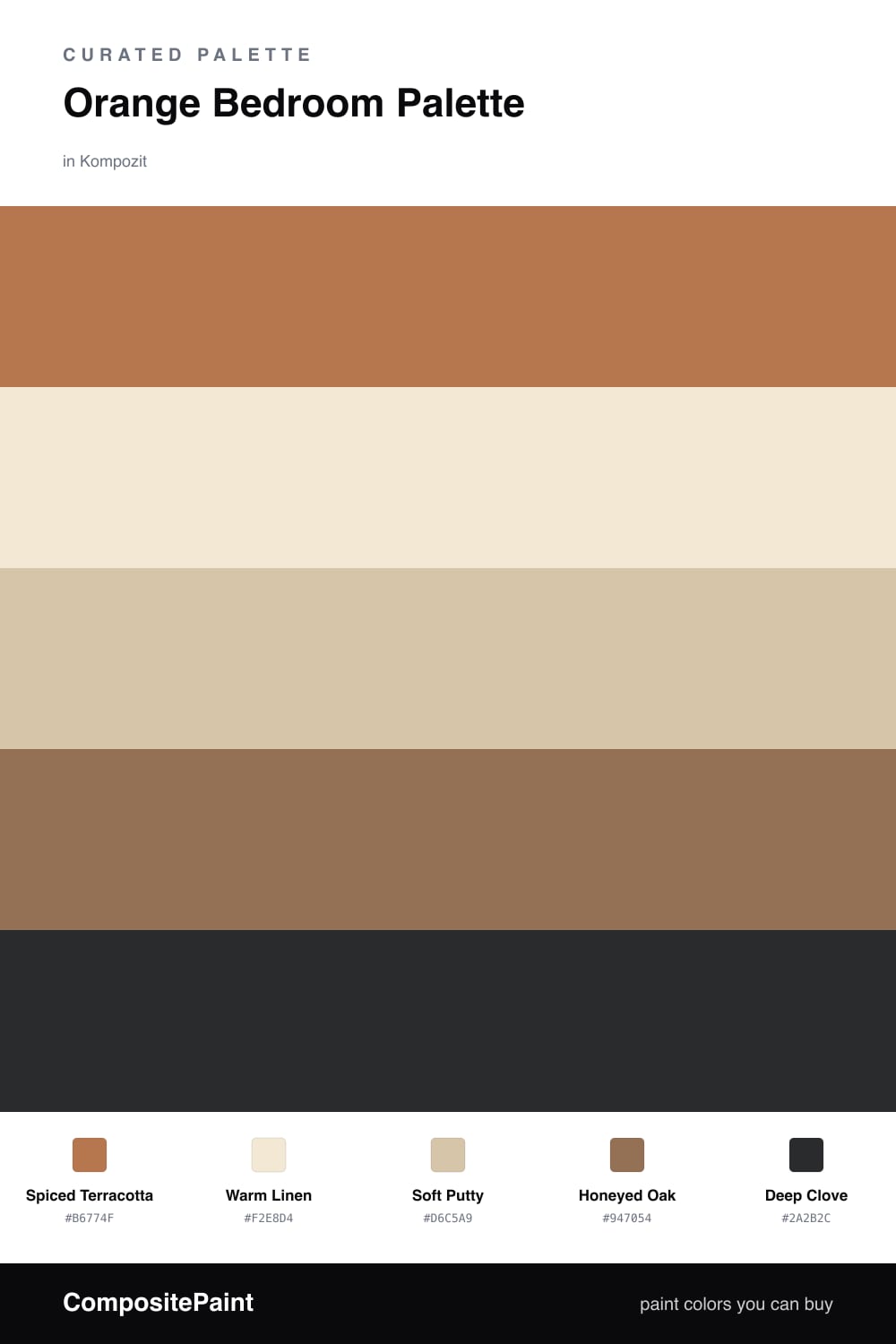
There is something deeply comforting about waking up inside a warm color, and Spiced Terracotta delivers exactly that. It is orange with the volume turned down, more clay and sunset than citrus, so it wraps the walls in a soft glow instead of shouting at you first thing in the morning.

To keep the room calm, I let Warm Linen carry the trim and ceiling and Soft Putty settle onto the vanity, both quiet enough to let the terracotta breathe. Honeyed Oak ties in naturally through floors and a headboard or nightstand, echoing the orange without competing with it.

The finishing move is Deep Clove, a near-black brown I would save for a single grounding piece — a lamp base, a frame, a length of bedding. Used sparingly, it gives this 2026-leaning earthy scheme its quiet anchor and makes the whole room feel collected and intentional.

Buy These Colors

Each color matched to the closest real paint in every brand, by ΔE2000. Kompozit first; take any SKU to the store — these mix on demand.

Spiced Terracotta
#C0734A · LRV 24 · Walls
Kompozit Semolina · 1011 ΔE 3.09
Backdrop Anita · BD-AN ΔE 17.83
Behr Marmalade Glaze · PPU3-02 ΔE 2.04
Benjamin Moore Sienna Clay · 104 ΔE 1.58
Clare Fire Sign · PNT100-DP-74 ΔE 4.58
Dunn-Edwards Cinnabar · DE5209 ΔE 1.58
Farrow & Ball Red Earth · No. 64 ΔE 7.35
Magnolia Home Work Worn Wood · JG-35 ΔE 3.84
PPG / Glidden Ginger Root · 1200-6 ΔE 1.97
Sherwin-Williams Yam · SW 6643 ΔE 2.24
Valspar Adobe Dusk · M145 ΔE 3.26
Warm Linen
#F1E7D6 · LRV 81 · Trim & Ceiling
Kompozit Eugenia · 0285 ΔE 1.22
Backdrop Don't Eat the Yellow Snow · BD-DS ΔE 3.19
Behr Rye Flour · HDC-FL13-5 ΔE 0.52
Benjamin Moore Franklin White · CW-200 ΔE 0.81
Clare Like Buttah · PNT100-LT-62 ΔE 0.52
Dunn-Edwards Rice Bowl · DE6170 ΔE 0.41
Farrow & Ball James White · No. 2010 ΔE 2.92
Magnolia Home Carter Crème · JG-16 ΔE 1.66
PPG / Glidden Elegant Ivory · 1081-1 ΔE 0.78
Sherwin-Williams Crisp Linen · SW 6378 ΔE 1.31
Valspar Nankeen · 8003-20A ΔE 0.51
Soft Putty
#D8C7AF · LRV 59 · Cabinets or Vanity
Kompozit Garden Country · 0279 ΔE 1.6
Backdrop August · BD-AU ΔE 7.04
Behr Parachute Silk · UL160-16 ΔE 0.83
Benjamin Moore Cocoa Sand · 1122 ΔE 1.68
Clare Meet Cute · PNT100-LT-60 ΔE 7.84
Dunn-Edwards Desert Suede · DE6206 ΔE 1.58
Farrow & Ball Savage Ground · No. 213 ΔE 1.64
Magnolia Home Plaster · JG-156 ΔE 3.18
PPG / Glidden Armadillo · 14-17 ΔE 0.85
Sherwin-Williams Kilim Beige · SW 6106 ΔE 0.85
Valspar Dakota Trail · 6008-3B ΔE 2.44
Honeyed Oak
#9C6B43 · LRV 18 · Wood & Floors
Kompozit Cavern Sand · 0165 ΔE 4.52
Backdrop Old Soul · BD-OS ΔE 17.74
Behr Castellina · MQ4-5 ΔE 1.69
Benjamin Moore Runyon Canyon Tan · 1140 ΔE 1.36
Clare Big Apple · PNT100-DP-30 ΔE 15.27
Dunn-Edwards Brown Eyes · DE5265 ΔE 2.55
Farrow & Ball Picture Gallery Red · No. 42 ΔE 12.57
Magnolia Home Remote Trail · JG-165 ΔE 11.5
PPG / Glidden Apple Butter · 15-02 ΔE 2.59
Sherwin-Williams El Caramelo · SW 9106 ΔE 3.24
Valspar Chestnut Beach · 3002-7A ΔE 1.18
Deep Clove
#3A2A22 · LRV 3 · Accent
Kompozit Silent Sea · 0515 ΔE 10.46
Backdrop Hocus Pocus · BD-HP ΔE 12.13
Behr Bitter Chocolate · 790B-7 ΔE 6.98
Benjamin Moore Wenge · AF-180 ΔE 3.73
Clare Blackish · PNT100-DP-54 ΔE 12.21
Dunn-Edwards Black · DEA187 ΔE 9.93
Farrow & Ball Pitch Black · No. 256 ΔE 9.17
Magnolia Home Moments · JG-150 ΔE 5.38
PPG / Glidden Black Magic · 1001-7 ΔE 10.9
Sherwin-Williams Raisin · SW 7630 ΔE 6.03
Valspar Noblesse Oblige · 8004-2G ΔE 5.65

Questions

Is orange too bold for a bedroom?

Not when you pick a softened, earthy version like terracotta. It reads warm and grounding rather than loud, and pairing it with linen and oak keeps the room feeling restful instead of energetic.

How much orange should I actually use?

Let terracotta lead on the walls, then pull it back everywhere else. Roughly two-thirds warm orange and earth tones, one-third soft neutrals, with the clove showing up only in small grounding doses.

Similar Palettes

Closest schemes by color — not by label.