CP

Rust Color Palette — Foundry Linen

A warm five-color scheme led by deep rust and softened with linen, oatmeal, and clay, grounded by espresso brown — every color matched to real paint you can buy.

By Maya Patel · Reviews Editor & Product Tester

Foundry Rust
Dominant
Kompozit Pretty Parasol · 1039
#AC5D3E
LRV 17
Warm Clay
Secondary
Kompozit Peace of Mind · 1004
#C1875F
LRV 29
Soft Linen
Base
Kompozit Tawny Daylilly · 0327
#EEE4D1
LRV 78
Toasted Oatmeal
Support
Kompozit Garden Country · 0279
#D6C5A9
LRV 57
Espresso Brown
Accent
Kompozit Silent Sea · 0515
#2A2B2C
LRV 2
View palette in

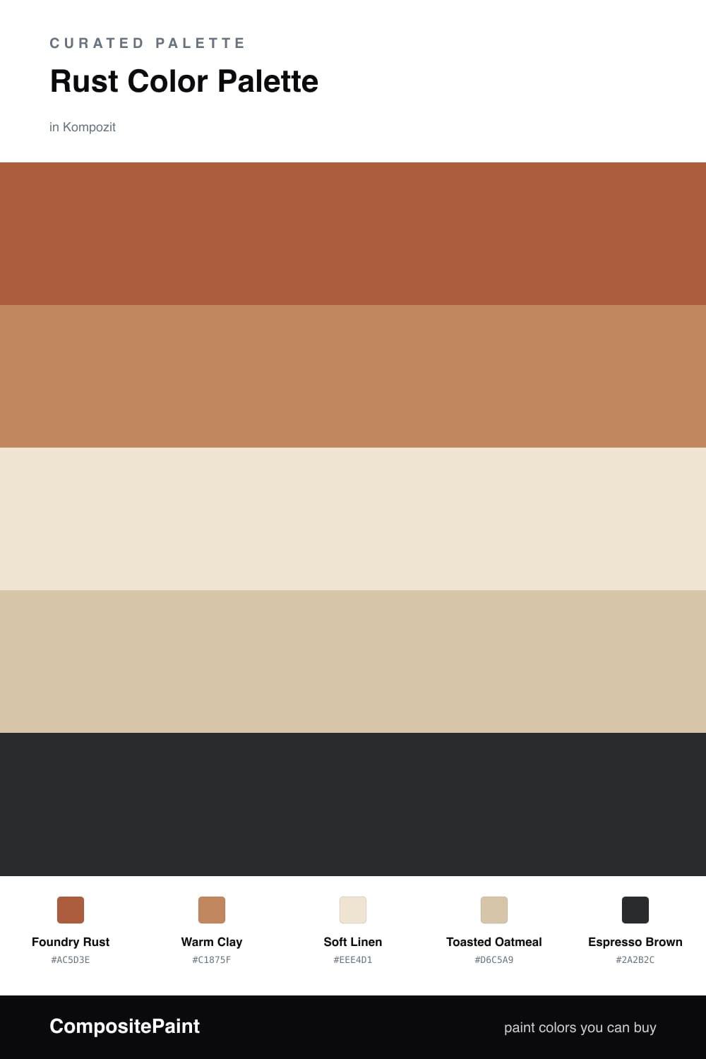
Rust is having a real moment in 2026, and this is the version I keep coming back to. Foundry Rust leads the scheme — a deep, earthy terracotta that feels warm and lived-in without tipping into red. It does the heavy lifting on the largest surfaces.

Around it, Warm Clay picks up the same family in a lighter key, while Soft Linen and Toasted Oatmeal open the whole thing up and keep it from feeling closed-in. Those two neutrals are the breathing room that lets the rust read as rich instead of loud.

The small move that makes it land is Espresso Brown in the accent slot — hardware, a frame, a single piece of furniture. Use it sparingly. It sharpens the rust and gives the soft neutrals a clean line to push against.

Buy These Colors

Each color matched to the closest real paint in every brand, by ΔE2000. Kompozit first; take any SKU to the store — these mix on demand.

Foundry Rust
#A65A36 · LRV 16 · Dominant
Kompozit Pretty Parasol · 1039 ΔE 2.41
Backdrop Buenos Aires · BD-BA ΔE 12.24
Behr Copper Mountain · 260D-7 ΔE 3.07
Benjamin Moore Pilgrimage Foliage · 2175-20 ΔE 1.71
Clare Big Apple · PNT100-DP-30 ΔE 12.21
Dunn-Edwards Iron Ore · DE5153 ΔE 5.65
Farrow & Ball Picture Gallery Red · No. 42 ΔE 7.83
Magnolia Home On Bosque · JG-36 ΔE 2.68
PPG / Glidden Fragrant Cloves · 1199-7 ΔE 1.79
Sherwin-Williams Earthen Jug · SW 7703 ΔE 1.36
Valspar Opening Night · V046-6 ΔE 4.19
Warm Clay
#C68A66 · LRV 31 · Secondary
Kompozit Peace of Mind · 1004 ΔE 1.95
Backdrop Anita · BD-AN ΔE 13.26
Behr Glazed Ginger · PPU3-13 ΔE 2.97
Benjamin Moore Tuscany · 1208 ΔE 2.94
Clare Pink Sky · PNT100-MD-28 ΔE 11.86
Dunn-Edwards Secluded Canyon · DE5186 ΔE 4.47
Farrow & Ball Red Earth · No. 64 ΔE 7.83
Magnolia Home Vintage Crown · JG-152 ΔE 9.15
PPG / Glidden Hitching Post · 1070-5 ΔE 1.39
Sherwin-Williams Subdued Sienna · SW 9009 ΔE 3.35
Valspar Pinch of Clove · P082 ΔE 2.59
Soft Linen
#EFE6D6 · LRV 80 · Base
Kompozit Tawny Daylilly · 0327 ΔE 1.21
Backdrop Don't Eat the Yellow Snow · BD-DS ΔE 3.35
Behr Rye Flour · HDC-FL13-5 ΔE 0.99
Benjamin Moore Navajo White · 947 ΔE 1.48
Clare Like Buttah · PNT100-LT-62 ΔE 0.99
Dunn-Edwards Finest Silk · DE6127 ΔE 1.97
Farrow & Ball James White · No. 2010 ΔE 2.63
Magnolia Home Carter Crème · JG-16 ΔE 1.48
PPG / Glidden Elegant Ivory · 1081-1 ΔE 0.97
Sherwin-Williams Restful White · SW 7563 ΔE 1.68
Valspar Double Scoop · V176 ΔE 0
Toasted Oatmeal
#D6C4A8 · LRV 57 · Support
Kompozit Garden Country · 0279 ΔE 0.49
Backdrop Boy Meets Girl · BD-BG ΔE 11.95
Behr Almond Butter · MQ2-23 ΔE 0.48
Benjamin Moore Adobe Beige · 1128 ΔE 1.74
Clare Meet Cute · PNT100-LT-60 ΔE 8.98
Dunn-Edwards Pale Beach · DE6199 ΔE 0.49
Farrow & Ball Savage Ground · No. 213 ΔE 0.89
Magnolia Home Plaster · JG-156 ΔE 4.23
PPG / Glidden Birch Beige · 1094-3 ΔE 2.03
Sherwin-Williams Buckram Binding · SW 36 ΔE 1.62
Valspar Garden Rain · V094-2 ΔE 1.94
Espresso Brown
#3A2C23 · LRV 3 · Accent
Kompozit Silent Sea · 0515 ΔE 9.81
Backdrop Hocus Pocus · BD-HP ΔE 11.95
Behr Bitter Chocolate · 790B-7 ΔE 6.23
Benjamin Moore Wenge · AF-180 ΔE 4.48
Clare Blackish · PNT100-DP-54 ΔE 11.29
Dunn-Edwards Black · DEA187 ΔE 9.15
Farrow & Ball Pitch Black · No. 256 ΔE 8.33
Magnolia Home Moments · JG-150 ΔE 4.68
PPG / Glidden Black Magic · 1001-7 ΔE 10.1
Sherwin-Williams Raisin · SW 7630 ΔE 6.78
Valspar Noblesse Oblige · 8004-2G ΔE 6.27

Questions

Why does rust work so well as the lead color?

Rust is a warm, grounded earth tone that reads as cozy without going dark. Paired with pale linen and oatmeal, it stays the clear star while the neutrals keep the whole scheme from feeling heavy.

How much rust should I actually use?

Let rust lead at roughly a 60/40 split with the neutrals, then add clay and espresso in small doses. The rust carries the room and everything else supports it.

Similar Palettes

Closest schemes by color — not by label.