Orange Color Palette — Linen & Amber
A warm five-color scheme led by soft amber orange and grounded in linen neutrals, with a single deep accent — every color matched to real paint you can buy.
By David Chen · Formulation Lead & Resident Chemist
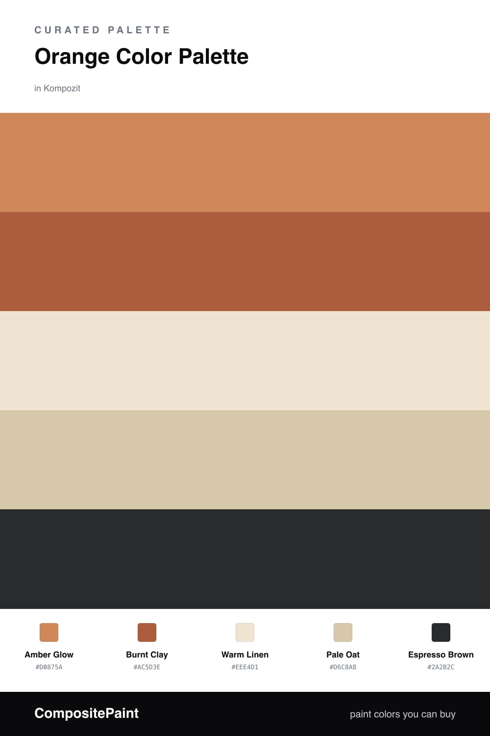
Think of orange the way you would a warm spice — a little carries the whole dish. This scheme builds around Amber Glow, a soft sun-baked orange that feels current without tipping into the loud terracotta trend, and backs it with Burnt Clay for depth where you want the color to settle.
The quiet half of the recipe is Warm Linen and Pale Oat. These linen neutrals are not really beige and not really cream — they hold just enough warmth to belong in the same family as the orange, which is what keeps the whole palette feeling intentional rather than thrown together.
Finally, Espresso Brown does the job a pinch of salt does — you barely notice it, but everything tastes better for it. Use it sparingly on a frame, a fixture, or a single piece of furniture to anchor all that warmth and give the eye a crisp edge to land on.
Buy These Colors
Each color matched to the closest real paint in every brand, by ΔE2000. Kompozit first; take any SKU to the store — these mix on demand.
Questions
Orange carries the warmth of both red and yellow, so it reads cozy without feeling heavy. Surrounding it with linen neutrals lets the orange stay the star while the room still feels calm and livable.
Aim for roughly a 60/40 split — let amber and clay cover the big surfaces, then lean on the linen and oat tones to give your eyes a place to rest. The espresso shows up last, in small grounding doses.
Similar Palettes
Closest schemes by color — not by label.