Orange Kitchen Palette — Burnt Clay & Warm Linen
A warm five-color kitchen scheme led by burnt-clay orange walls, balanced with linen, soft white trim, oak, and a deep espresso accent — every color matched to real paint you can buy.
By Jessica Williams · Color Stylist & Interior Editor
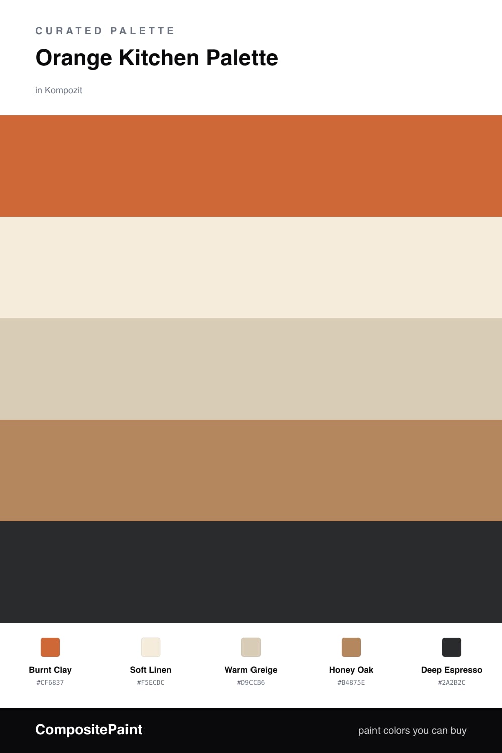
There is something about an orange kitchen that just feels lived-in and generous. This scheme leans on a Burnt Clay orange for the walls, the kind of earthy, sun-baked tone that reads warm without shouting. It is the heart of the room, the color you notice first when the morning light hits.
Around it, Soft Linen keeps the trim and ceiling light and breathing, while Warm Greige cabinets settle everything into a calm middle ground. Honey Oak on the floors and open shelving echoes the warmth in the walls, so the whole palette feels like it grew together rather than being assembled.
For 2026 I like a single grounding note, and Deep Espresso does that here, picked up in a worktop edge, hardware, or a pendant light. Use it sparingly and it gives the orange somewhere to land, making the room feel both cozy and quietly modern.
Buy These Colors
Each color matched to the closest real paint in every brand, by ΔE2000. Kompozit first; take any SKU to the store — these mix on demand.
Questions
Orange is the color of warmth and appetite, so it makes a kitchen feel alive and inviting. Keeping it grounded with greige and oak stops it from feeling too bright over a whole room.
Let the clay tone lead on the walls and let everything else stay quiet. A roughly two-thirds warm-neutral to one-third orange balance keeps the space cozy rather than overwhelming.
Similar Palettes
Closest schemes by color — not by label.