CP

Rust Color Palette — Ember Workshop

A warm five-color scheme led by deep rust and softened with toasted neutrals and a single iron-gray accent, every color matched to real paint you can buy.

By Emily Roberts · DIY Editor & First-Timer's Guide

Burnt Rust
Dominant
Kompozit Dark Marmalade · 1040
#994939
LRV 12
Terracotta Clay
Secondary
Kompozit Semolina · 1011
#B6774F
LRV 24
Toasted Almond
Base
Kompozit Yellow Page · 0286
#EADCC6
LRV 73
Warm Putty
Support
Kompozit Courtyard · 0344
#C8BDA4
LRV 51
Iron Gray
Accent
Kompozit Black Licorice · 0529
#3A3B3B
LRV 4
View palette in

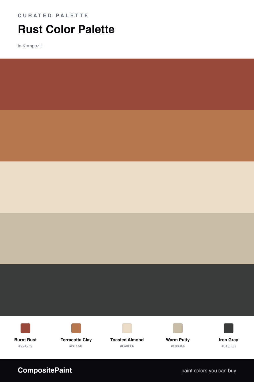
Rust is having a real moment right now, and it is easy to see why. Burnt Rust leads this scheme with a deep, cozy warmth that feels grown-up and a little bit moody, the kind of color that makes a space feel finished rather than loud.

To keep it from getting too intense, Terracotta Clay steps in as a softer cousin, and Toasted Almond with Warm Putty spread out as gentle neutrals. Think of these three as the breathing room around your star color.

Finally, a touch of Iron Gray sharpens the whole thing up. Use it sparingly, on a door frame or a chair, and it will quietly tie everything together without stealing the show.

Buy These Colors

Each color matched to the closest real paint in every brand, by ΔE2000. Kompozit first; take any SKU to the store — these mix on demand.

Burnt Rust
#9C4A2E · LRV 12 · Dominant
Kompozit Dark Marmalade · 1040 ΔE 4.04
Backdrop Bahaus · BD-BH ΔE 9.69
Behr Smokin Hot · MQ1-24 ΔE 6.12
Benjamin Moore Rich Chestnut · 2090-20 ΔE 3.66
Clare Big Apple · PNT100-DP-30 ΔE 11.97
Dunn-Edwards Arabian Red · DEA155 ΔE 5.36
Farrow & Ball Incarnadine · No. 248 ΔE 9.93
Magnolia Home On Bosque · JG-36 ΔE 3.3
PPG / Glidden Rojo Colonial · 13-15 ΔE 5.69
Sherwin-Williams Spicy Hue · SW 6342 ΔE 2.03
Valspar Tropical Nut · 2003-5A ΔE 3.61
Terracotta Clay
#C2724B · LRV 24 · Secondary
Kompozit Semolina · 1011 ΔE 3.92
Backdrop Anita · BD-AN ΔE 18.22
Behr Marmalade Glaze · PPU3-02 ΔE 2.9
Benjamin Moore Hale Orange · CW-295 ΔE 1.36
Clare Fire Sign · PNT100-DP-74 ΔE 3.58
Dunn-Edwards Spanish Peanut · DE5180 ΔE 2.75
Farrow & Ball Red Earth · No. 64 ΔE 6.71
Magnolia Home Work Worn Wood · JG-35 ΔE 3.55
PPG / Glidden Ginger Root · 1200-6 ΔE 2.85
Sherwin-Williams Yam · SW 6643 ΔE 2.68
Valspar Clove Bud · 2004-5B ΔE 2.16
Toasted Almond
#E8DAC6 · LRV 71 · Base
Kompozit Yellow Page · 0286 ΔE 0.9
Backdrop Cookies & Cream · BD-CC ΔE 3.31
Behr Moongaze · MQ3-41 ΔE 1.09
Benjamin Moore Lambskin · 1051 ΔE 1.02
Clare Neutral Territory · PNT100-LT-20 ΔE 2.29
Dunn-Edwards Cream Wave · DE6198 ΔE 1.1
Farrow & Ball Lime White · No. 1 ΔE 2.22
Magnolia Home Morning Snow · JG-167 ΔE 2.15
PPG / Glidden Oatmeal Cookie · 1080-1 ΔE 0.93
Sherwin-Williams Antique White · SW 6119 ΔE 1.51
Valspar Antique Buff · 7007-11 ΔE 0
Warm Putty
#CDBBA2 · LRV 51 · Support
Kompozit Courtyard · 0344 ΔE 3.32
Backdrop Boy Meets Girl · BD-BG ΔE 11.23
Behr Gobi Desert · 710C-3 ΔE 0.84
Benjamin Moore Bar Harbor Beige · 1032 ΔE 0.8
Clare Greige · PNT100-LT-13 ΔE 7.79
Dunn-Edwards Rustic Taupe · DE6129 ΔE 1.51
Farrow & Ball Drop Cloth · No. 283 ΔE 3.19
Magnolia Home Solid Wood · JG-109 ΔE 4.23
PPG / Glidden Dusty Trail · 1097-4 ΔE 1.75
Sherwin-Williams Downing Sand · SW 2822 ΔE 1.27
Valspar Country Charm · 3007-10B ΔE 1.53
Iron Gray
#3A3431 · LRV 4 · Accent
Kompozit Black Licorice · 0529 ΔE 4.79
Backdrop After Hours · BD-AH ΔE 8.17
Behr Bitter Chocolate · 790B-7 ΔE 0.77
Benjamin Moore Onyx · 2133-10 ΔE 3.28
Clare Blackish · PNT100-DP-54 ΔE 6.68
Dunn-Edwards Black · DEA187 ΔE 3.67
Farrow & Ball Pitch Black · No. 256 ΔE 2.87
Magnolia Home Moments · JG-150 ΔE 1.89
PPG / Glidden Black Magic · 1001-7 ΔE 4.88
Sherwin-Williams Deep Forest Brown · SW 9175 ΔE 3.88
Valspar Fired Earth · 6011-1 ΔE 1.64

Questions

Why does rust work as the main color here?

Rust is rich and grounded, so it can carry a whole room without feeling heavy. The lighter putty and almond tones give your eyes a place to rest, while the iron gray adds just enough contrast to keep things from going flat.

How much rust is too much?

A good rule is to let rust lead on roughly two-thirds of the space and keep the neutrals on the rest. Save the iron gray for small moments like trim or a single piece of furniture.

Similar Palettes

Closest schemes by color — not by label.