Brown Color Palette — Mocha Hour
A warm five-color brown scheme layering espresso, mocha, and walnut over soft taupe and cream — every color matched to real paint you can buy.
By Emily Roberts · DIY Editor & First-Timer's Guide
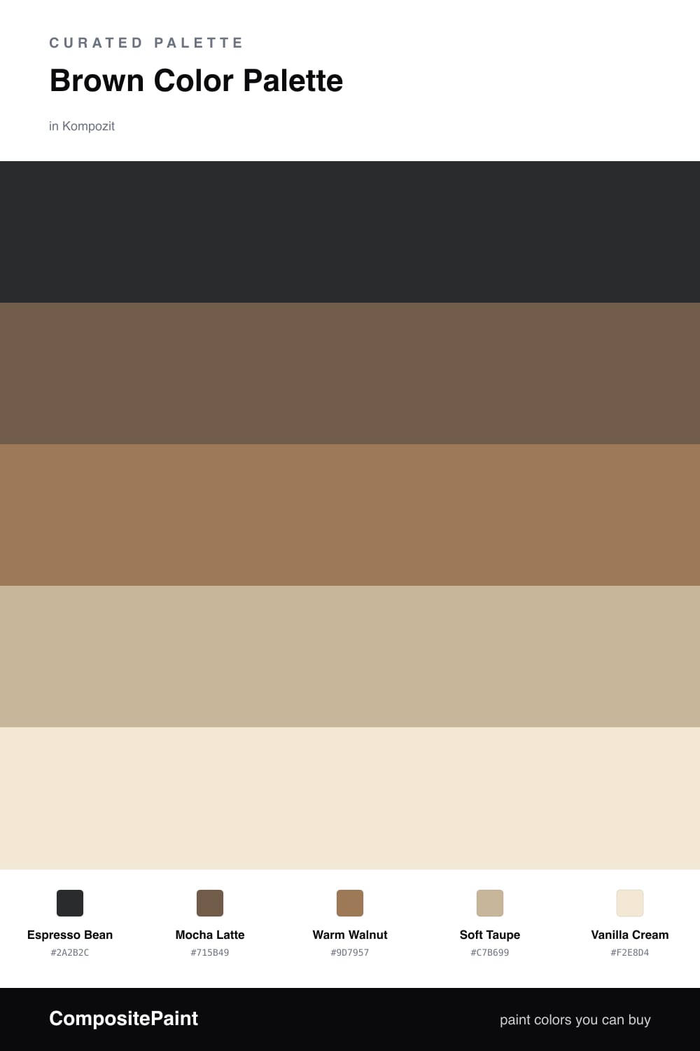
Brown is having a real moment again, and this scheme is why. It starts with a deep Espresso Bean that feels grounded and grown-up, then warms up with Mocha Latte as the second-in-command. Think of these two as your coffee order, with the rich one doing most of the talking.
From there it gets soft. Warm Walnut adds that woody, lived-in middle tone, and Soft Taupe is the quiet base that keeps everything from going too heavy. Taupe is just a gentle gray-brown, by the way, and it is the color that lets all this warmth breathe.
Finish with a little Vanilla Cream to lift the whole thing. Use the espresso as your main color, mocha and walnut in the middle, and let the cream catch the light. It is cozy without being dark, which is exactly where browns are headed in 2026.
Buy These Colors
Each color matched to the closest real paint in every brand, by ΔE2000. Kompozit first; take any SKU to the store — these mix on demand.
Questions
Not if you let the lighter tones carry the walls. Use Soft Taupe and Vanilla Cream across the big surfaces, then save Espresso Bean for smaller, deeper moments. The cream keeps light bouncing around so the warmth reads cozy, not cave-like.
Lean on the gaps between them. Espresso Bean is deep, Vanilla Cream is nearly off-white, and the three middle browns step up evenly between. That spacing gives your eye a clear path, so the palette feels layered instead of flat.
Similar Palettes
Closest schemes by color — not by label.