CP

Brown Color Palette — Chocolate Mocha

A rich five-color brown scheme layering espresso, chocolate and walnut over warm taupe and cream — every color matched to real paint you can buy.

By Maya Patel · Reviews Editor & Product Tester

Dark Espresso
Dominant
Kompozit Silent Sea · 0515
#2A2B2C
LRV 2
Rich Chocolate
Secondary
Kompozit Hideaway · 0137
#654637
LRV 7
Warm Cream
Base
Kompozit Tawny Daylilly · 0327
#EEE4D1
LRV 78
Soft Taupe
Support
Kompozit Wicker Basket · 0280
#C7B699
LRV 48
Walnut Mocha
Accent
Kompozit Dapper · 0192
#715B49
LRV 11
View palette in

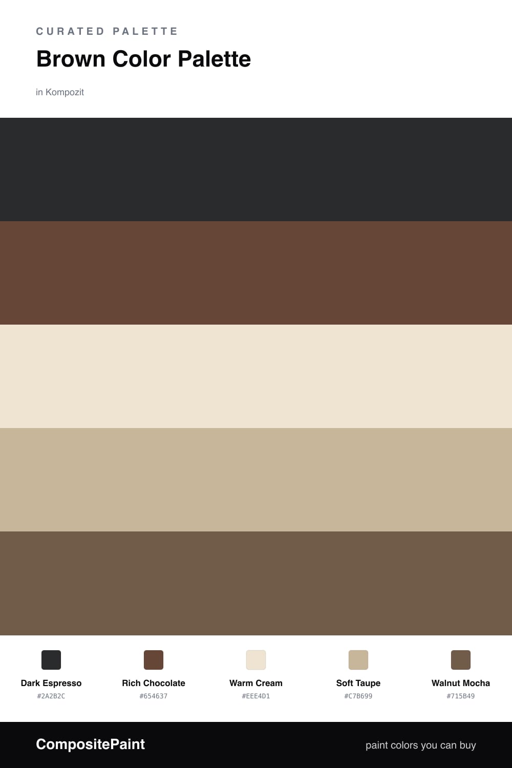
Brown is having a real moment in 2026, and this scheme leans all the way in. Dark Espresso anchors everything with a deep, almost-black coffee tone, while Rich Chocolate sits just above it as a warmer, friendlier second layer.

To keep all that depth from going heavy, Warm Cream opens the palette back up and Soft Taupe carries the quiet middle ground. The two of them do most of the work on big surfaces so the dark browns read as luxe instead of dim.

Walnut Mocha is the connector, the wood-toned shade that links the pale neutrals to the espresso end. Lead with the creams and taupes, drop in the dark browns as your contrast, and let the mocha smooth the seams between them.

Buy These Colors

Each color matched to the closest real paint in every brand, by ΔE2000. Kompozit first; take any SKU to the store — these mix on demand.

Dark Espresso
#3A2A21 · LRV 3 · Dominant
Kompozit Silent Sea · 0515 ΔE 10.64
Backdrop Hocus Pocus · BD-HP ΔE 12.41
Behr Bitter Chocolate · 790B-7 ΔE 7.18
Benjamin Moore Wenge · AF-180 ΔE 4.29
Clare Blackish · PNT100-DP-54 ΔE 12.31
Dunn-Edwards Black · DEA187 ΔE 10.12
Farrow & Ball Pitch Black · No. 256 ΔE 9.33
Magnolia Home Moments · JG-150 ΔE 5.57
PPG / Glidden Black Magic · 1001-7 ΔE 11.07
Sherwin-Williams Raisin · SW 7630 ΔE 6.61
Valspar Noblesse Oblige · 8004-2G ΔE 6.21
Rich Chocolate
#5B4034 · LRV 6 · Secondary
Kompozit Hideaway · 0137 ΔE 2.83
Backdrop It's a Date · BD-IT ΔE 2.57
Behr Breakfast Blend · 280F-7 ΔE 5.23
Benjamin Moore Chocolate Sundae · 2113-10 ΔE 1.71
Clare Blackish · PNT100-DP-54 ΔE 12.83
Dunn-Edwards Northern Territory · DEA158 ΔE 2.33
Farrow & Ball Mahogany · No. 36 ΔE 7.36
Magnolia Home Moody Fig · JG-155 ΔE 7.12
PPG / Glidden Racy Raisin · 16-24 ΔE 5.51
Sherwin-Williams Otter · SW 6041 ΔE 3.59
Valspar Roasted Coffee · 2009-10 ΔE 2.36
Warm Cream
#EFE6D6 · LRV 80 · Base
Kompozit Tawny Daylilly · 0327 ΔE 1.21
Backdrop Don't Eat the Yellow Snow · BD-DS ΔE 3.35
Behr Rye Flour · HDC-FL13-5 ΔE 0.99
Benjamin Moore Navajo White · 947 ΔE 1.48
Clare Like Buttah · PNT100-LT-62 ΔE 0.99
Dunn-Edwards Finest Silk · DE6127 ΔE 1.97
Farrow & Ball James White · No. 2010 ΔE 2.63
Magnolia Home Carter Crème · JG-16 ΔE 1.48
PPG / Glidden Elegant Ivory · 1081-1 ΔE 0.97
Sherwin-Williams Restful White · SW 7563 ΔE 1.68
Valspar Double Scoop · V176 ΔE 0
Soft Taupe
#C9B79E · LRV 49 · Support
Kompozit Wicker Basket · 0280 ΔE 1.78
Backdrop Boy Meets Girl · BD-BG ΔE 11.47
Behr Windsor Tan · MQ2-26 ΔE 1.29
Benjamin Moore Sierra Hills · 1053 ΔE 1.01
Clare Greige · PNT100-LT-13 ΔE 7.76
Dunn-Edwards Stonish Beige · DEC716 ΔE 2.55
Farrow & Ball Jitney · No. 293 ΔE 3.98
Magnolia Home Solid Wood · JG-109 ΔE 4.32
PPG / Glidden Happy Trails · 1084-4 ΔE 1.98
Sherwin-Williams Macadamia · SW 6142 ΔE 1.3
Valspar Sandy Trail · V134-3 ΔE 0.86
Walnut Mocha
#7A5C46 · LRV 12 · Accent
Kompozit Dapper · 0192 ΔE 3.28
Backdrop Buenos Aires · BD-BA ΔE 1.46
Behr Molasses · S220-7 ΔE 2.5
Benjamin Moore Coconut Grove · 1029 ΔE 2
Clare Coffee Date · PNT100-DP-53 ΔE 9.35
Dunn-Edwards Rodeo · DEA163 ΔE 1.45
Farrow & Ball Salon Drab · No. 290 ΔE 7.07
Magnolia Home Cognac · JG-164 ΔE 3.45
PPG / Glidden Spiced Cinnamon · 1071-7 ΔE 3.35
Sherwin-Williams Burnished Brandy · SW 7523 ΔE 1.16
Valspar Muddy Mississippi · 3004-9A ΔE 1.89

Questions

How do I keep an all-brown scheme from feeling flat?

Spread the values out. Pair the near-black Dark Espresso against the pale Warm Cream so there is real contrast, then let Soft Taupe and Walnut Mocha bridge the gap. Texture helps too, so mix a matte wall finish with something a little softer like a linen or wood tone.

Which brown should I use on the walls?

For most rooms lead with Warm Cream or Soft Taupe on the big surfaces so the space stays light, then bring in Dark Espresso and Rich Chocolate on trim, doors or a single feature wall. Save Walnut Mocha for the in-between moments that tie it together.

Similar Palettes

Closest schemes by color — not by label.