Brown Color Palette — Espresso Hour
A warm five-color scheme layering deep espresso brown with mocha, walnut and soft cream for a grounded modern look — every color matched to real paint you can buy.
By Jessica Williams · Color Stylist & Interior Editor
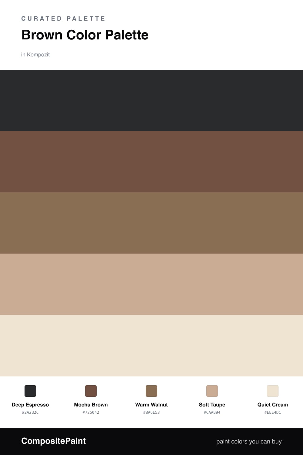
Brown is having a quiet moment again, and this scheme leans all the way into it. A deep Deep Espresso anchors everything, the kind of near-black brown that feels like the last sip of coffee rather than a flat dark wall. Against it, Mocha Brown softens the drop and warms the room up.
Warm Walnut carries that warmth through the mid-tones, the color of an old worn table, while Soft Taupe steps the palette gently toward the light. Then Quiet Cream lifts the whole thing, catching the daylight so all that brown reads rich and layered instead of dim.
Let the espresso and mocha do the heavy lifting on your largest surfaces, keep walnut for the pieces you want to feel hand-touched, and let taupe and cream open up the breathing room. It is one family of color doing all the work, which is exactly what makes it feel so calm and current.
Buy These Colors
Each color matched to the closest real paint in every brand, by ΔE2000. Kompozit first; take any SKU to the store — these mix on demand.
Questions
It only goes heavy if the browns crowd each other. Let the espresso and mocha lead on the larger surfaces, then keep plenty of the cream and taupe in the mix so the eye gets soft places to rest. A roughly 60/40 split of warm browns to light neutrals keeps it cozy instead of closed-in.
Lean on the temperature shifts. The espresso is cool and grounding, the walnut and mocha run warmer and redder, and the cream warms the whole thing up. Stacking those slight differences in warmth is what gives the palette depth without adding a single other color.
Similar Palettes
Closest schemes by color — not by label.