Brown Color Palette — Cocoa Hour
A warm five-color brown scheme layering rich espresso and chocolate with mocha, soft taupe and cream — every color matched to real paint you can buy.
By Jessica Williams · Color Stylist & Interior Editor
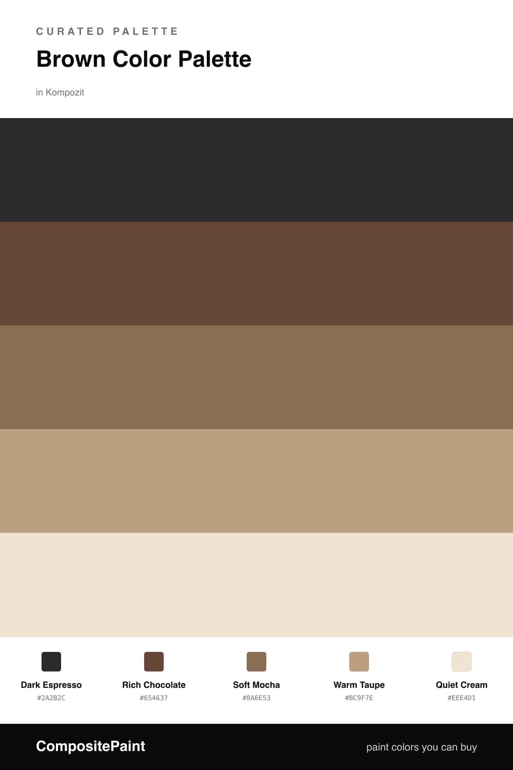
Brown is having a quiet renaissance, and this scheme is why. It pours together a near-black Dark Espresso and a true Rich Chocolate for depth, the kind of browns that feel less like dirt and more like a good pour of coffee at the end of the day.
In the middle, Soft Mocha does the everyday work — warm, grounded, easy to live with — while Warm Taupe lifts the scheme toward the light and keeps it from going heavy. A clean Quiet Cream is the breath of air at the top, the place your eye rests.
Use the espresso and chocolate in smaller, deliberate doses, let mocha and taupe carry the larger surfaces, and reach for cream wherever the palette needs to exhale. The result feels current for 2026: tonal, tactile and unmistakably warm.
Buy These Colors
Each color matched to the closest real paint in every brand, by ΔE2000. Kompozit first; take any SKU to the store — these mix on demand.
Questions
Stretch the range. Going from a near-black espresso down to a barely-there cream gives your eye somewhere to travel, so the browns read as layered and deliberate rather than one muddy tone.
A soft matte or eggshell. Flat sheens swallow light and make the deep espresso and chocolate feel velvety, while a touch of eggshell on the mocha and taupe keeps mid-tones easy to wipe clean.
Similar Palettes
Closest schemes by color — not by label.