CP

Brown Color Palette — Toffee Hour

A warm five-color brown scheme layering espresso, mocha and walnut over toffee and cream — every color matched to real paint you can buy.

By Maya Patel · Reviews Editor & Product Tester

Deep Espresso
Dominant
Kompozit Silent Sea · 0515
#2A2B2C
LRV 2
Soft Mocha
Secondary
Kompozit Dapper · 0192
#715B49
LRV 11
Toffee Cream
Base
Kompozit Palest of Lemon · 0264
#E6D6BB
LRV 69
Warm Taupe
Support
Kompozit Cocoa Nib · 0260
#BC9F7E
LRV 37
Walnut Brown
Accent
Kompozit Hideaway · 0137
#654637
LRV 7
View palette in

Brown is having a real moment again, and this scheme shows why it earns the comeback. Instead of one flat tone, Toffee Hour stacks five warm shades from light to dark so the whole thing feels layered and intentional rather than safe.

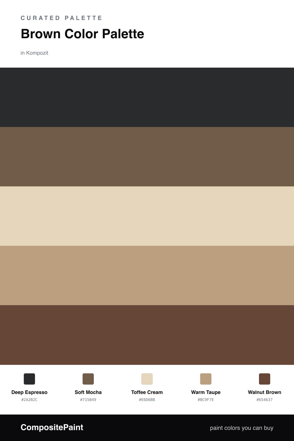
Deep Espresso anchors everything with a near-black richness, while Soft Mocha carries the main color story across walls or cabinetry. Toffee Cream keeps it from going heavy, acting as the light base that lets the deeper browns breathe.

Round it out with Warm Taupe as the quiet bridge tone and a hit of Walnut Brown for the parts you want to pop. The result is cozy and current, the kind of palette that feels expensive without trying too hard.

Buy These Colors

Each color matched to the closest real paint in every brand, by ΔE2000. Kompozit first; take any SKU to the store — these mix on demand.

Deep Espresso
#3B2A21 · LRV 3 · Dominant
Kompozit Silent Sea · 0515 ΔE 11.05
Backdrop Hocus Pocus · BD-HP ΔE 12.74
Behr Bitter Chocolate · 790B-7 ΔE 7.52
Benjamin Moore Wenge · AF-180 ΔE 4.24
Clare Blackish · PNT100-DP-54 ΔE 12.58
Dunn-Edwards Black · DEA187 ΔE 10.44
Farrow & Ball Pitch Black · No. 256 ΔE 9.67
Magnolia Home Moments · JG-150 ΔE 5.84
PPG / Glidden Black Magic · 1001-7 ΔE 11.36
Sherwin-Williams Polished Mahogany · SW 2838 ΔE 5.91
Valspar Noblesse Oblige · 8004-2G ΔE 6.18
Soft Mocha
#7A5C48 · LRV 12 · Secondary
Kompozit Dapper · 0192 ΔE 3.33
Backdrop Buenos Aires · BD-BA ΔE 2.14
Behr Molasses · S220-7 ΔE 2.64
Benjamin Moore Coconut Grove · 1029 ΔE 2
Clare Coffee Date · PNT100-DP-53 ΔE 8.8
Dunn-Edwards Burns Cave · DE6098 ΔE 2.89
Farrow & Ball Salon Drab · No. 290 ΔE 7.17
Magnolia Home Cognac · JG-164 ΔE 4.12
PPG / Glidden Spiced Cinnamon · 1071-7 ΔE 2.81
Sherwin-Williams Grounded · SW 6089 ΔE 0.6
Valspar Mona's Mane · 3002-9A ΔE 2.21
Toffee Cream
#E6D5BE · LRV 68 · Base
Kompozit Palest of Lemon · 0264 ΔE 1.77
Backdrop Cookies & Cream · BD-CC ΔE 4.11
Behr Minimum Beige · HDC-MD-17 ΔE 1.78
Benjamin Moore Mohair · 1058 ΔE 1.42
Clare Neutral Territory · PNT100-LT-20 ΔE 3
Dunn-Edwards Sand Dollar · DE6171 ΔE 2.74
Farrow & Ball Matchstick · No. 2013 ΔE 1.44
Magnolia Home Morning Snow · JG-167 ΔE 3.12
PPG / Glidden Alpaca Wool · 14-19 ΔE 1.44
Sherwin-Williams Lotus Pod · SW 7572 ΔE 0.85
Valspar Lovely Bluff · 3004-10C ΔE 0
Warm Taupe
#B8A084 · LRV 37 · Support
Kompozit Cocoa Nib · 0260 ΔE 1.99
Backdrop Carry the Two · BD-CT ΔE 6.11
Behr Craft Brown · HDC-AC-12 ΔE 0.38
Benjamin Moore Sherwood Tan · 1054 ΔE 1.03
Clare Good as Gold · PNT100-DP-59 ΔE 7.33
Dunn-Edwards Baked Potato · DEC717 ΔE 2.04
Farrow & Ball London Stone · No. 6 ΔE 3.02
Magnolia Home Juniper Tree · JG-166 ΔE 6.86
PPG / Glidden Maison De Campagne · 15-01 ΔE 3.11
Sherwin-Williams Latte · SW 6108 ΔE 0.55
Valspar Faint Maple · 2008-9C ΔE 2.77
Walnut Brown
#5A3E2B · LRV 6 · Accent
Kompozit Hideaway · 0137 ΔE 3.91
Backdrop It's a Date · BD-IT ΔE 2.77
Behr Breakfast Blend · 280F-7 ΔE 3.26
Benjamin Moore Deep Taupe · 2111-10 ΔE 3.01
Clare Blackish · PNT100-DP-54 ΔE 13.97
Dunn-Edwards Northern Territory · DEA158 ΔE 4.94
Farrow & Ball Mahogany · No. 36 ΔE 9.74
Magnolia Home Wooded Acres · JG-122 ΔE 8.96
PPG / Glidden Dark Granite · 1005-7 ΔE 8.96
Sherwin-Williams Terra Brun · SW 6048 ΔE 5.22
Valspar Roasted Coffee · 2009-10 ΔE 3.53

Questions

Is an all-brown palette too flat for a modern home?

Not when you spread the values out. The trick here is contrast within one family. Deep Espresso reads almost black, Toffee Cream reads almost ivory, and the mid-browns fill the gap, so the scheme has depth instead of looking like one muddy wash.

Which brown should I use the most?

Lead with Toffee Cream on the big surfaces so the room stays light and warm. Use Soft Mocha as your main color statement, then save Deep Espresso and Walnut Brown for trim, doors and smaller accents where the richness lands.

Similar Palettes

Closest schemes by color — not by label.