Brown Color Palette — Chestnut Hearth
A warm five-color brown scheme layering rich espresso and chestnut with walnut, taupe, and soft cream — every color matched to real paint you can buy.
By Emily Roberts · DIY Editor & First-Timer's Guide
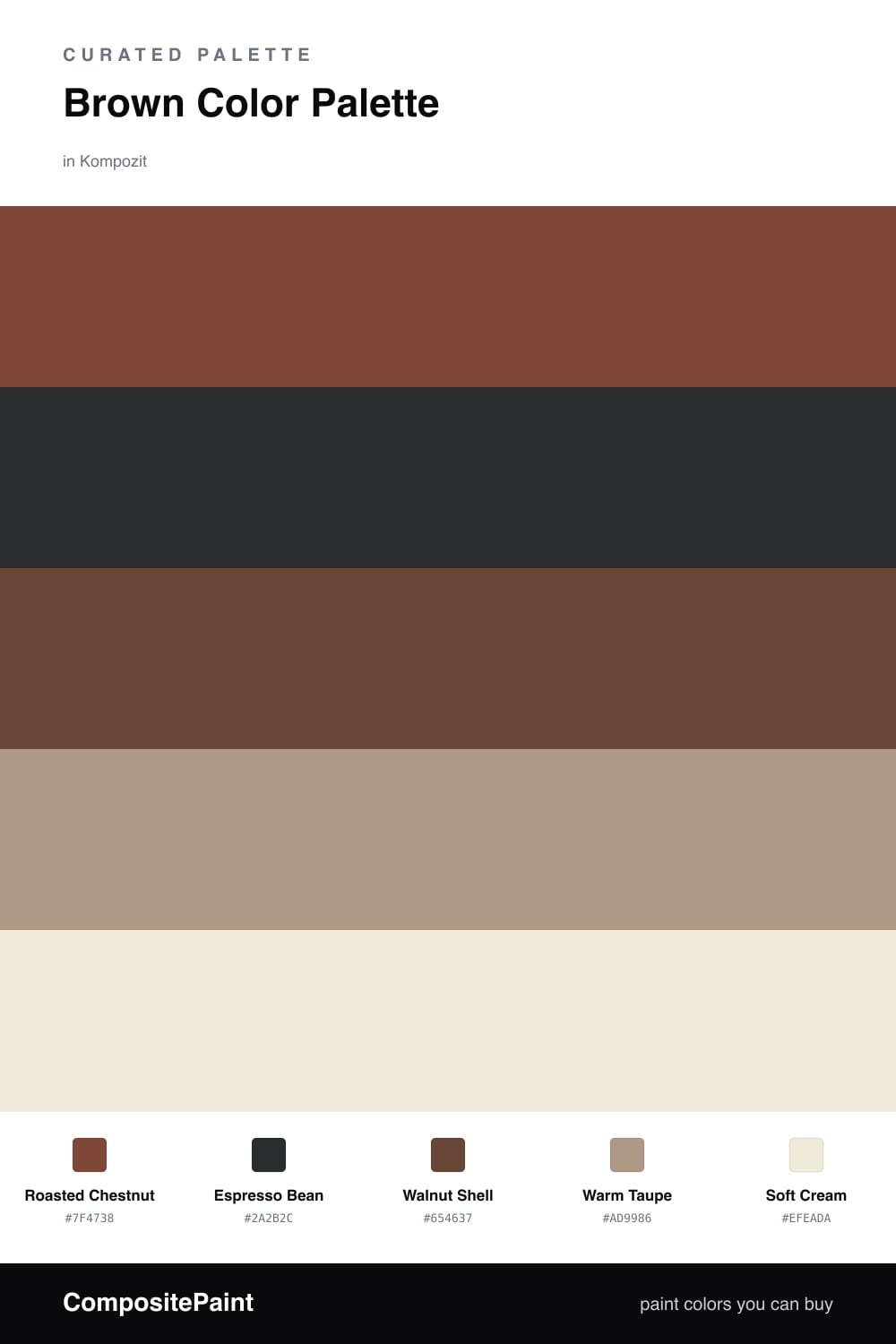
Brown is having a quiet comeback in 2026, and this is the cozy, lived-in version of it. Roasted Chestnut leads the way with that warm reddish glow you get from real wood, while Espresso Bean drops in as the deep, almost-black anchor that makes everything else feel grounded.
In between, Walnut Shell gives you a softer mid brown to lean on, and Warm Taupe bridges the rich tones and the light ones so nothing feels like a hard jump. Think of taupe as the friendly middle that keeps the whole group talking to each other.
Then Soft Cream opens it all up. Used on your biggest surfaces, it lets the browns feel intentional and warm instead of heavy. Let chestnut be the star, keep espresso for the small grounding moments, and let cream do the breathing — that balance is what makes this scheme feel rich rather than dim.
Buy These Colors
Each color matched to the closest real paint in every brand, by ΔE2000. Kompozit first; take any SKU to the store — these mix on demand.
Questions
Not if you let the light ones carry the big surfaces. Use Soft Cream on walls and Warm Taupe on trim, then bring in Roasted Chestnut and Espresso Bean as smaller, richer moments. The deep browns add depth without closing the room in.
Give them different jobs and a little contrast in value. Soft Cream is your light, Espresso Bean is your dark, and the three mid browns sit between them. When the lightest and darkest are far apart, the browns in the middle read as layered rather than blended into one flat tone.
Similar Palettes
Closest schemes by color — not by label.